devtools::install_github("xuyiqing/panelView@dev")4 Network Structure
Note
The type = "network" feature is currently available only on the development branch. Install it with:
When estimating models with multiple sets of fixed effects, the connectivity structure of the data determines what can be identified. As Correia (2016) shows, the fixed-effect estimation problem is equivalent to solving a linear system on a graph, and the structure of that graph has direct consequences for estimation and inference.
Two features of this structure are particularly important:
Singletons — units (or time periods, firms, etc.) that appear in only one combination with the other fixed-effect dimension. Singletons contribute no identifying variation for the fixed effects on the other side of the graph. In linear models, they can be iteratively removed without affecting the estimates of the remaining coefficients. In nonlinear models (e.g., Poisson regression), failing to remove singletons leads to incidental-parameter bias. Detecting singletons before estimation is therefore a prerequisite for valid inference.
Non-unique observations — when multiple observations share the same combination of fixed-effect indices (e.g., the same worker appears at the same firm multiple times), these duplicates create weighted edges in the graph. Understanding where and how often such duplicates occur is essential for specifying the correct model and interpreting standard errors.
The panelView package visualizes them with the type = "network" option, constructing a \(k\)-partite graph from \(k \geq 2\) sets of fixed effects.
4.1 Network elements
In the network plot, each distinct level of a fixed-effect dimension becomes a node. In a standard unit \(\times\) time panel, there is one node for each unit and one node for each time period. Different fixed-effect dimensions are distinguished by shape: circles for the first dimension (e.g., units), squares for the second (e.g., time periods), triangles for the third, and so on.
Each observation in the data creates an edge (link) between the nodes it connects. For example, if unit \(A\) is observed at time \(t\), an edge is drawn between node \(A\) and node \(t\). If the same combination appears multiple times (duplicate observations), the edge becomes thicker to reflect the count.
In short,
- nodes represent fixed-effect levels (units, time periods, firms, etc.);
- edges represent observed combinations.
The resulting plot reveals connected components, singletons, and duplicate observations at a glance.
- Connected components: groups of nodes that are linked to each other through some chain of edges. Nodes in different components share no observations and are shaded with distinct convex hulls.
- Singletons: nodes with exactly one edge (degree 1), highlighted with a colored glow ring.
- Duplicate observations: when the same combination of fixed-effect levels appears more than once, the edge becomes thicker to reflect the count.
We first load the package.
4.2 Basic usage: Unit \(\times\) Time
With the standard panel structure (unit \(\times\) time), the function constructs a bipartite graph: units are shown as circles, time periods as squares, and edges connect each unit to the periods in which it is observed.
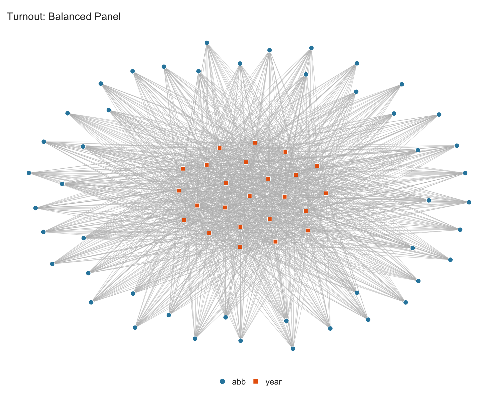
4.2.1 Balanced panel
The turnout dataset is a balanced panel of 47 US states over 24 election years. Because every state is observed in every year, the graph is a complete bipartite graph with a single connected component and no singletons.
4.2.2 Unbalanced panel with singletons
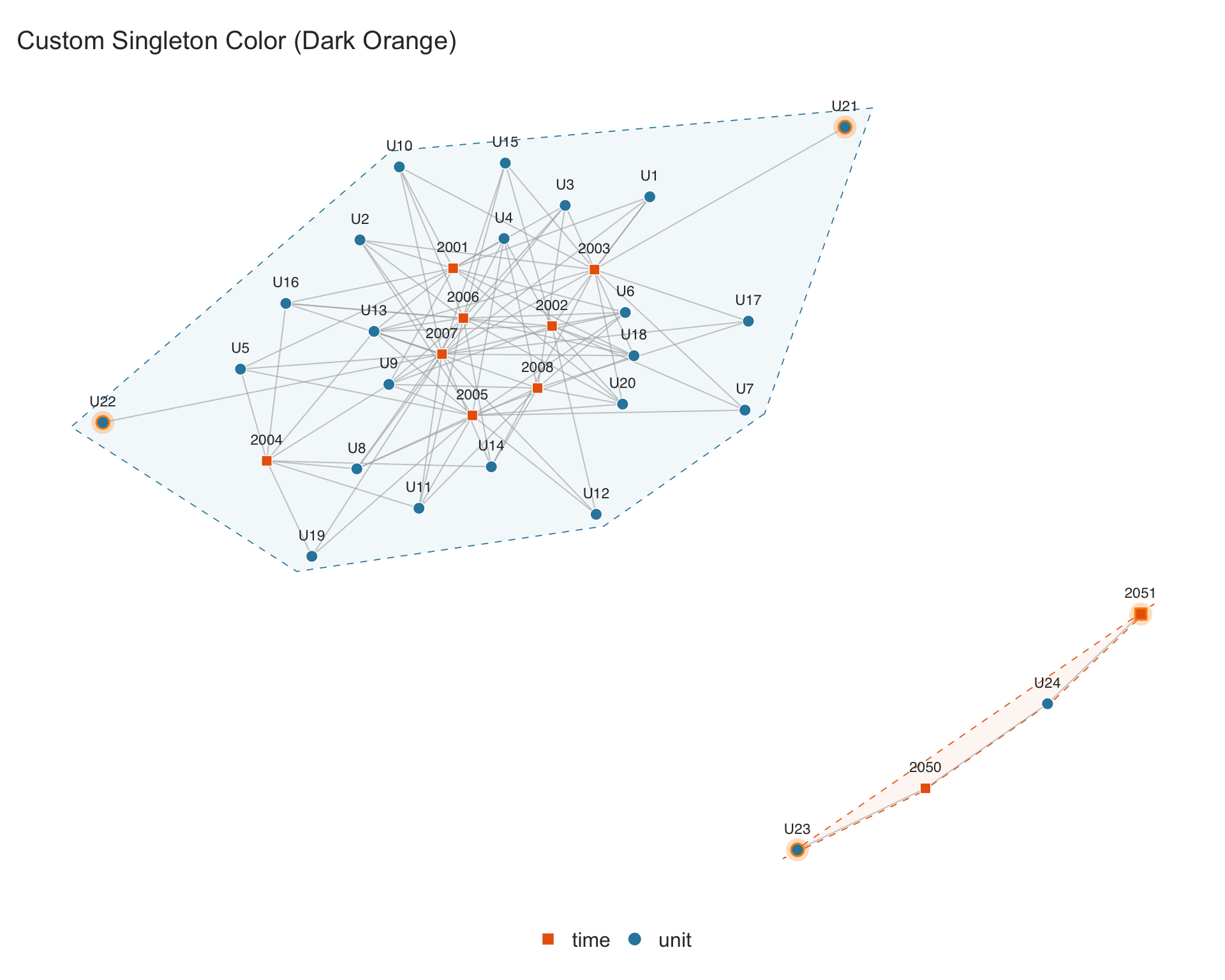
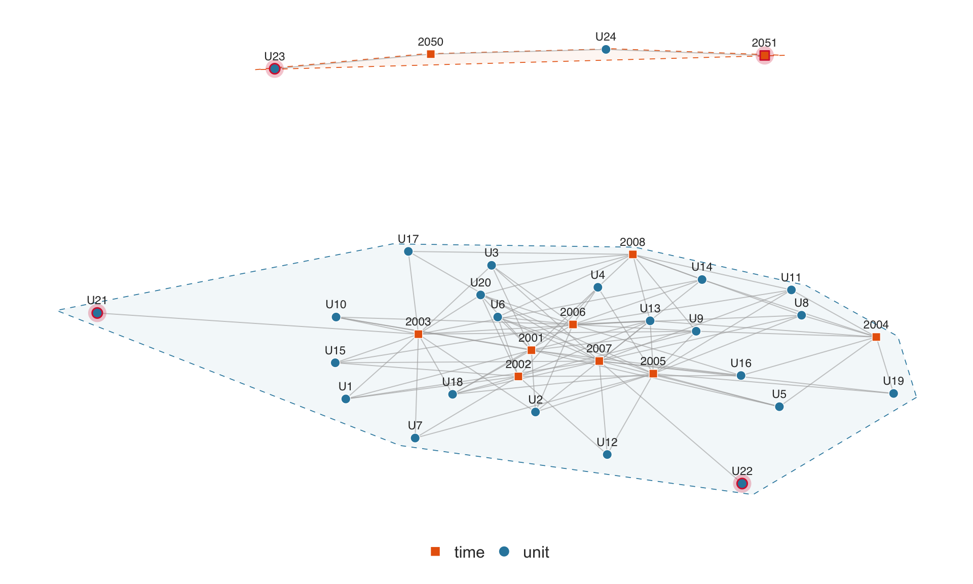
In many applied settings, panels are unbalanced: some units are observed in only a subset of periods. Units or periods with only one connection (degree 1) are called singletons. Correia (2016) shows that singletons can be iteratively removed without affecting the estimation of multi-way fixed effects.
We construct a simple example where some units appear in only one period:
set.seed(42)

## start with a 20-unit, 8-period balanced panel
sim_unbalanced <- expand.grid(unit = paste0("U", 1:20), time = 2001:2008,
                              stringsAsFactors = FALSE)

## randomly drop 40% of observations to create an unbalanced panel
sim_unbalanced <- sim_unbalanced[sample(nrow(sim_unbalanced),
                                        round(nrow(sim_unbalanced) * 0.6)), ]

## add two units that each appear in only one period (singletons)
sim_unbalanced <- rbind(sim_unbalanced,
                        data.frame(unit = "U21", time = 2003))
sim_unbalanced <- rbind(sim_unbalanced,
                        data.frame(unit = "U22", time = 2007))

## add two units in a separate time range (disconnected component)
sim_unbalanced <- rbind(sim_unbalanced,
                        data.frame(unit = "U23", time = 2050),
                        data.frame(unit = "U24", time = 2050),
                        data.frame(unit = "U24", time = 2051))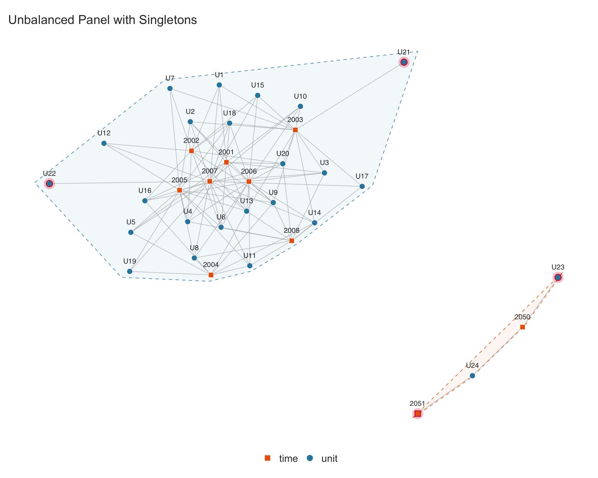
Singletons are highlighted with a crimson glow. The function returns graph diagnostics invisibly. The $singletons element is a data frame listing each singleton along with the fixed-effect dimension it belongs to:
p.network$singletonsThe $n_components element reports the number of connected components — groups of units and time periods that share no observations with each other:
## two components: the main group and the {U23, U24, 2050, 2051} cluster
p.network$n_components
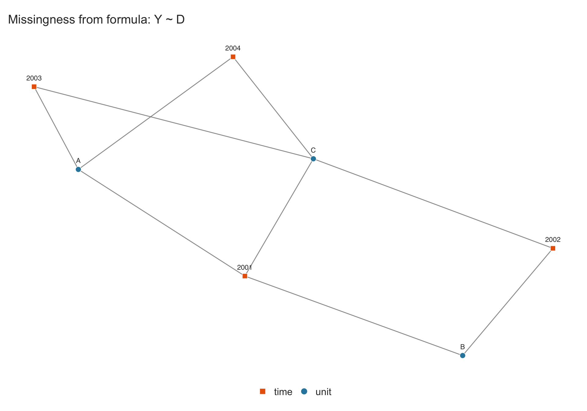
#> [1] 24.2.3 Missingness in Data
When a formula such as Y ~ D + X is supplied with type = "network", observations with missing values in any of the specified variables are dropped before the graph is constructed. This way the graph reflects only the observations usable for estimation.
sim_missing <- data.frame(
  unit = rep(c("A", "B", "C"), each = 4),
  time = rep(2001:2004, 3),
  Y    = c(1, NA, 3, 4,   5, 6, NA, 8,   9, 10, 11, 12),
  D    = c(0, 0, 1, 1,    0, 0, 0, NA,   1, 1, 1, 1)
)

## ~1 keeps all 12 observations (missingness in Y/D is ignored)
p.all <- panelview(sim_missing, ~ 1,
                   index = c("unit", "time"), type = "network")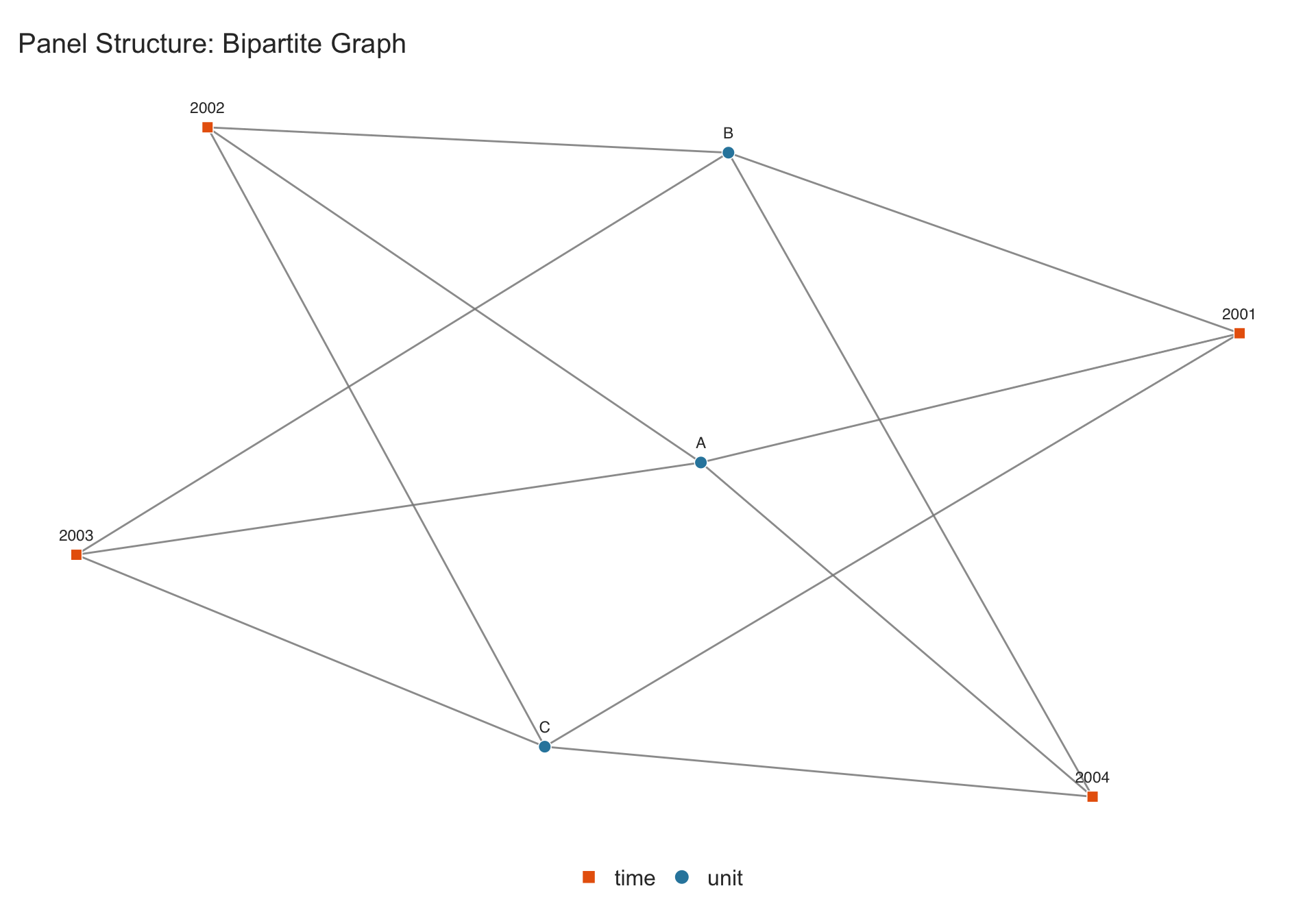
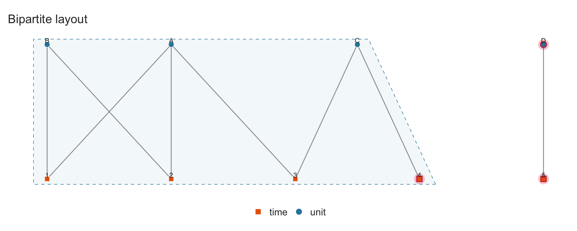
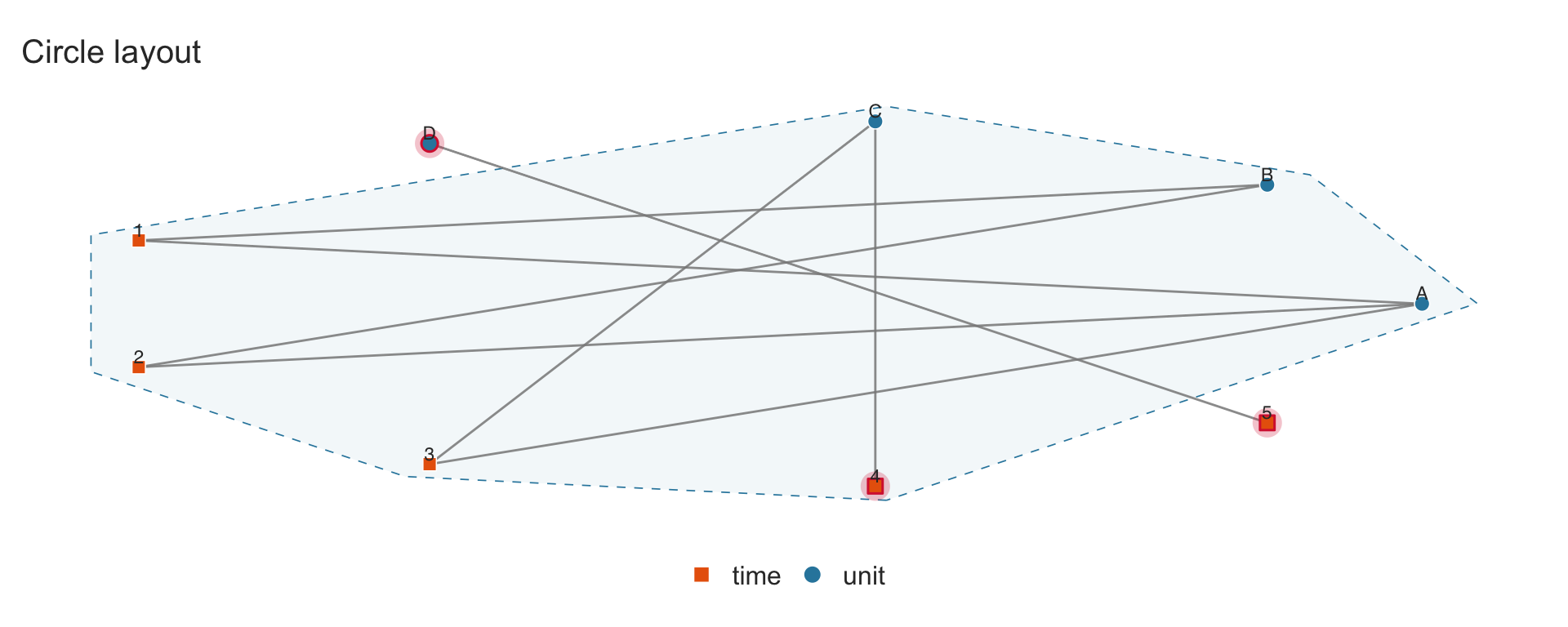
4.3 Layout options
Three layout algorithms are available via the layout parameter:
-
"fr"(default): Fruchterman–Reingold force-directed layout. Good for revealing cluster structure. -
"bipartite": Two-row layout with each fixed-effect dimension on a separate horizontal line. Best for small panels. -
"circle": Nodes arranged on a circle.
sim_small <- data.frame(
  unit = c("A","A","A","B","B","C","C","D"),
  time = c(1, 2, 3, 1, 2, 3, 4, 5)
)

panelview(sim_small, ~ 1, index = c("unit", "time"), type = "network",
          layout = "fr", show.labels = "all", main = "FR layout")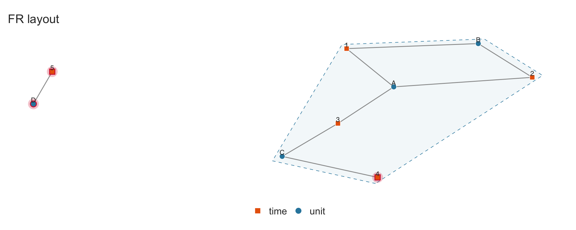
4.4 Multi-way fixed effects
Many empirical settings involve more than two sets of fixed effects (\(k \geq 3\)). For example, matched employer–employee data has worker, firm, and year fixed effects simultaneously. The index parameter accepts 3 or more column names for the network type.
Each fixed-effect dimension is rendered with a distinct shape and color:
| Dimension | Shape | Default color |
|---|---|---|
| 1st | Circle | Steel blue |
| 2nd | Square | Burnt orange |
| 3rd | Triangle | Sage green |
| 4th | Diamond | Purple |
| 5th | Inv. triangle | Amber |
4.4.1 Three-way example: worker \(\times\) firm \(\times\) year
sim_workers <- data.frame(
  worker = c("Alice", "Alice", "Bob", "Bob", "Carol", "Carol", "Dave"),
  firm   = c("Google", "Meta", "Google", "Apple",
             "Meta", "Apple", "Netflix"),
  year   = c(2020, 2021, 2020, 2021, 2020, 2021, 2022)
)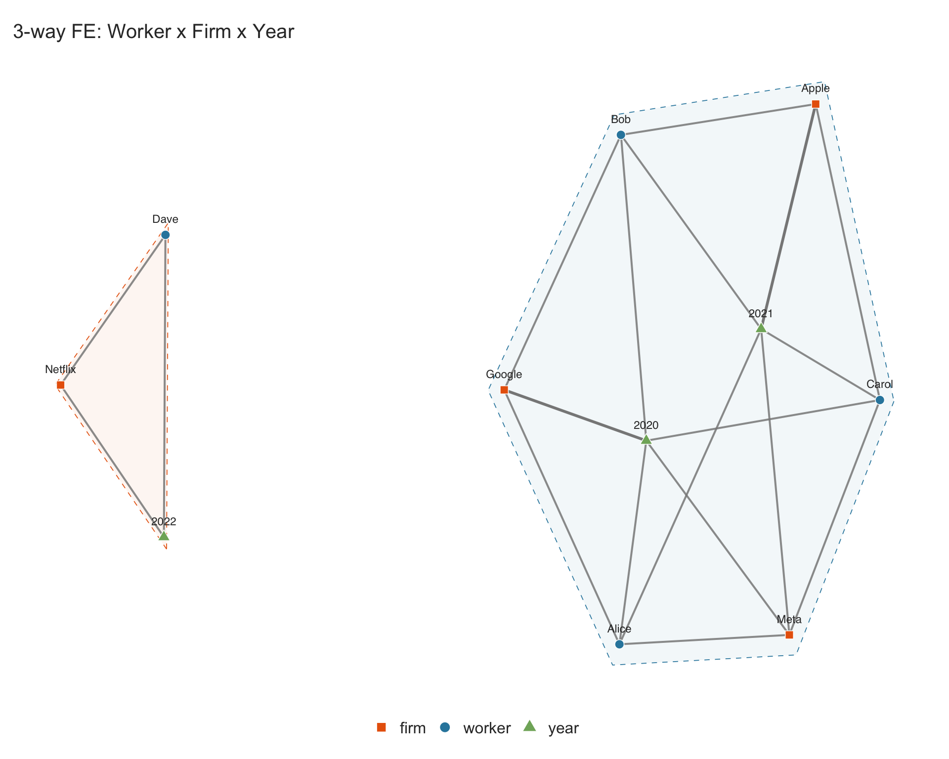
Dave works only at Netflix and only in 2022, forming a separate connected component from the main group. The $n_components element confirms the number of connected components in the graph:
## main group (Alice, Bob, Carol with Google, Meta, Apple in 2020-2021)
## and the isolated {Dave, Netflix, 2022} cluster
p.workers$n_components
#> [1] 2
4.4.2 Four-way example: student \(\times\) teacher \(\times\) school \(\times\) year
sim_schools <- data.frame(
  student = c("S1","S1","S2","S2","S3","S3","S4","S5"),
  teacher = c("T1","T2","T1","T3","T2","T3","T4","T5"),
  school  = c("A","A","A","A","B","B","C","D"),
  year    = c(2020,2021,2020,2021,2020,2021,2022,2022)
)

panelview(sim_schools, ~ 1,
          index = c("student", "teacher", "school", "year"),
          type = "network", show.labels = "all",
          main = "4-way FE: Student x Teacher x School x Year")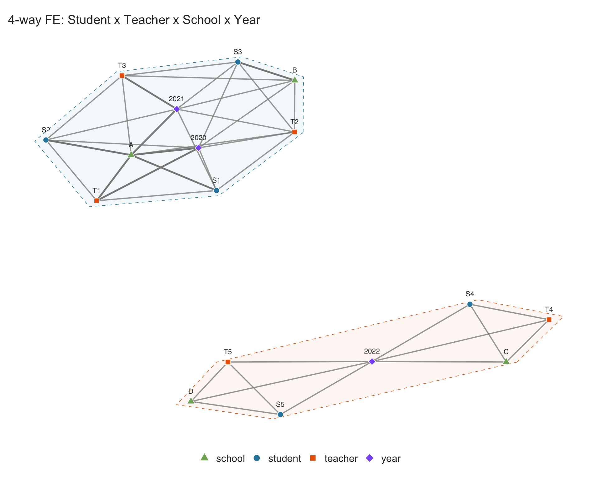
4.5 Weighted edges
Theories for standard panel data methods often assume each combination of fixed-effect indices (e.g., unit and time) uniquely identifies an observation. However, in many empirical settings this assumption does not hold. For example, in matched employer–employee data, a worker may appear at the same firm in multiple records within the same year. It is important for researchers to diagnose these cases before estimation.
The network plot aggregates duplicate edges and renders them with proportionally thicker lines. To illustrate, we take the turnout dataset and deliberately duplicate some state-year observations:
## take a subset of turnout and create duplicates
sim_turnout_dup <- turnout[turnout$year <= 1940, c("abb", "year")]

## duplicate some state-year pairs: MN appears 3x in 1920, WI 2x in 1924
sim_turnout_dup <- rbind(sim_turnout_dup,
  data.frame(abb = "MN", year = 1920),
  data.frame(abb = "MN", year = 1920),
  data.frame(abb = "WI", year = 1924)
)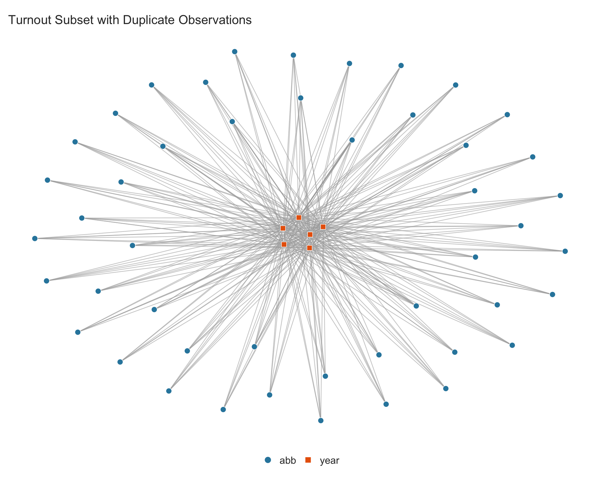
The thicker edges between MN–1920 and WI–1924 are clearly visible. The $multi_edges element is a data frame with one row per duplicated combination, with columns for each fixed-effect dimension and a count column:
p.dup$multi_edges4.6 Customization
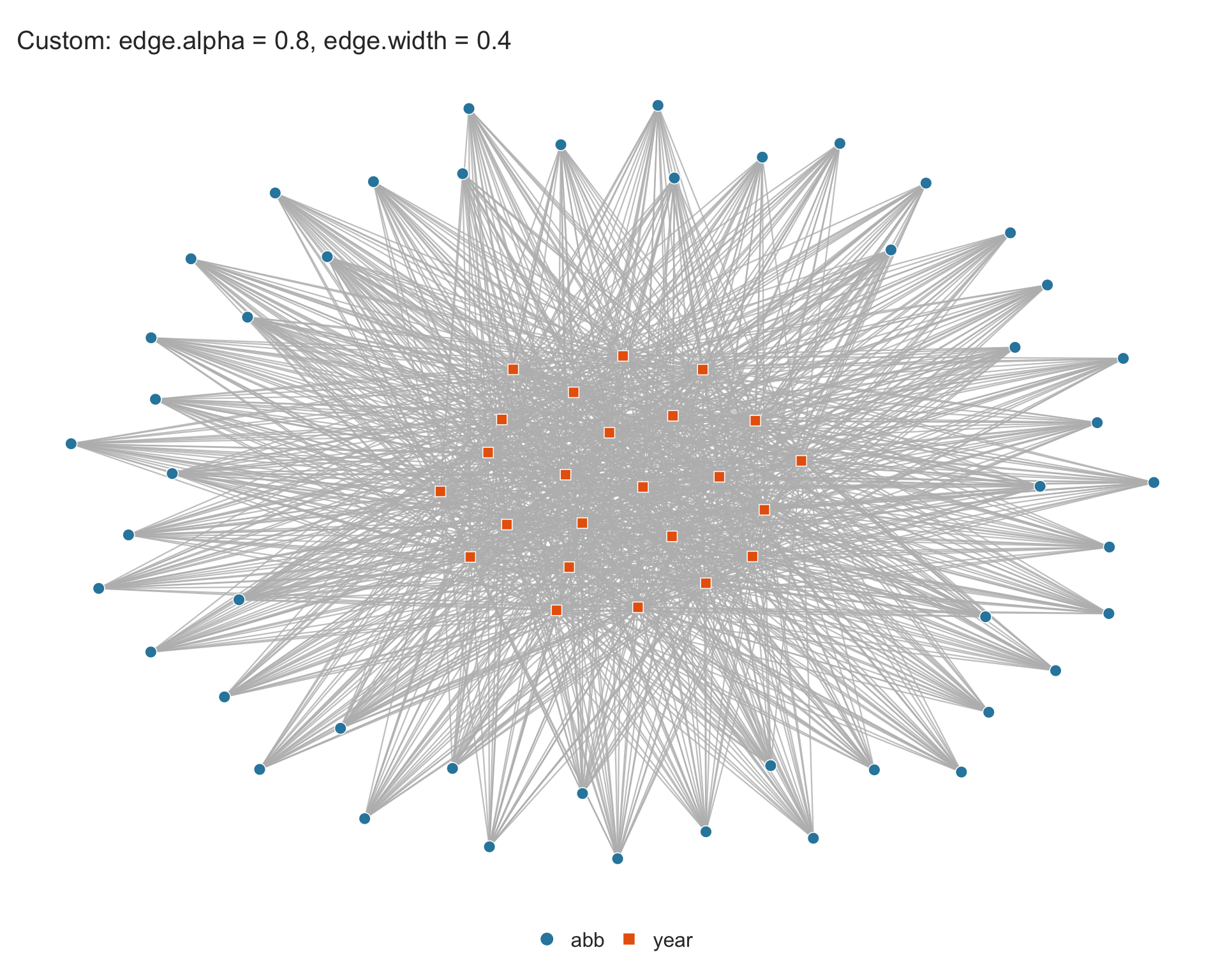
4.6.1 Edge visibility
For dense graphs, the default edge transparency may need adjustment. Use edge.alpha (0–1) and edge.width (in mm) to control edge appearance:
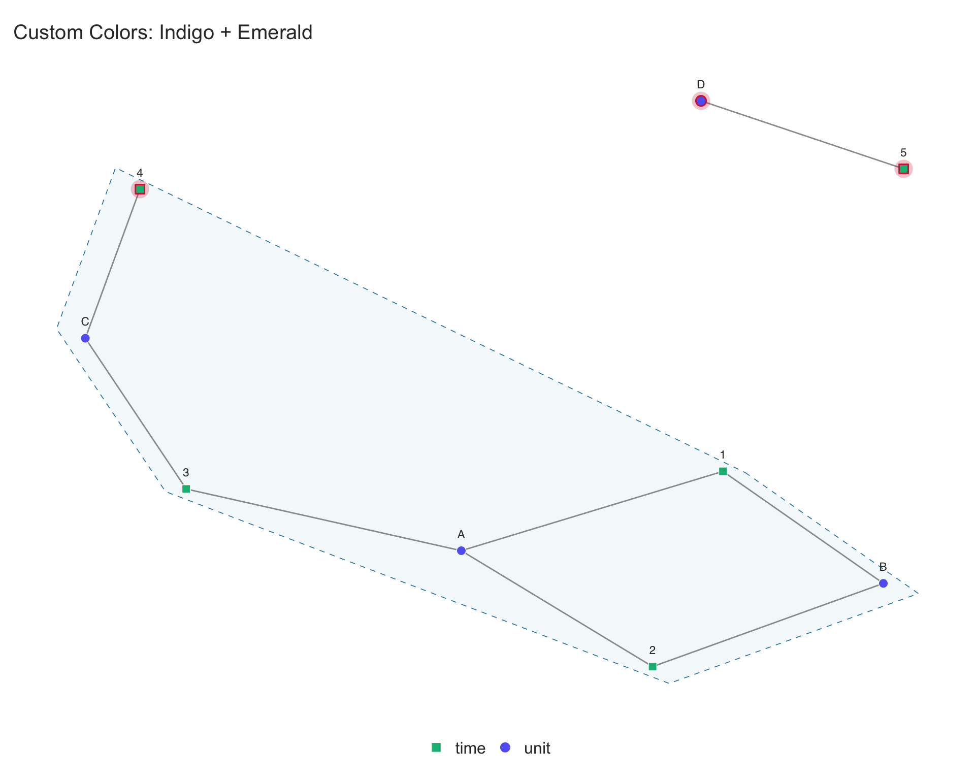
4.6.2 Custom colors
Supply a vector of colors (one per fixed-effect dimension) via the color parameter:
4.6.3 Singleton color
The color used to highlight singletons can be changed with singleton.color:
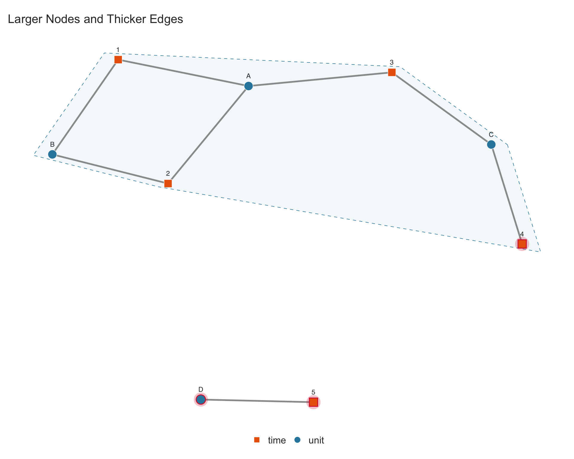
4.6.4 Node size and edge width
Use node.size to control node size and edge.width for edge thickness:
4.6.5 Other options
-
show.singletons = FALSE: do not highlight singletons. -
highlight.components = FALSE: do not draw convex hulls around connected components. -
show.labels = "singletons": label only singleton nodes (useful for large panels). -
legendOff = TRUE: hide the legend. -
main = "": suppress the title.
4.7 Accessing diagnostics
When type = "network", panelview() invisibly returns a list with the full graph structure. This allows programmatic inspection beyond what the plot shows.
4.7.1 Identifying singletons in the data
The $singletons element is a data frame with one column per fixed-effect dimension, plus a singleton_fe column indicating which dimension the singleton belongs to. Each row shows the singleton node and its connected FE levels:
p.network$singletonsThe singleton_fe column tells you which dimension is the singleton. To extract just the singleton units:
p.network$singletons[p.network$singletons$singleton_fe == "unit", ]4.7.2 Identifying duplicate observations
The $multi_edges data frame has one row per duplicated fixed-effect combination, with columns named after the fixed-effect dimensions and a count column:
p.dup$multi_edgesTo find the original rows in the data that correspond to duplicated combinations:
## rows where (abb, year) is a duplicated combination
dup_idx <- duplicated(sim_turnout_dup[, c("abb", "year")]) |
           duplicated(sim_turnout_dup[, c("abb", "year")], fromLast = TRUE)
sim_turnout_dup[dup_idx, ]
4.7.3 Full return value
| Element | Description |
|---|---|
graph |
An igraph object for further analysis |
singletons |
Data frame with one column per FE dimension + singleton_fe: rows are singleton nodes with their connected FE levels |
multi_edges |
Data frame with FE columns + count: duplicated combinations |
components |
Component membership vector |
n_components |
Number of connected components |
plot |
The ggplot2 object for further customization |
The igraph object can be used for additional graph analysis: