2 Outcome Trajectories
This chapter shows how to plot raw outcome variables as time series, colored by treatment status, using type = "outcome". The syntax is the same as for type = "treat" with type = "outcome" added.
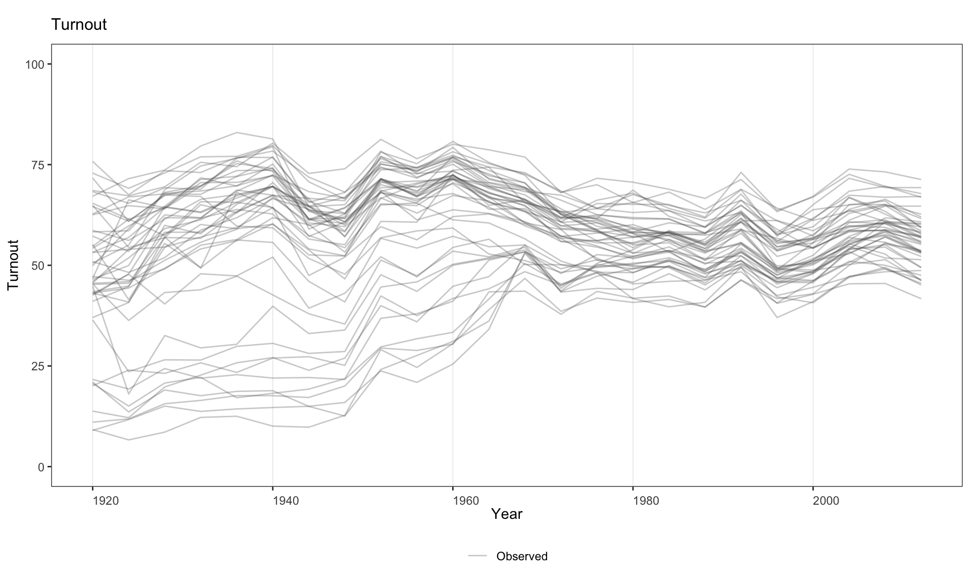
2.1 Basic outcome plot
Turn off pre/post coloring with pre.post = FALSE.
Customise the legend, or suppress it entirely with legendOff = TRUE.
Customise line colors and legend labels simultaneously.
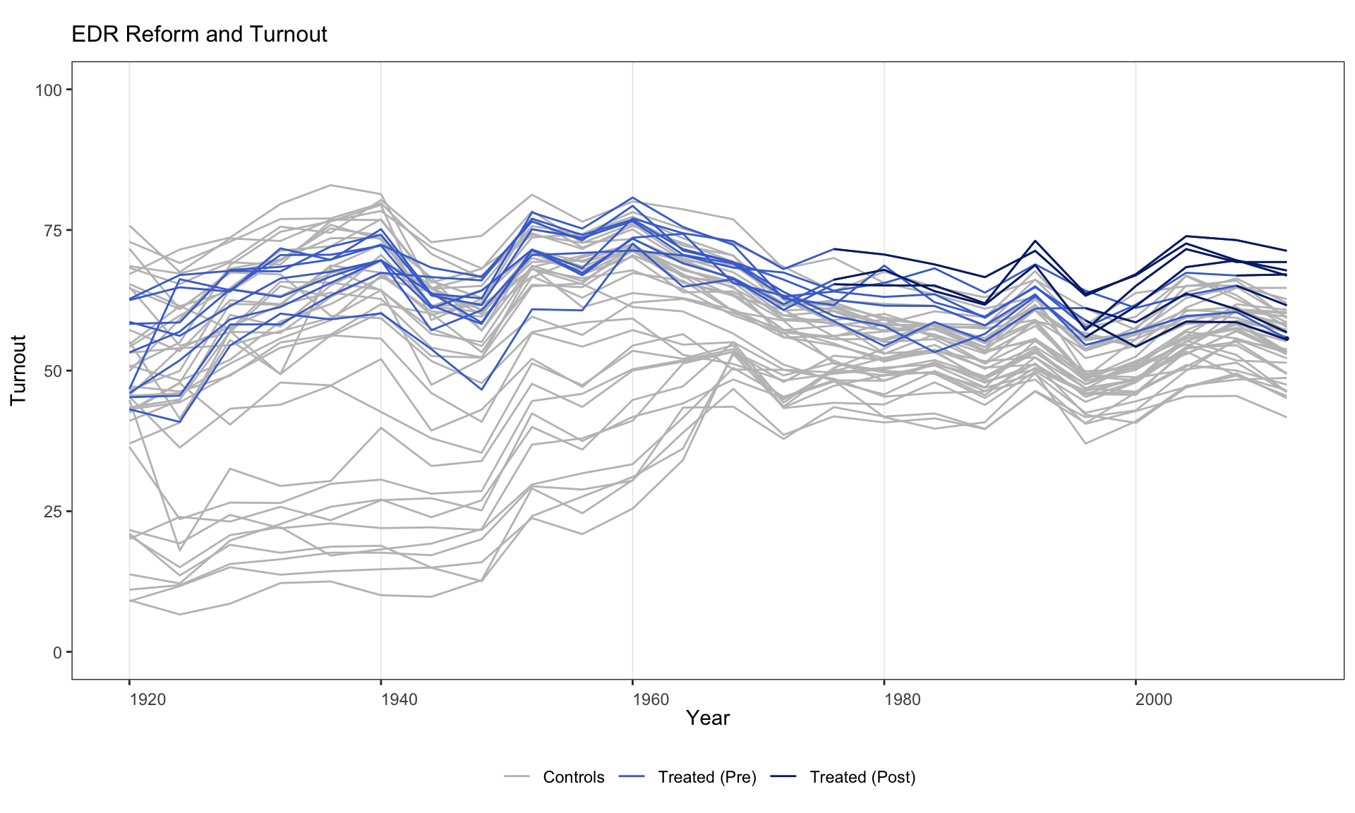
panelview(turnout ~ policy_edr + policy_mail_in + policy_motor,
          data = turnout, index = c("abb", "year"),
          type = "outcome", main = "EDR Reform and Turnout",
          color = c("lightblue", "blue", "grey75"),
          legend.labs = c("Control States",
                          "Treated States (before EDR)",
                          "Treated States (after EDR)"))
#> Specified colors in the order of "treated (pre)", "treated (post)", "control".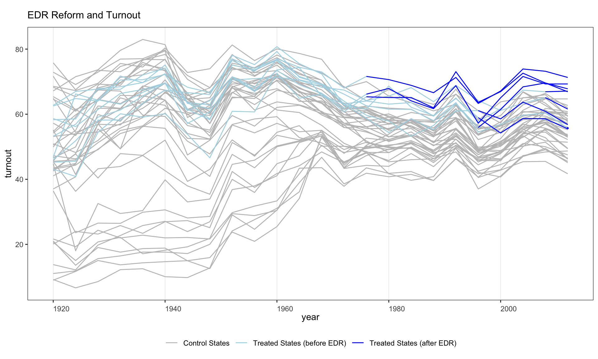
2.2 Themes and overlays
Activate the high-contrast red theme for a publication-paper look. Under theme = "red", controls fade to a light gray, treated trajectories pick up a brick-red accent, and the treatment-onset marker becomes a solid black dashed line.
panelview(turnout ~ policy_edr + policy_mail_in + policy_motor,
          data = turnout, index = c("abb", "year"), type = "outcome",
          main = "EDR Reform and Turnout", theme = "red")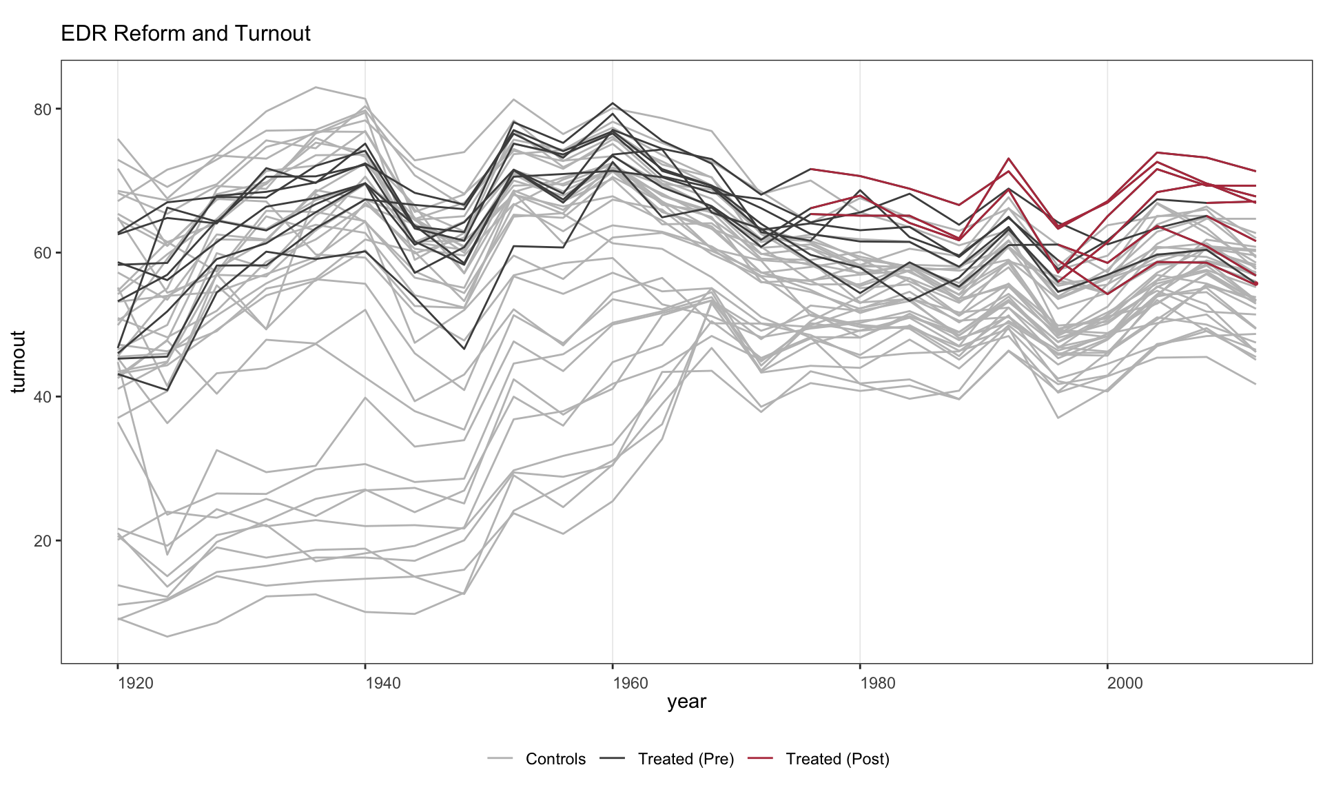
Overlay heavy group-mean trajectories and a 10–90% quantile ribbon with group.mean.overlay = TRUE. Useful when there are many units per group and you want the audience to see both individual variation and the group average at a glance. (Currently implemented for the main DID continuous- outcome path; combine with theme = "red" for the cleanest read.)
panelview(turnout ~ policy_edr + policy_mail_in + policy_motor,
          data = turnout, index = c("abb", "year"), type = "outcome",
          main = "EDR Reform and Turnout",
          theme = "red", group.mean.overlay = TRUE)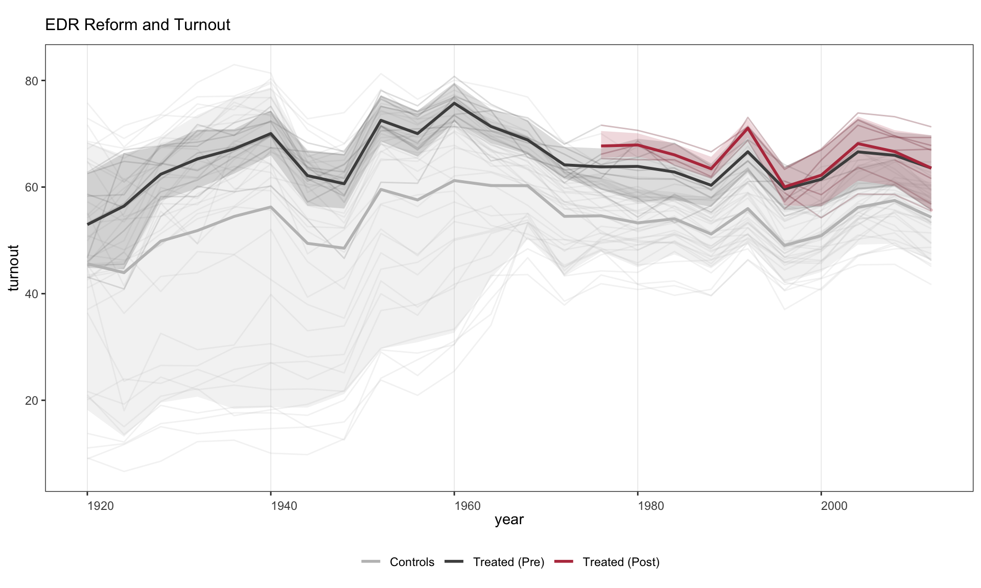
2.3 Plotting a subset of units
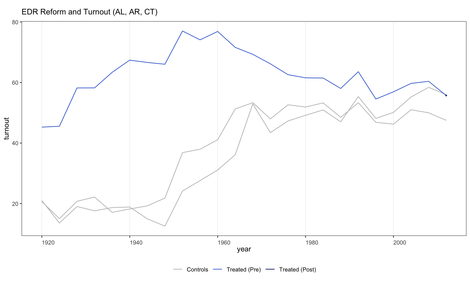
Use id to plot only specific units.
2.4 Splitting by treatment-status group
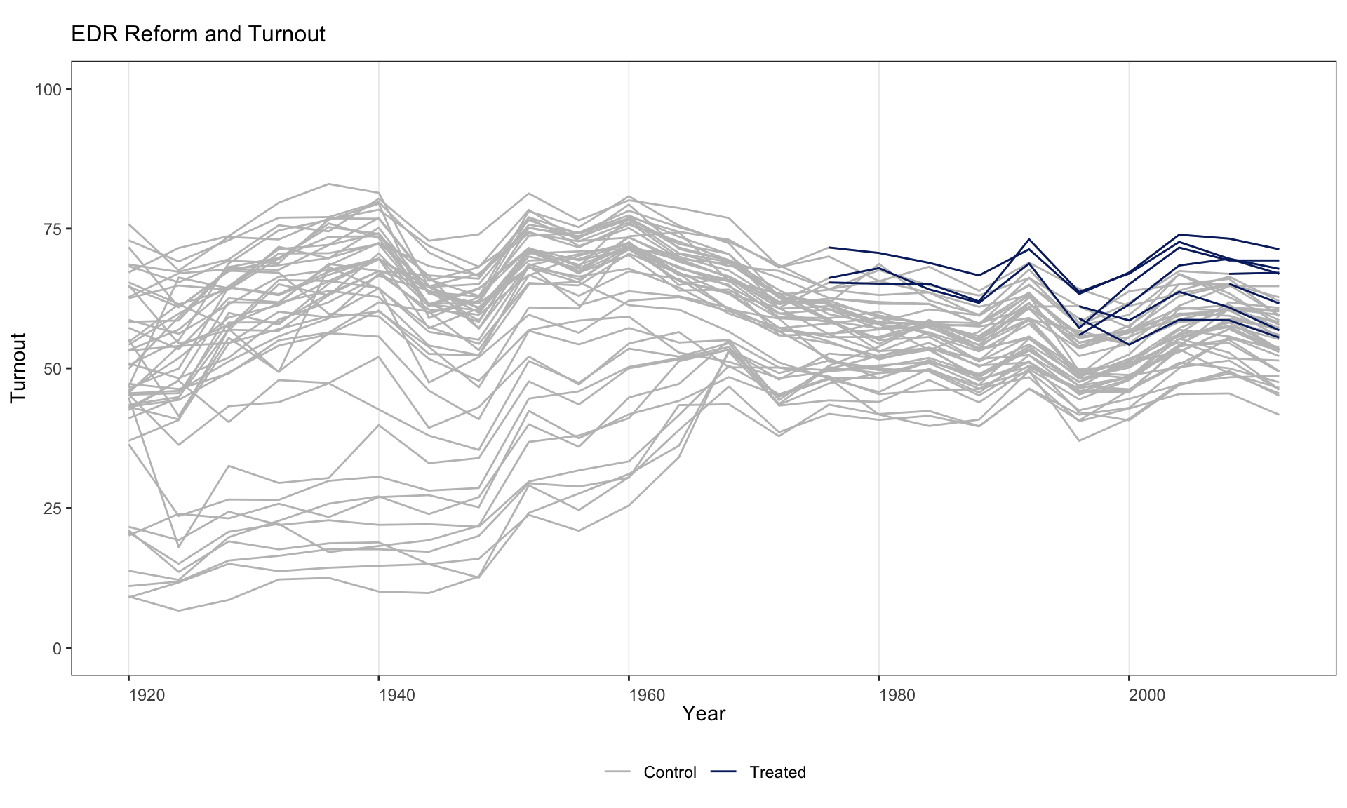
by.group = TRUE separates units into groups based on whether their treatment status ever changed (e.g., always treated, always control, switchers).
panelview(turnout ~ policy_edr + policy_mail_in + policy_motor,
          data = turnout, index = c("abb", "year"),
          type = "outcome", main = "EDR Reform and Turnout",
          by.group = TRUE)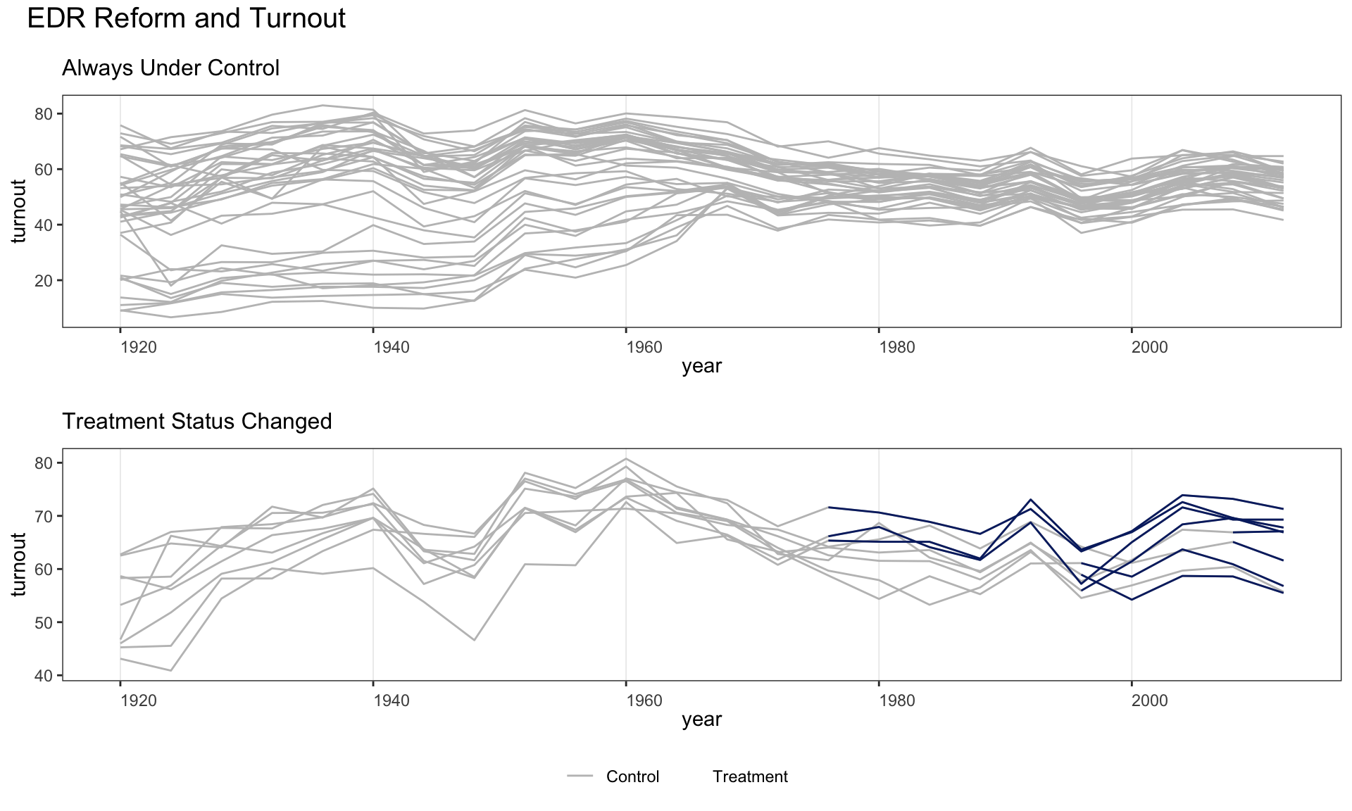
Use by.group.side = TRUE to arrange the subfigures in a row rather than a column.
panelview(turnout ~ policy_edr + policy_mail_in + policy_motor,
          data = turnout, index = c("abb", "year"),
          type = "outcome", main = "EDR Reform and Turnout",
          by.group.side = TRUE)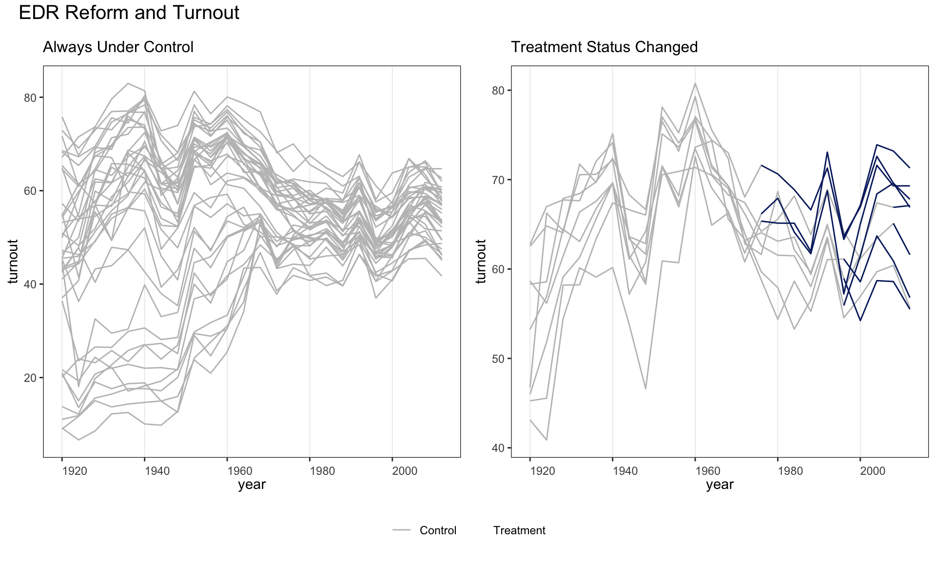
2.5 Cohort-averaged trajectories
by.cohort = TRUE collapses units with identical treatment histories into cohort-average trajectories. This helps diagnose treatment-effect heterogeneity that may bias TWFE estimates.
panelview(turnout ~ policy_edr + policy_mail_in + policy_motor,
          data = turnout, index = c("abb", "year"),
          type = "outcome", main = "EDR Reform and Turnout",
          by.cohort = TRUE)
#> Number of unique treatment histories: 5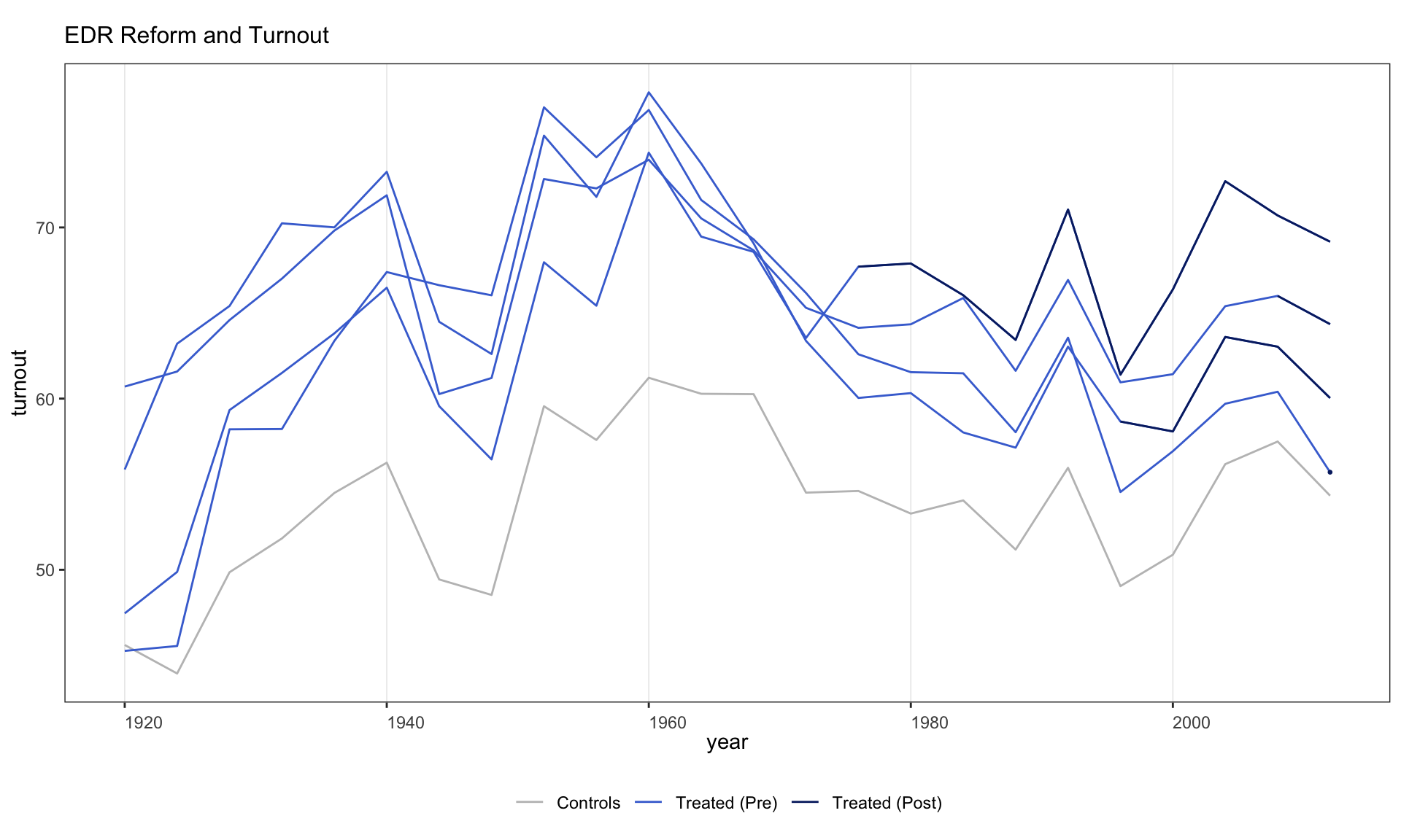
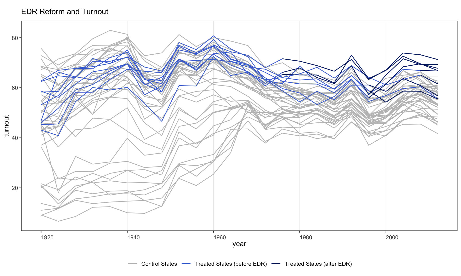
A more detailed cohort plot with custom legend labels and y-axis limits.
panelview(turnout ~ policy_edr + policy_motor,
          data = turnout, index = c("abb", "year"), type = "outcome",
          main = "EDR Reform and Turnout", by.cohort = TRUE,
          ylim = c(40, 80),
          legend.labs = c("Control States",
                          "Treated States (before EDR)",
                          "Treated States (after EDR)"))
#> Number of unique treatment histories: 5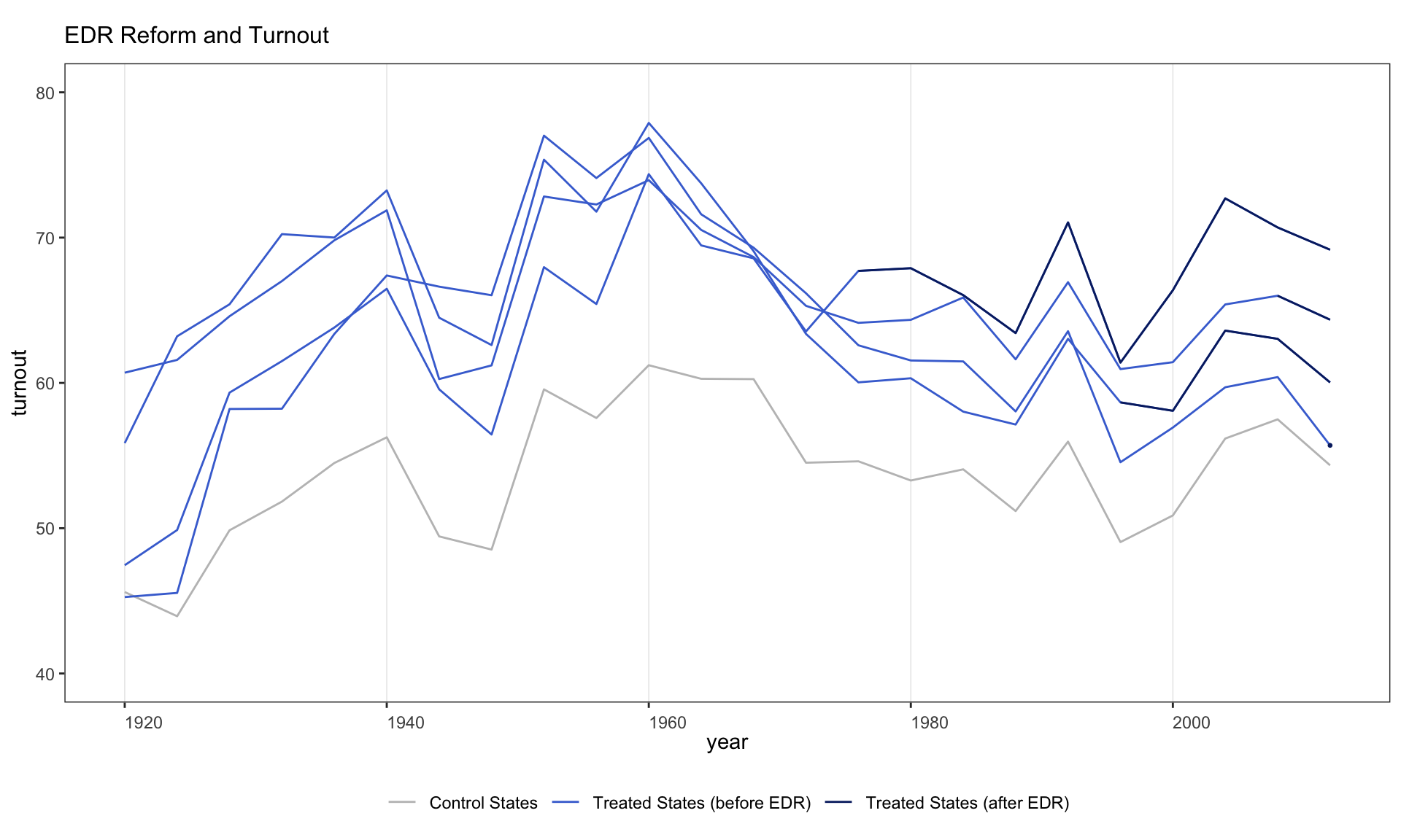
2.6 Ignoring treatment status
Since v1.0.3, omitting the treatment indicator (using Y ~ 1) lets panelView visualize any variable in a panel dataset without reference to treatment.
Equivalently, supply the variable name via Y =.
2.7 Treatment reversal and missing data
How panelView handles two common discontinuities in the outcome trajectory:
- Treatment reversal (unit goes on then off, or off then on). The treated overlay is drawn only at periods the unit is treated, so each treated spell is a separate line segment.
-
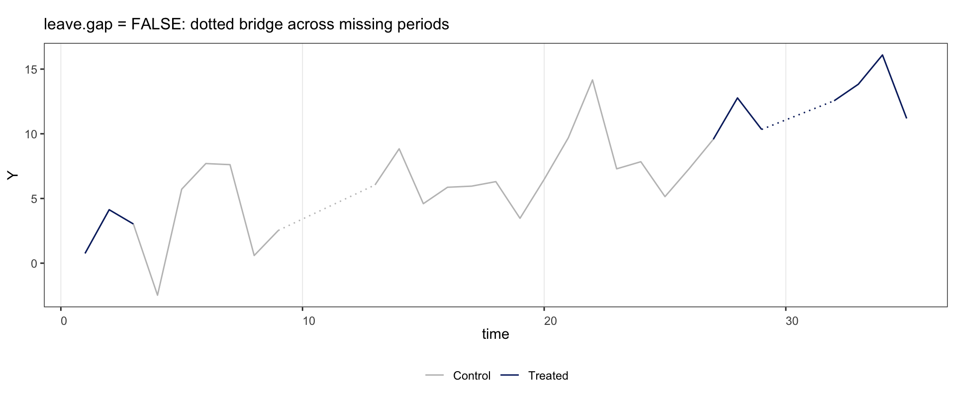
Missing outcome. Under the default
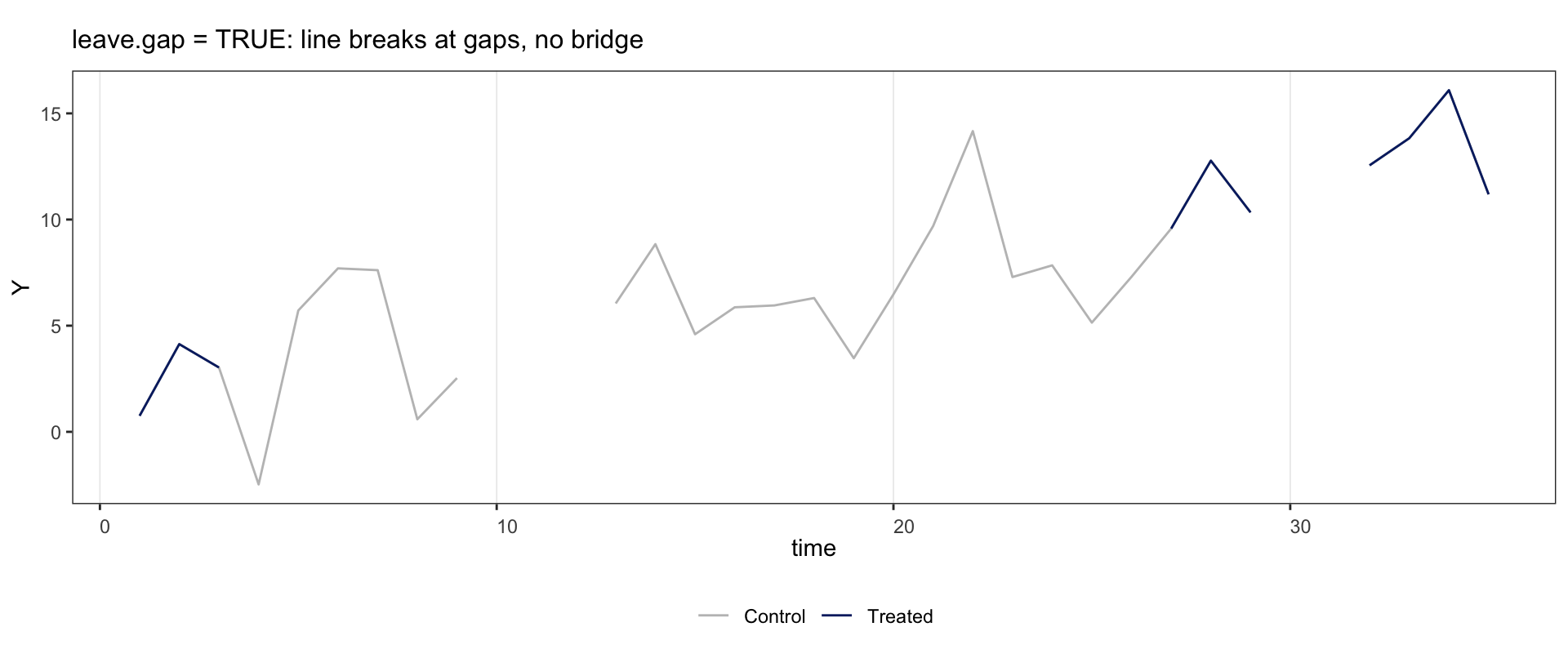
leave.gap = FALSE, rows with missingYare dropped and the bracketing observed points are joined by a dotted segment so the gap is visible. Underleave.gap = TRUEthe panel is expanded and the line breaks cleanly at every NA cell.
Topology classification (reversal vs. staggered) follows the observed data: if a unit’s leading treated rows are missing and the surviving D pattern is monotonic, the unit is plotted in the staggered palette.
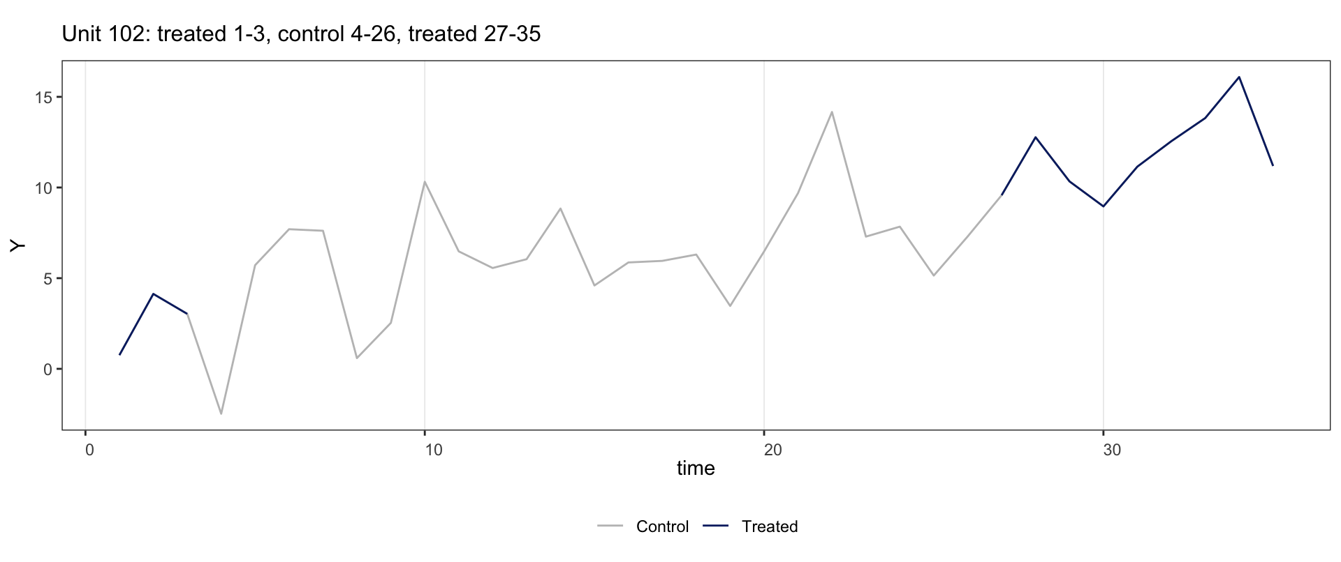
Examples below use fect::sim_base. Unit 102 is treated at \(t=1\!-\!3\), control at \(t=4\!-\!26\), then treated at \(t=27\!-\!35\).
2.7.1 Reversal alone
if (requireNamespace("fect", quietly = TRUE)) {
  data("sim_base", package = "fect")
  panelview(Y ~ D, data = subset(sim_base, id == 102),
            index = c("id", "time"), type = "outcome",
            main = "Unit 102: treated 1-3, control 4-26, treated 27-35")
}
2.7.2 Interior gap: dotted bridge under leave.gap = FALSE
Set \(Y\) to NA at \(t=10\!-\!12\) and \(t=30\!-\!31\). The control line shows a dotted bridge between \(t=9\) and \(t=13\); the treated line shows one between \(t=29\) and \(t=32\).
2.7.3 Interior gap: clean break under leave.gap = TRUE
Same data, but leave.gap = TRUE keeps the NA rows, so the line breaks at every gap with no bridge.
2.7.4 Missing at the boundary
Drop unit 102’s \(Y\) at \(t=1\!-\!3\) (the start of its series) and pass leave.gap = TRUE so the row is retained, the x-axis stays at \(t=1\!-\!35\), and the topology classifier still sees the early treated \(D\) values. The line is empty at \(t=1\!-\!3\); everything else is unchanged.
if (requireNamespace("fect", quietly = TRUE)) {
  d <- subset(sim_base, id == 102)
  d$Y[d$time %in% 1:3] <- NA
  panelview(Y ~ D, data = d, index = c("id", "time"),
            type = "outcome", leave.gap = TRUE,
            main = "Drop Y at t=1-3 (leave.gap = TRUE keeps x-axis and classification)")
}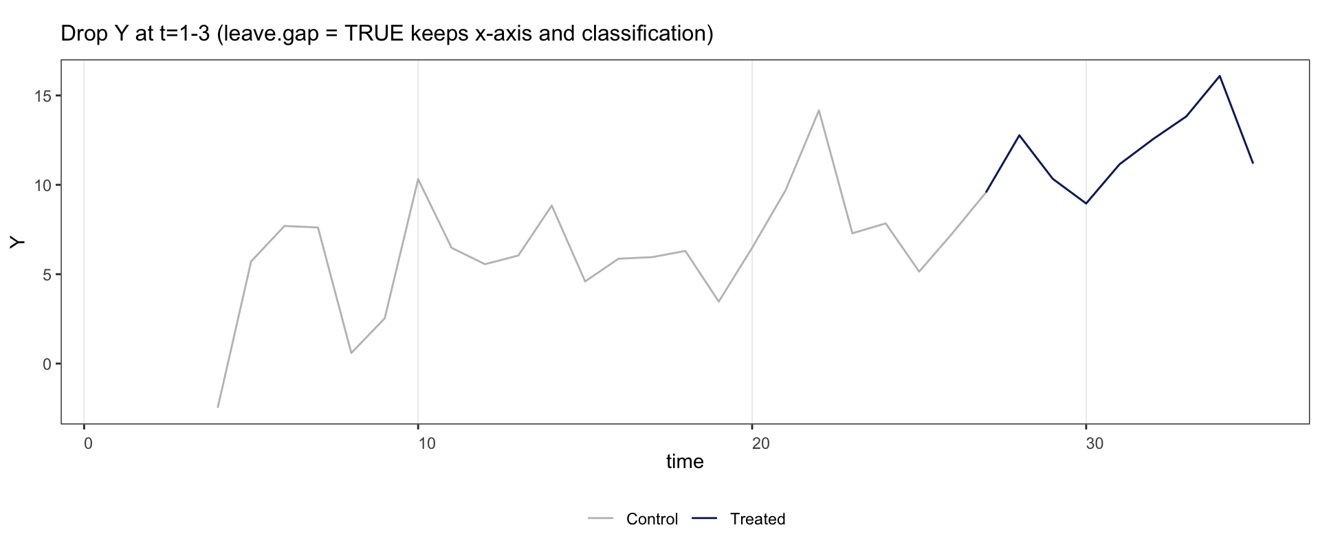
Under the default leave.gap = FALSE, the same NA injection drops those rows entirely. The panel for this unit shrinks to \(t=4\!-\!35\), its surviving \(D\) pattern becomes monotonic, and the classifier re-types it as staggered. Use leave.gap = TRUE whenever you need the boundary intact.
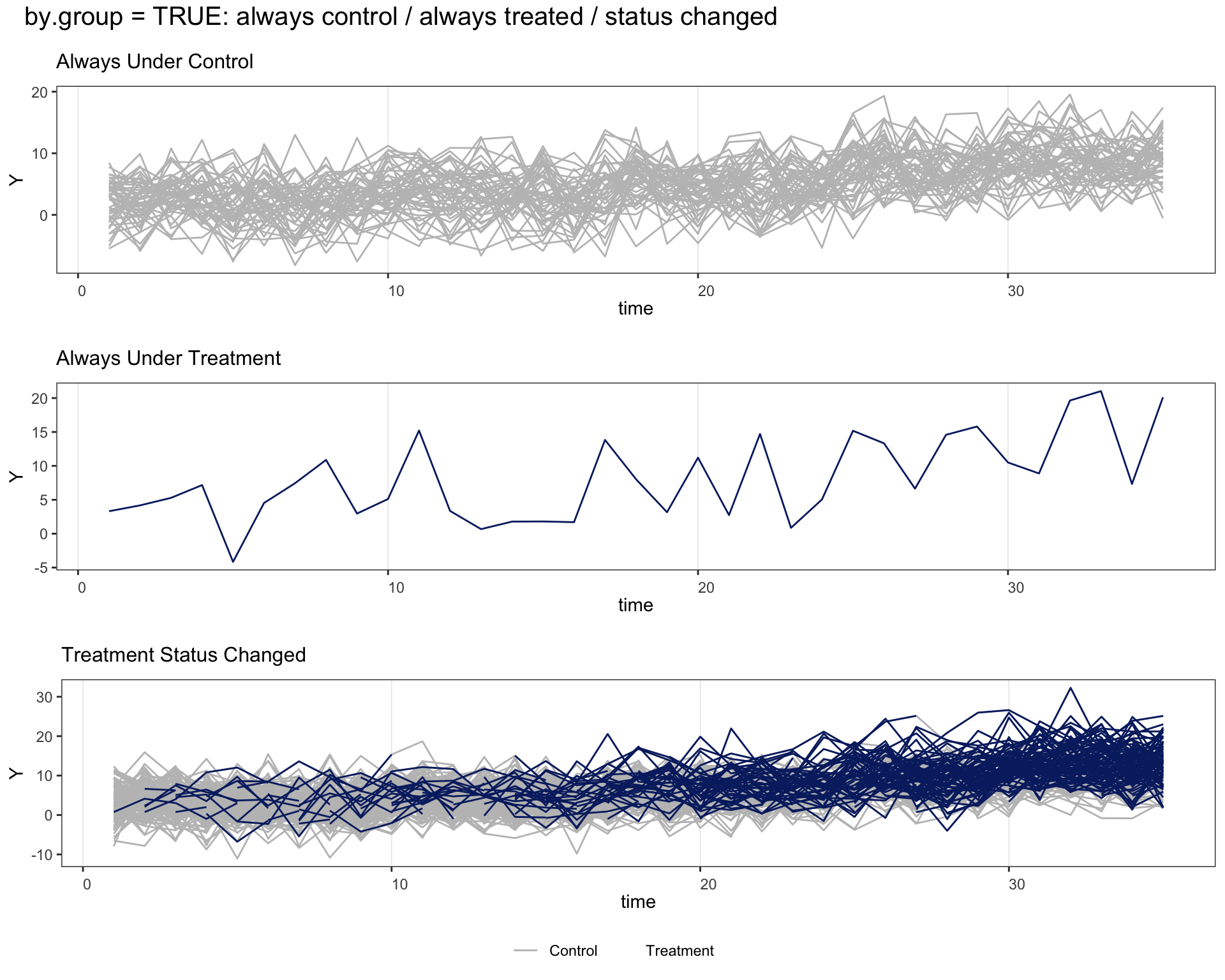
2.7.5 by.group = TRUE with all three subpanels
by.group = TRUE splits units by their treatment history: always under control, always under treatment, and treatment status changed. To exercise all three subpanels we promote one sim_base unit to always-treated.
if (requireNamespace("fect", quietly = TRUE)) {
  d <- sim_base
  d$D[d$id == 101] <- 1    ## promote unit 101 to always-treated
  panelview(Y ~ D, data = d, index = c("id", "time"),
            type = "outcome", by.group = TRUE,
            main = "by.group = TRUE: always control / always treated / status changed")
}
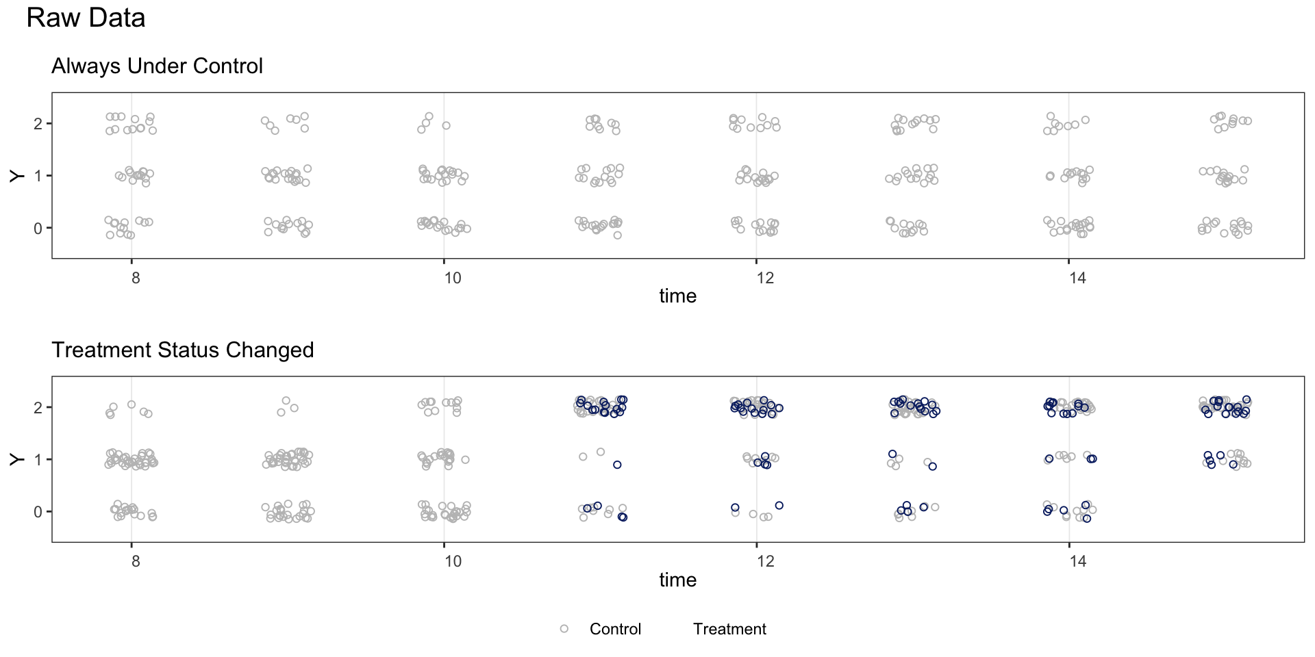
2.8 Discrete outcomes
Set outcome.type = "discrete" when the outcome takes a small number of integer values.
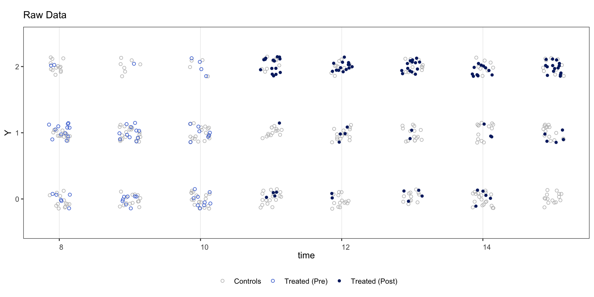
Split by treatment-status group.
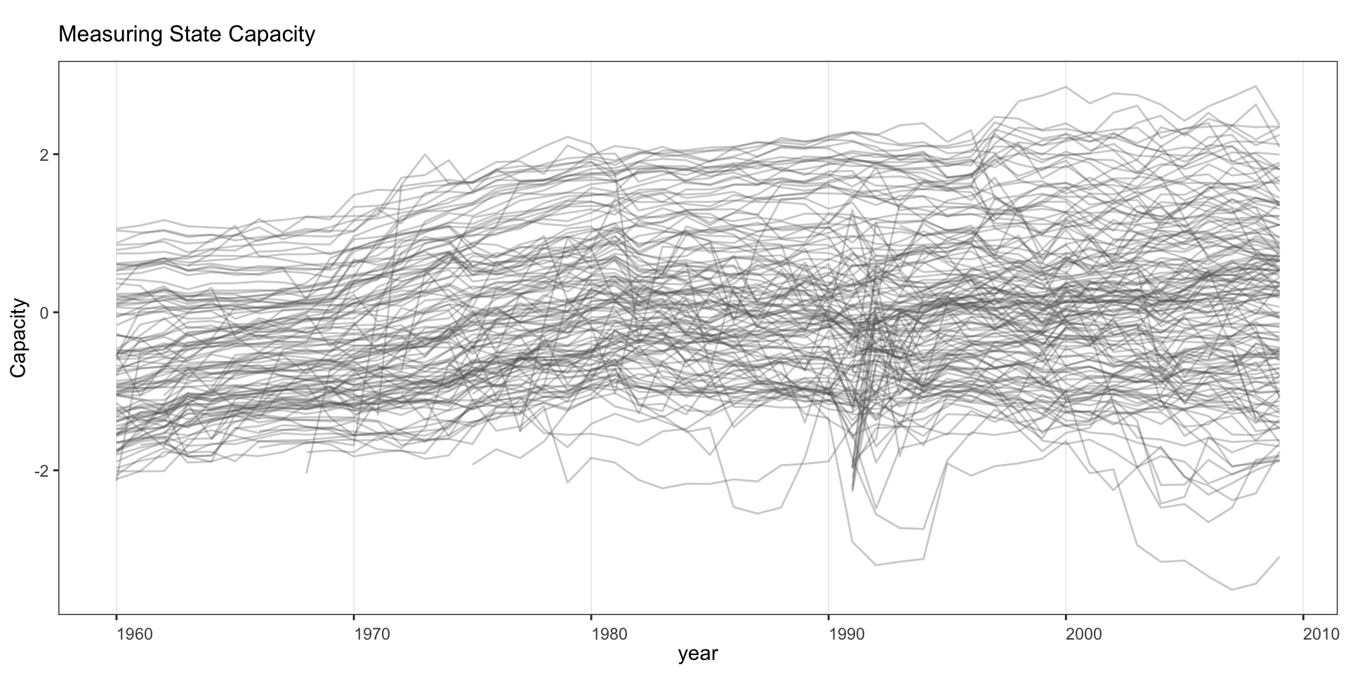
2.9 Multi-level or continuous treatment
When the treatment variable has more than 5 unique values (e.g., polity2), treatment status is not shown on the outcome plot.
panelview(Capacity ~ polity2 + lngdp,
          data = capacity, index = c("ccode", "year"),
          main = "Measuring State Capacity",
          type = "outcome", legendOff = TRUE)
#> 21 treatment levels.