1 Treatment Status
This chapter shows how to visualize the treatment conditions and missing values in a panel dataset using type = "treat" and type = "missing". The treatment indicator may be dichotomous, multi-level, or continuous.
We first load the package and its built-in datasets.
1.1 Binary treatment
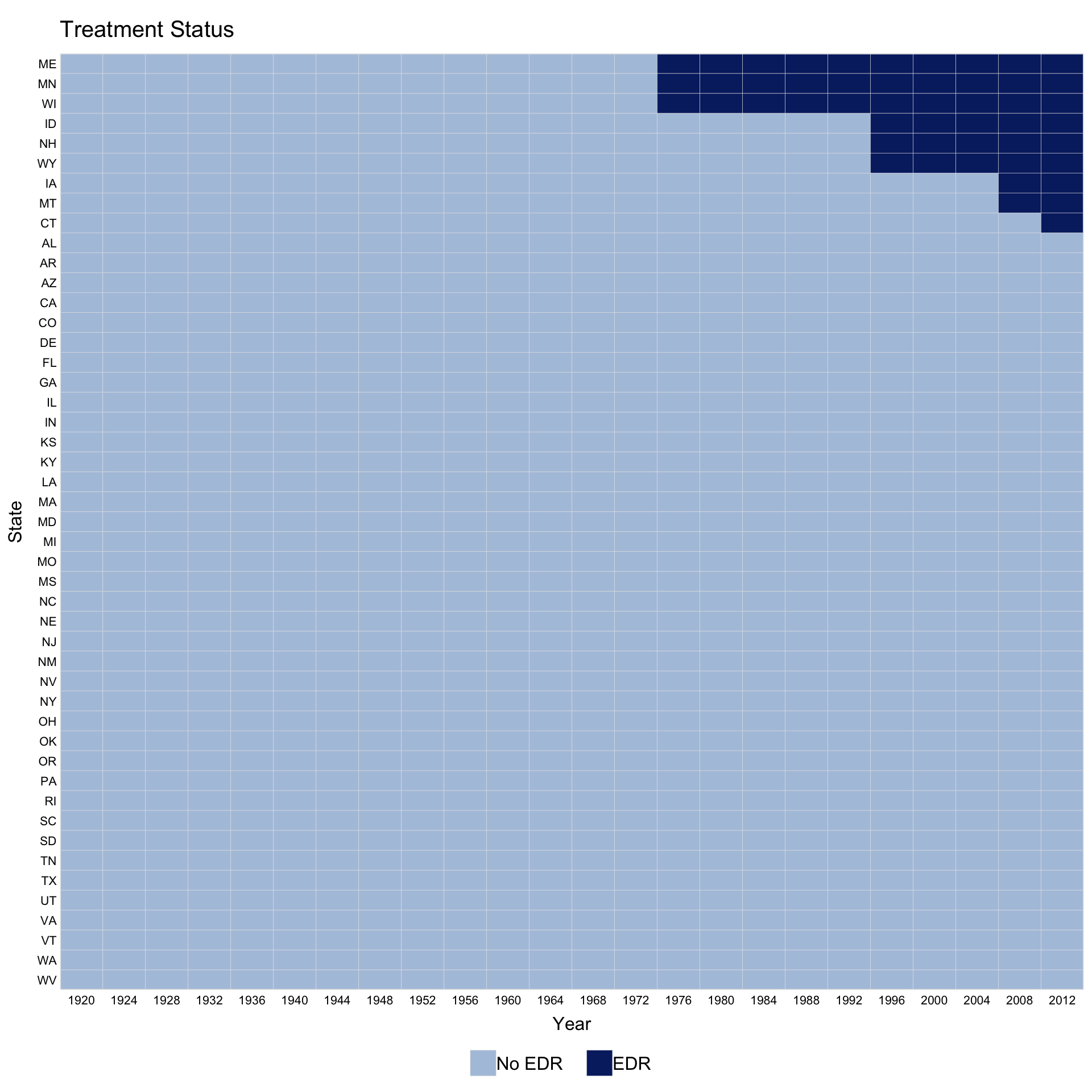
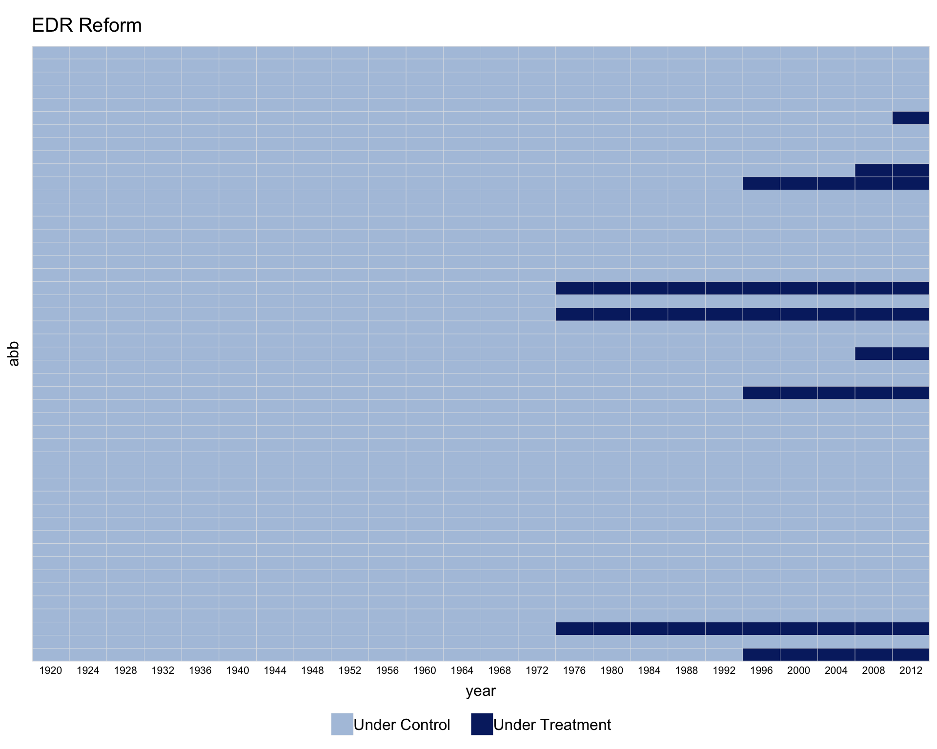
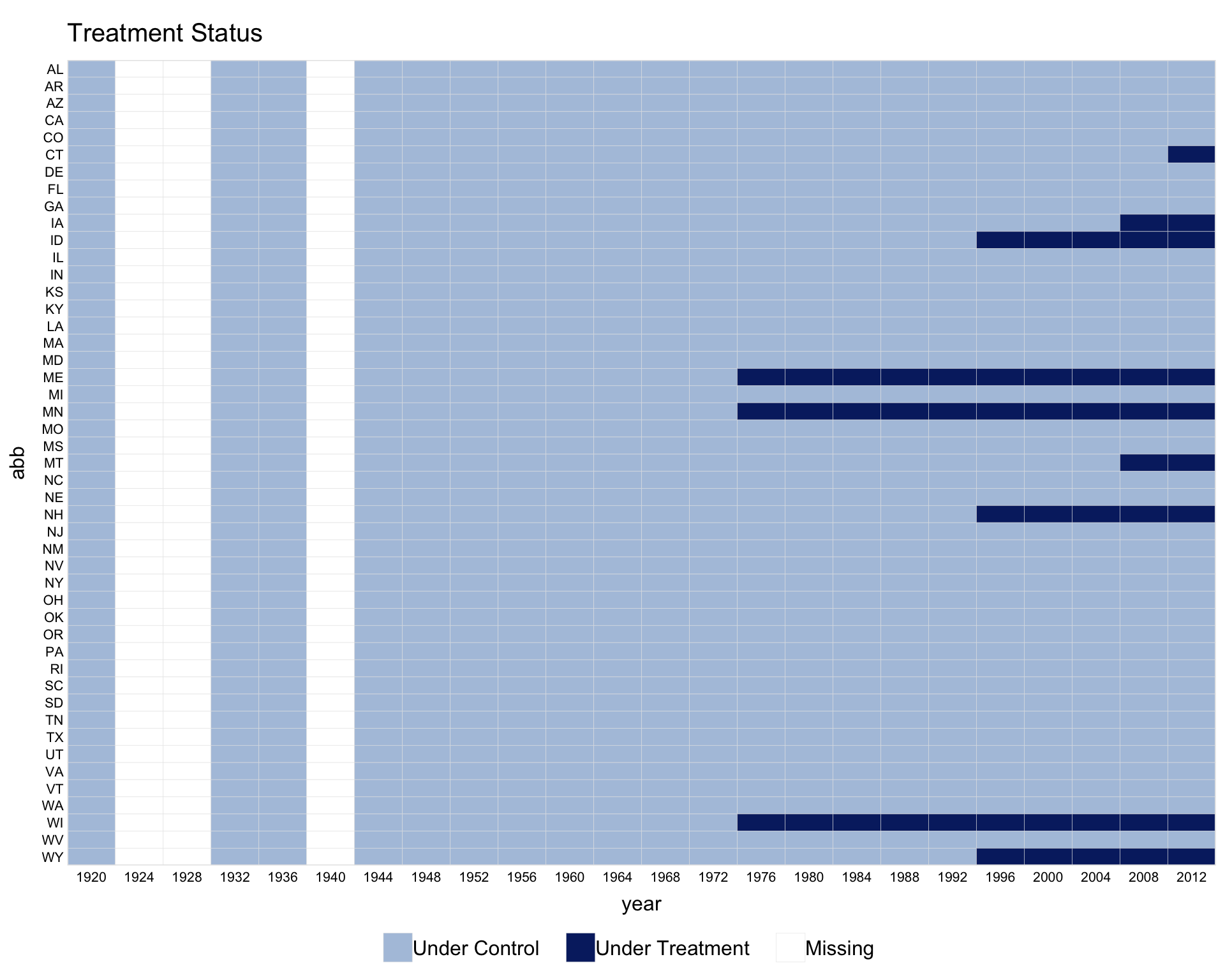
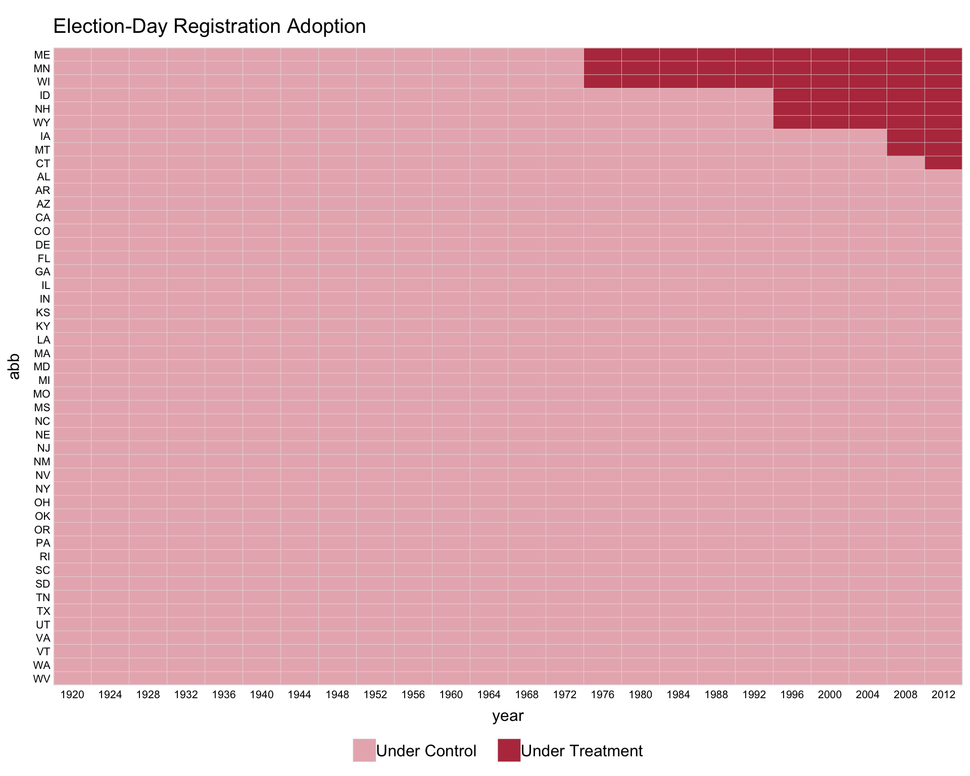
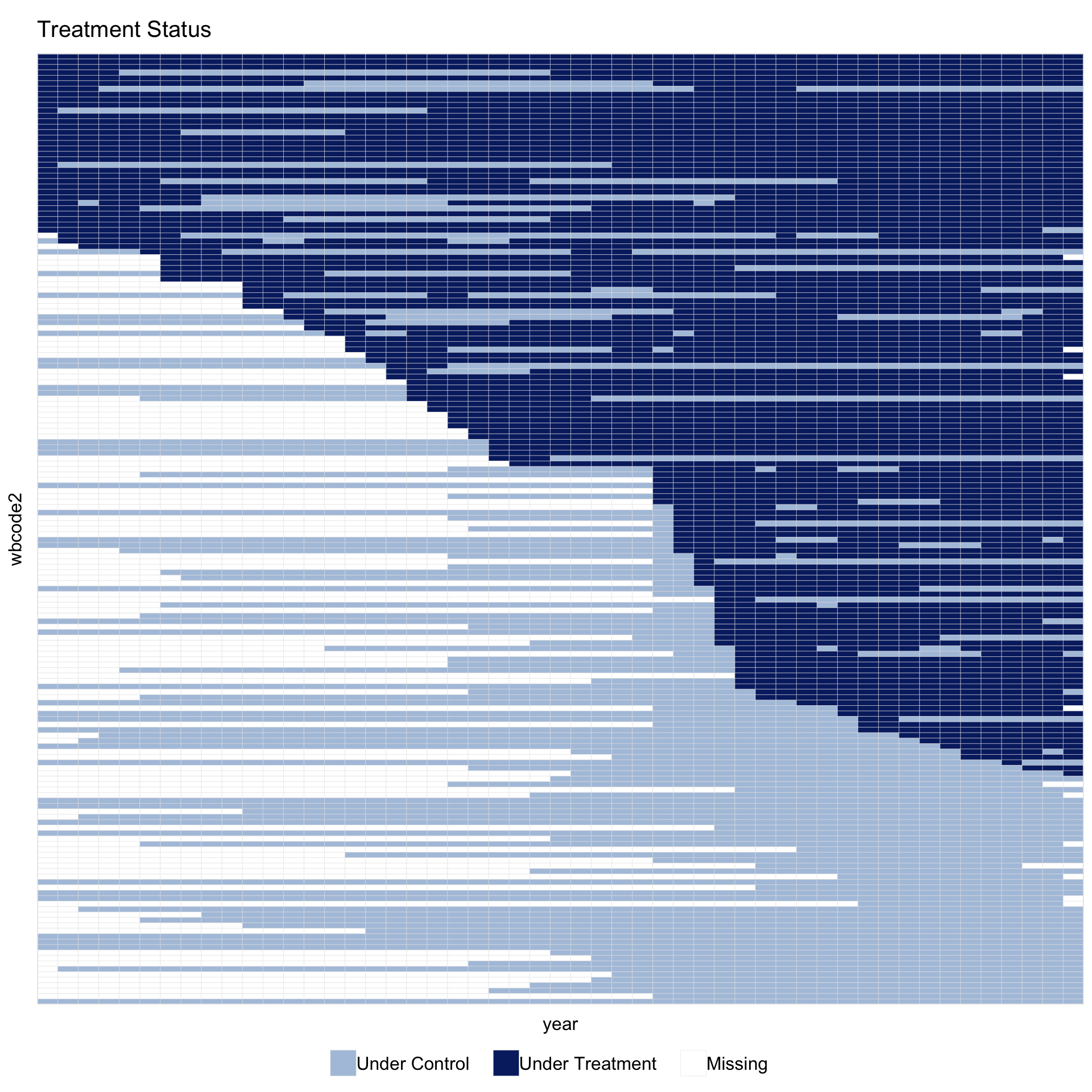
Using the turnout dataset (a balanced panel), we visualize the treatment status of Election Day Registration (EDR) across US states (Xu 2017). The first variable on the right-hand side of the formula is the treatment indicator. The index option specifies the unit and time variables.
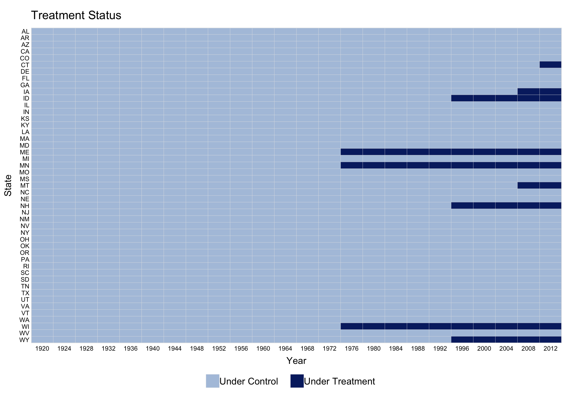
Use by.timing = TRUE to sort units by the timing of first treatment.
For staggered adoption, pre.post = TRUE distinguishes pre- and post-treatment periods for treated units.
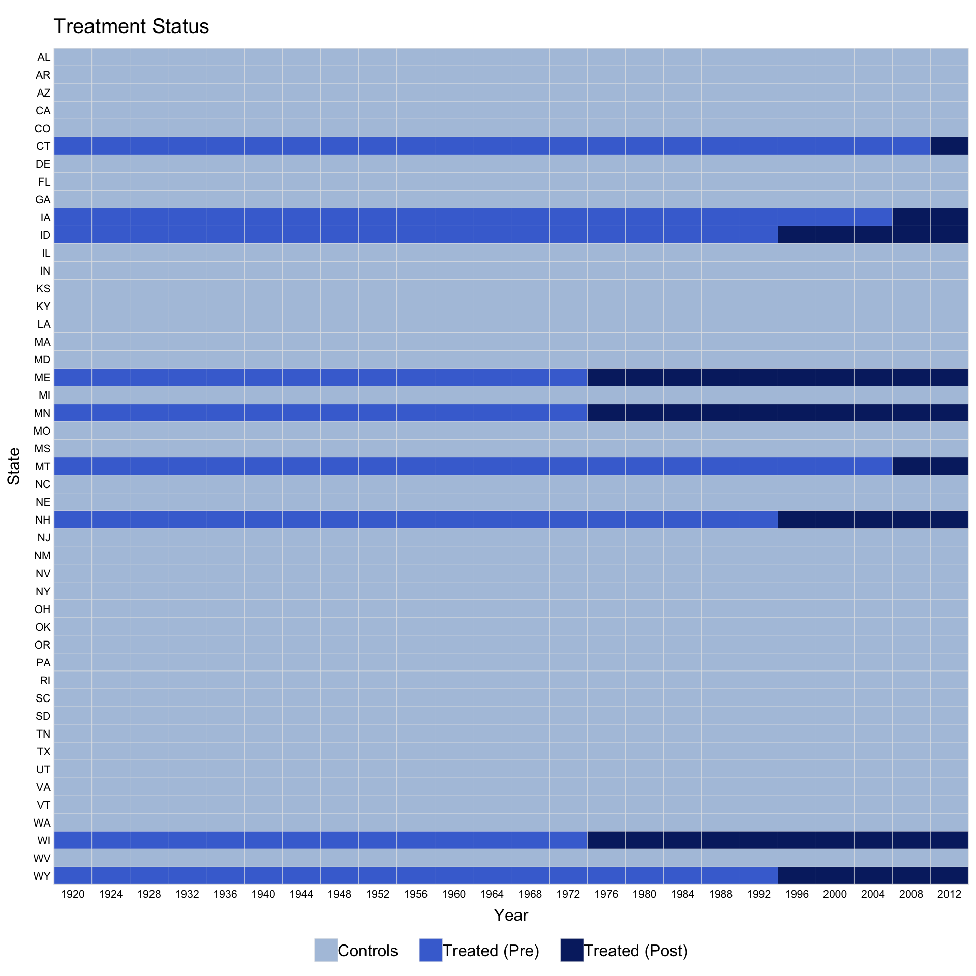
Customise legend labels by passing a character vector to legend.labs. Its length must match the number of distinct treatment statuses shown.
panelview(turnout ~ policy_edr + policy_mail_in + policy_motor,
          data = turnout, index = c("abb", "year"),
          xlab = "Year", ylab = "State", by.timing = TRUE,
          pre.post = TRUE,
          legend.labs = c("Control States",
                          "Treated States (before EDR)",
                          "Treated States (after EDR)"))
#> Specified labels in the order of: Controls, Treated (Pre), Treated (Post).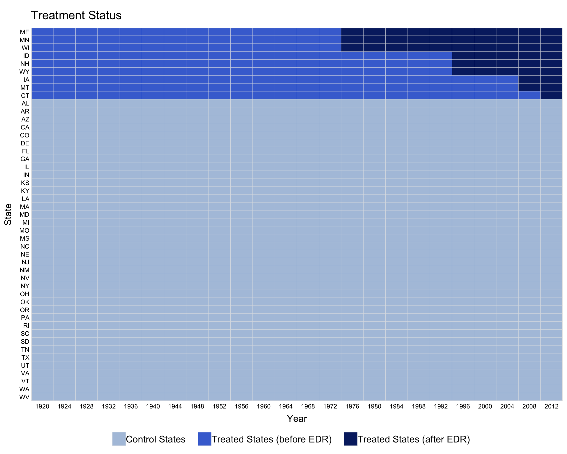
Control axis label display with axis.lab: "both" (default), "time", "unit", or "off".
Instead of a formula, supply the treatment variable name directly via D =.
Override brick colors with the color option. When pre.post = FALSE, colors follow the order c("control", "treated"); when pre.post = TRUE, the order is c("treated-pre", "treated-post", "control").
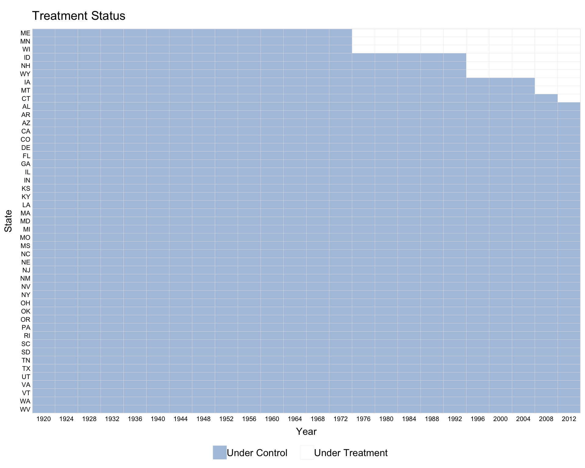
When the time variable has gaps, use leave.gap = TRUE to display them as white bars. Without it, panelView skips the gaps and issues a warning.
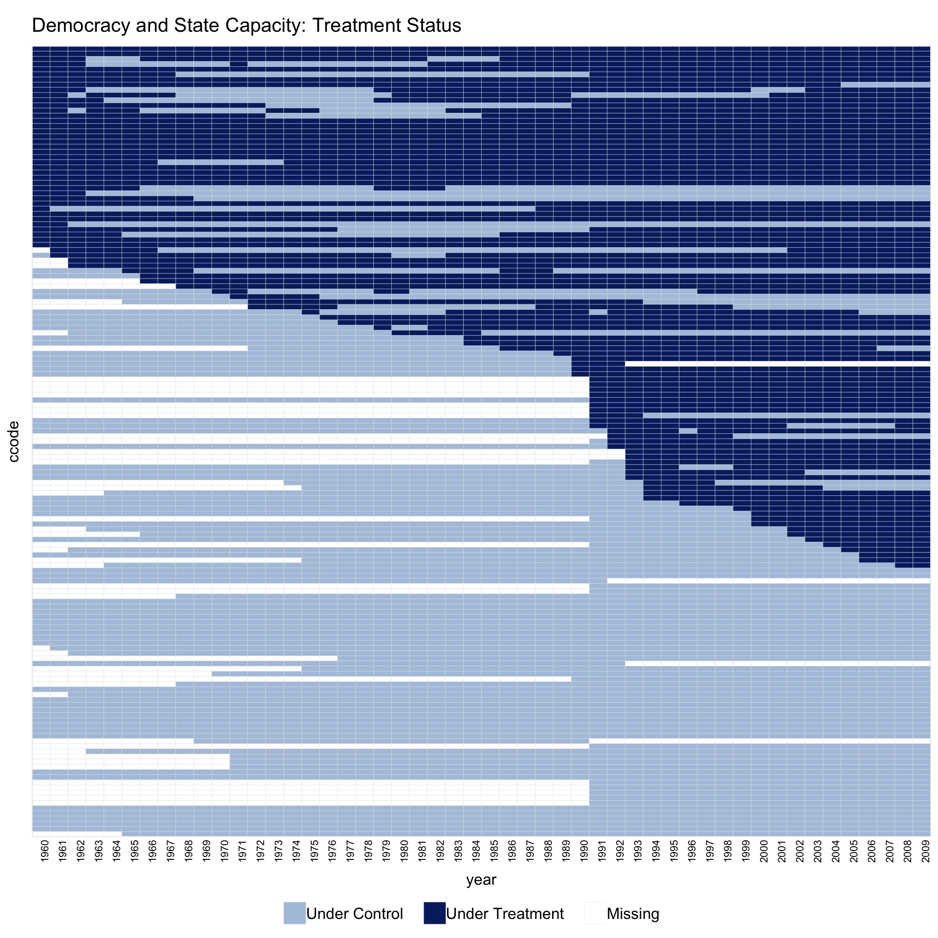
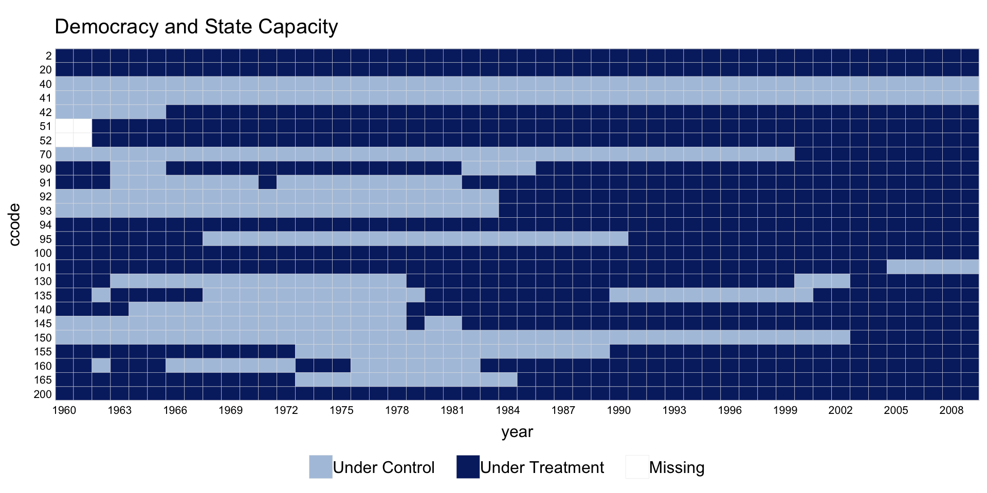
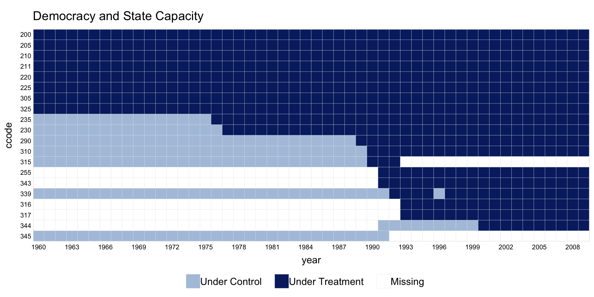
1.2 Switch-on/switch-off treatment
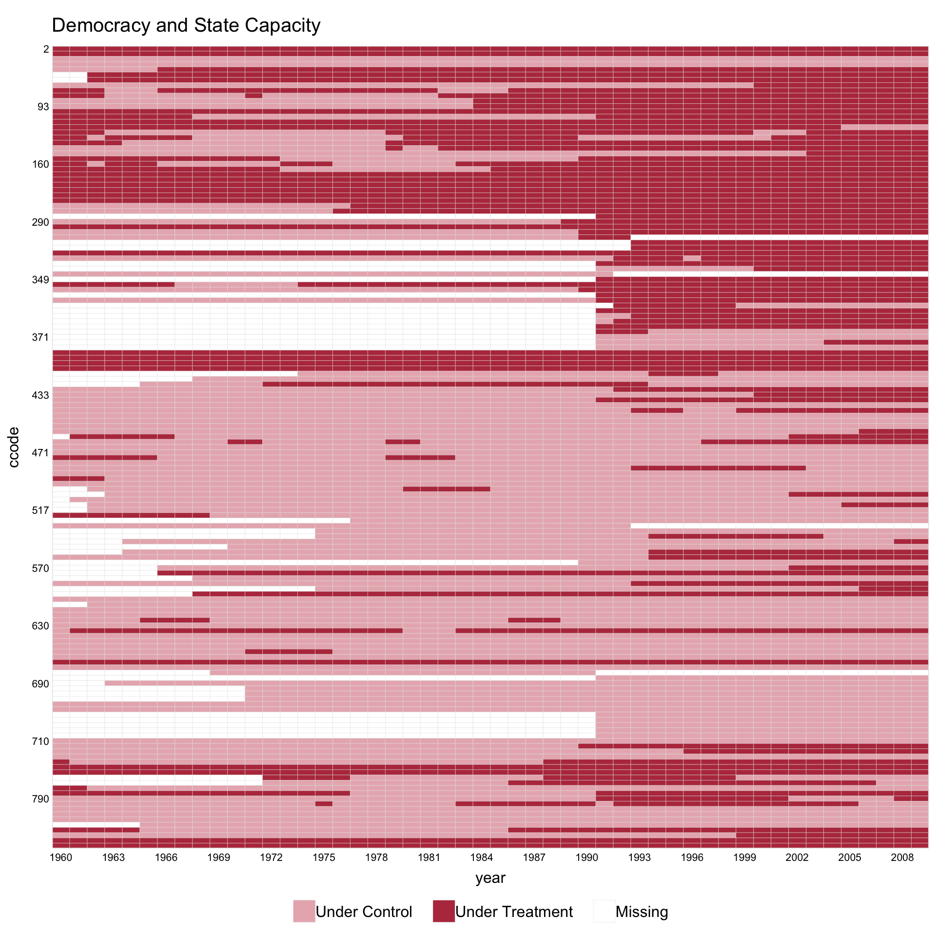
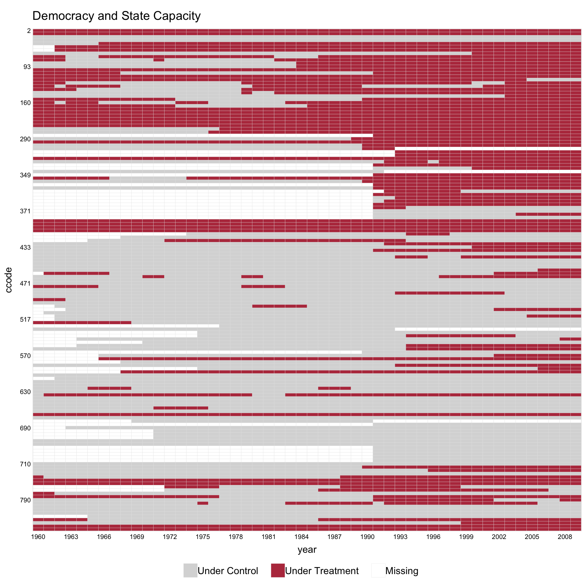
The capacity dataset has treatment that can turn on and off (democratic reversals). In this setting, pre.post is not meaningful.
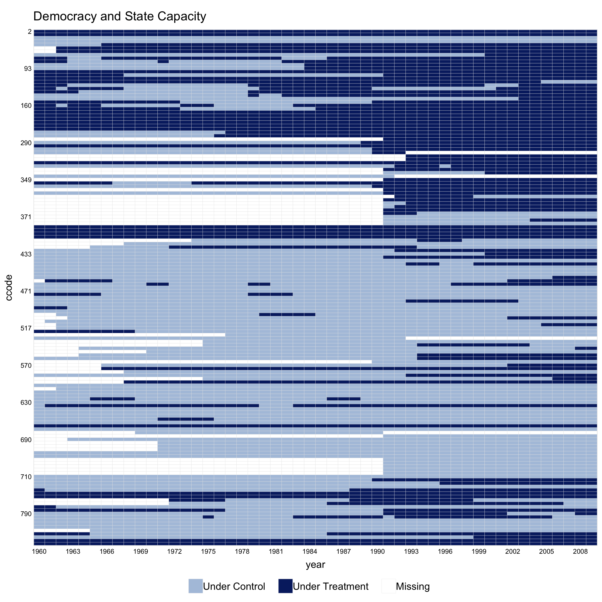
Sorting by by.timing = TRUE and rotating x-axis labels with axis.lab.angle = 90 often improves readability.
1.3 Themes
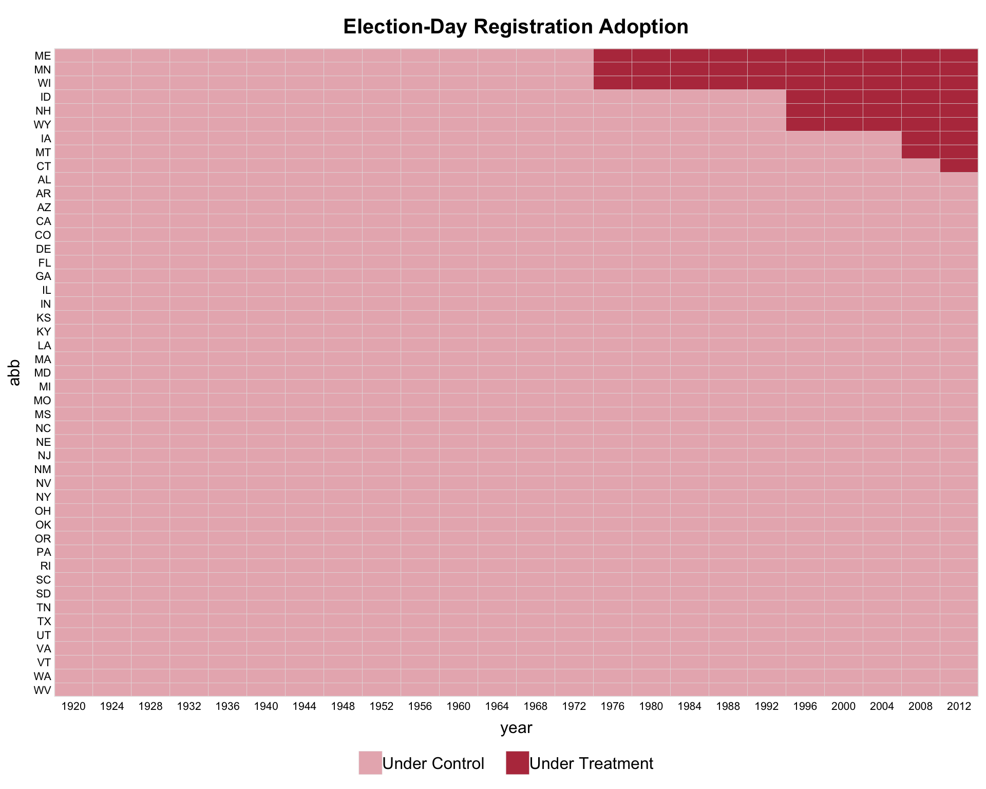
The theme argument selects the color recipe. The default ("default") uses panelView’s classic blue progression. Setting theme = "red" activates a high-contrast publication-paper recipe: control units fade to a light gray and treated post-period cells pick up a brick-red accent.
panelview(turnout ~ policy_edr + policy_mail_in + policy_motor,
          data = turnout, index = c("abb", "year"),
          xlab = "Year", ylab = "State", by.timing = TRUE,
          pre.post = TRUE, theme = "red",
          legend.labs = c("Control States",
                          "Treated States (before EDR)",
                          "Treated States (after EDR)"))
#> Specified labels in the order of: Controls, Treated (Pre), Treated (Post).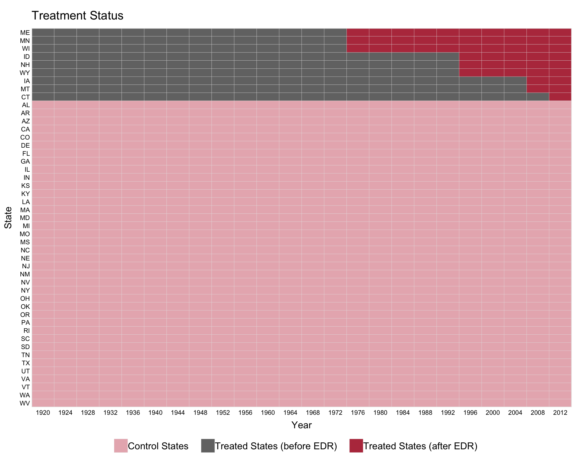
The red theme also handles panels with missing observations. On capacity (treatment turns on and off; some unit-year cells are unobserved), the heatmap reads as three layers — gray untreated cells, brick-red treated cells, and white missing cells — with all three shown in the legend.
If the dusty pink for “Under Control” feels too warm, swap in a neutral light grey via the named color argument so the dark-red treatment cells become the only chromatic element. All other palette slots inherit the red theme’s defaults:
1.4 Customizing with ggplot2 syntax
panelview() returns a ggplot object for single-panel plots, so any ggplot2 layer can be added with the usual +. In v1.3.1 the default title is left-aligned and plain; to recover a centered, bold title, add a theme(plot.title = ...) layer:
The same pattern works for other theme elements (axis text, legend position, margins, etc.). Multi-panel layouts (by.group, by.group.side, by.cohort, by.unit) are an exception: those return a gtable produced by grid.arrange() and do not accept + composition.
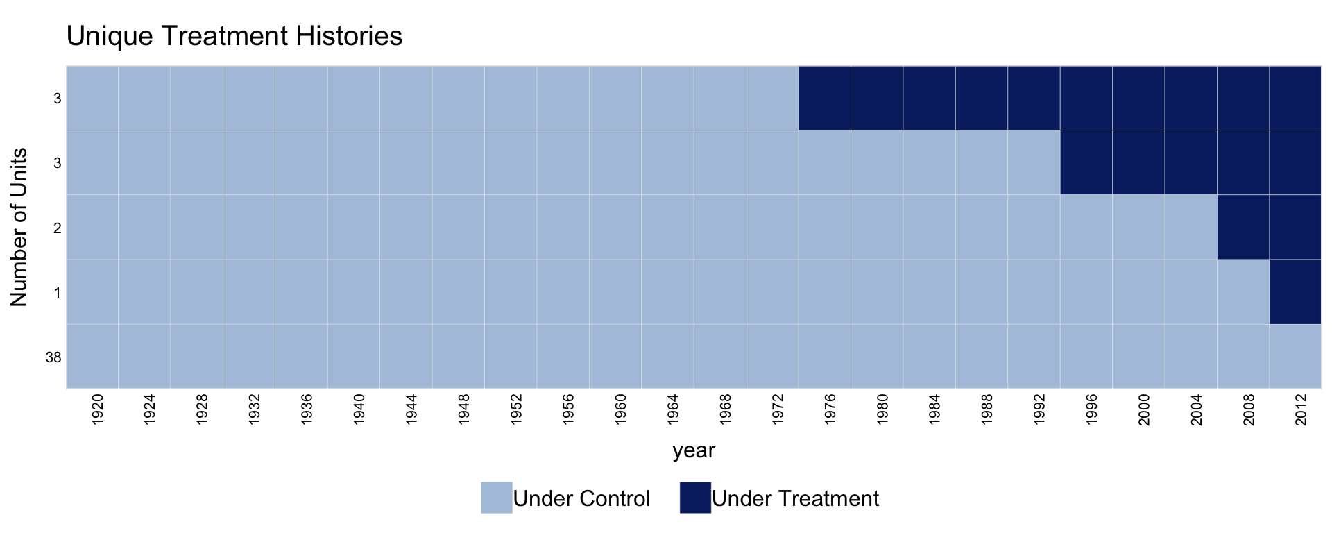
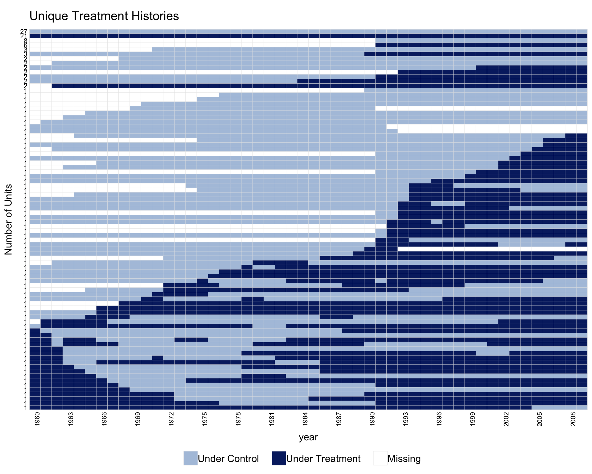
1.5 Collapsing units by treatment history
When the number of units is large, collapse.history = TRUE collapses units that share the same treatment history into a single row. The y-axis shows the group size.
1.6 Plotting a subset of units
Use show.id to select units by their rank (alphabetical order), or id to select by their original identifiers.
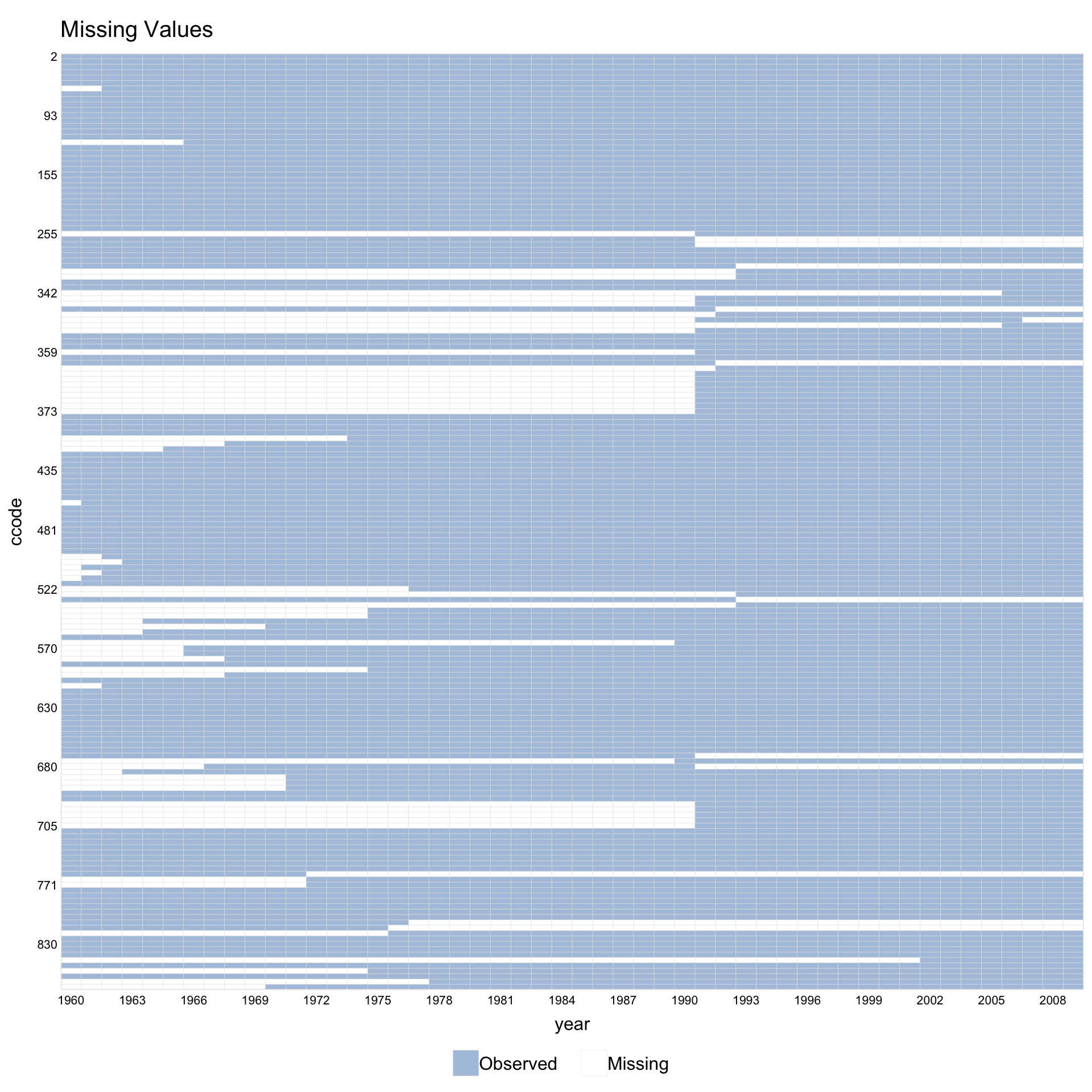
1.7 Missingness only
Set type = "missing" to plot only the pattern of missing values, ignoring treatment assignment.
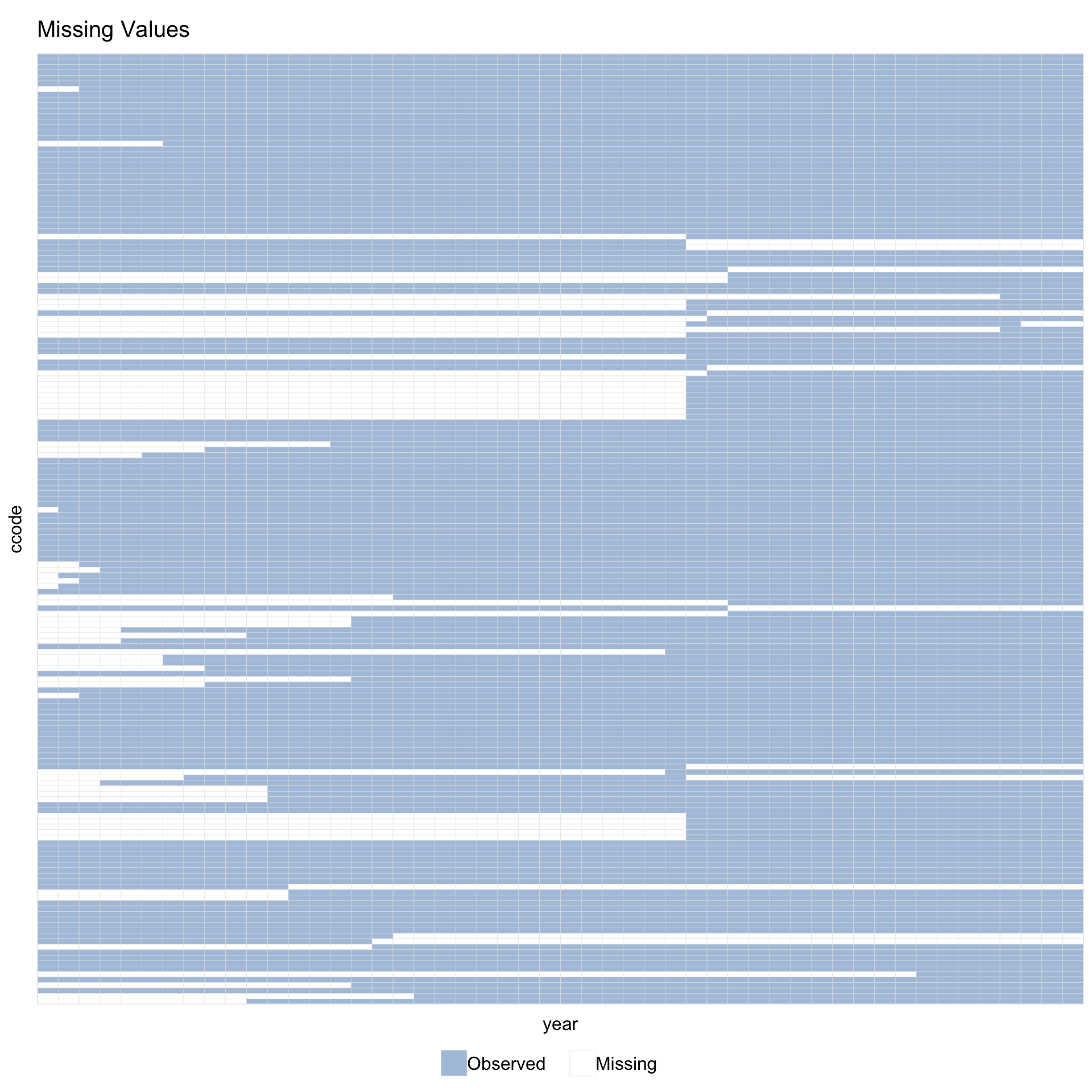
Supply a variable name instead of a formula via Y =.
With leave.gap = TRUE, time gaps are visible even when the data has no explicit gap rows.
1.8 Multi-level treatment
panelView supports treatment variables with more than 2 levels.
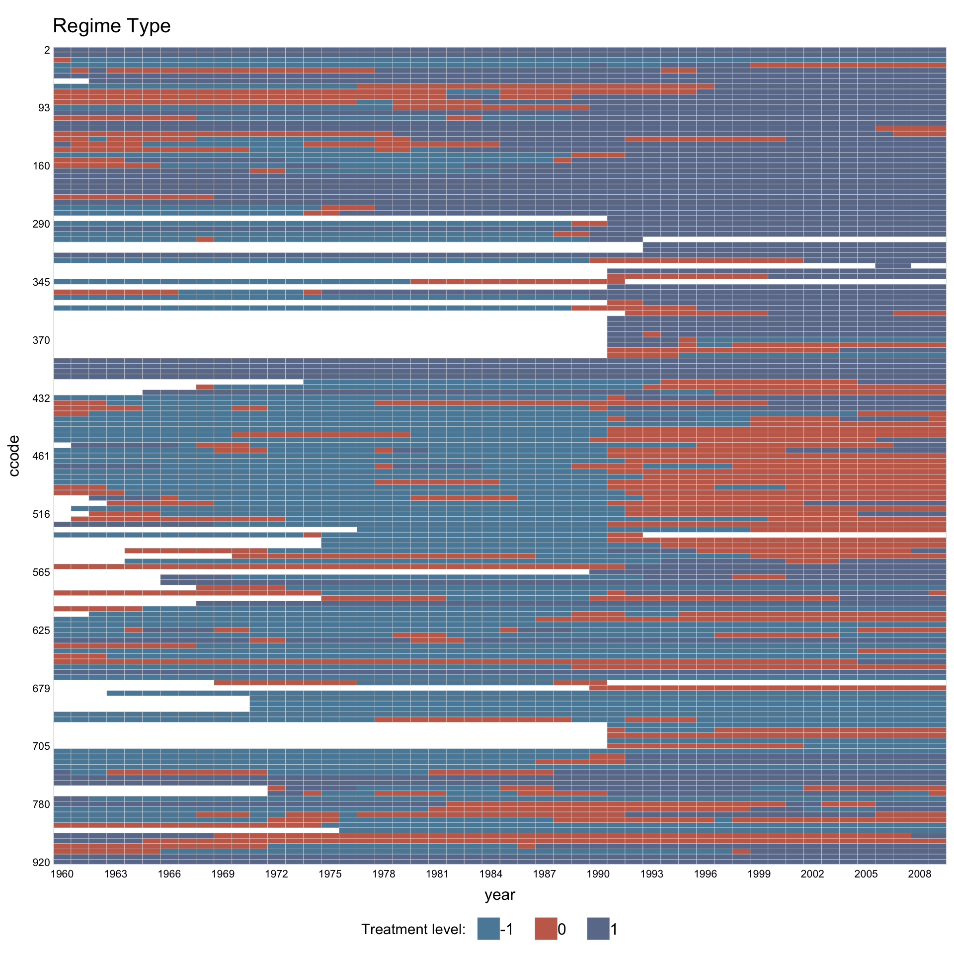
Assign custom colors and legend labels.
library(RColorBrewer)
mycol <- brewer.pal(3, "Set1")[c(1, 3, 2)]
panelview(Capacity ~ demo2, data = capacity,
          index = c("ccode", "year"), axis.lab.gap = 2,
          main = "Regime Type", axis.lab = "time",
          color = mycol,
          legend.labs = c("Autocracy", "Hybrid", "Democracy"))
#> 3 treatment levels.
#> Specified colors in the order of: -1, 0, 1.
#> Specified labels in the order of: -1, 0, 1.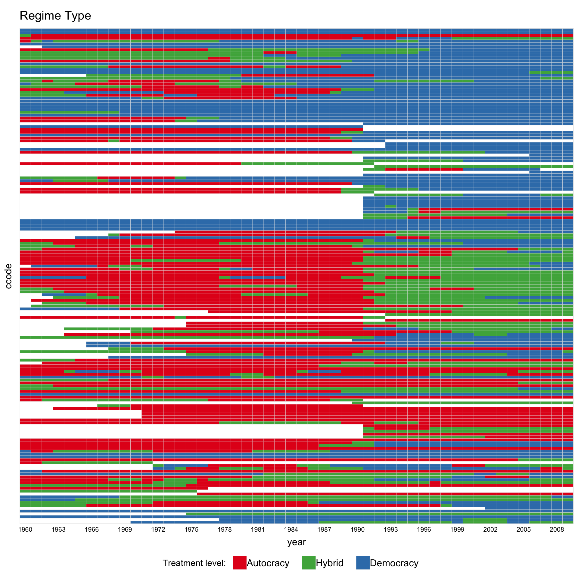
1.9 Continuous treatment
When the treatment has more than 5 unique values, panelView treats it as continuous and renders a gradient heatmap. Use gridOff = TRUE to remove grid lines.
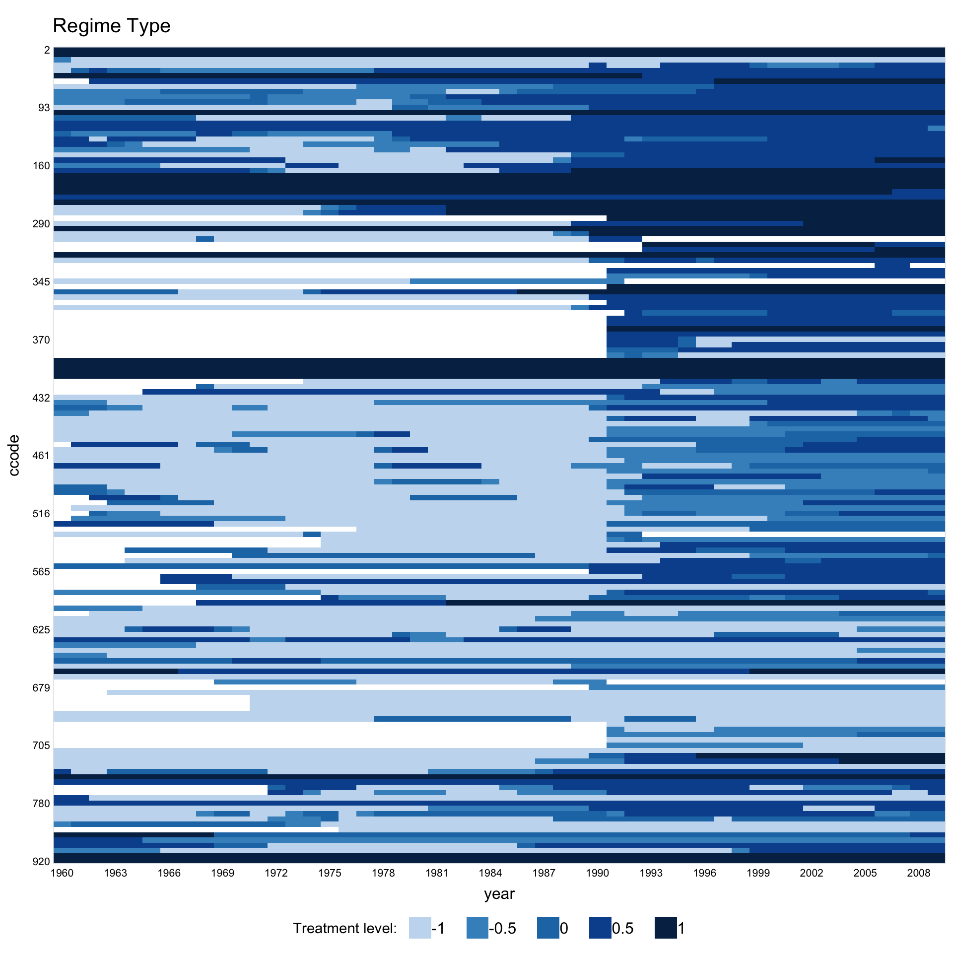
Customise the gradient palette via color.
panelview(Capacity ~ polity2 + lngdp,
          data = capacity, index = c("ccode", "year"),
          axis.lab.gap = c(2, 10), main = "Regime Type",
          color = c("yellow", "orange", "red", "purple", "brown"),
          background = "white")
#> 21 treatment levels.
#> Continuous treatment.
#> Specified colors in the order of: -1, -0.5, 0, 0.5, 1.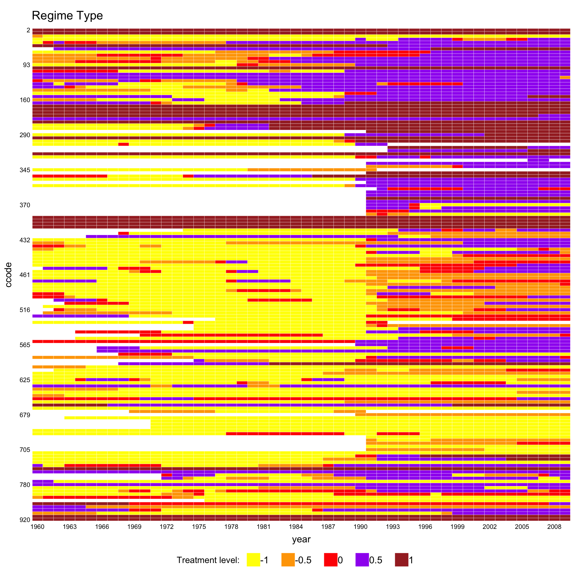
1.10 Overlaying the estimation sample
For the treatment plot (type = "treat"), panelView can shade the cells the estimator actually used in grey. This shows what fraction of the panel a given method relies on, and which units or periods are dropped. The feature works for the imputation estimators fect, gsynth, and tjbal, and for the matching estimator PanelMatch.
The example data in this section is the dem panel from PanelMatch: 175 countries from 1960 to 2010, with a binary democracy indicator and per-capita income (y) as outcome. The data are already in long format. PanelMatch::PanelData() attaches treatment, outcome, unit-id, and time-id metadata to the data.frame so that subsequent PanelMatch() calls can resolve those columns without restating them; it does not reshape the data. fect() and panelview() treat the result, pd, as an ordinary data.frame.
1.10.1 Baseline: pre-fit treatment plot
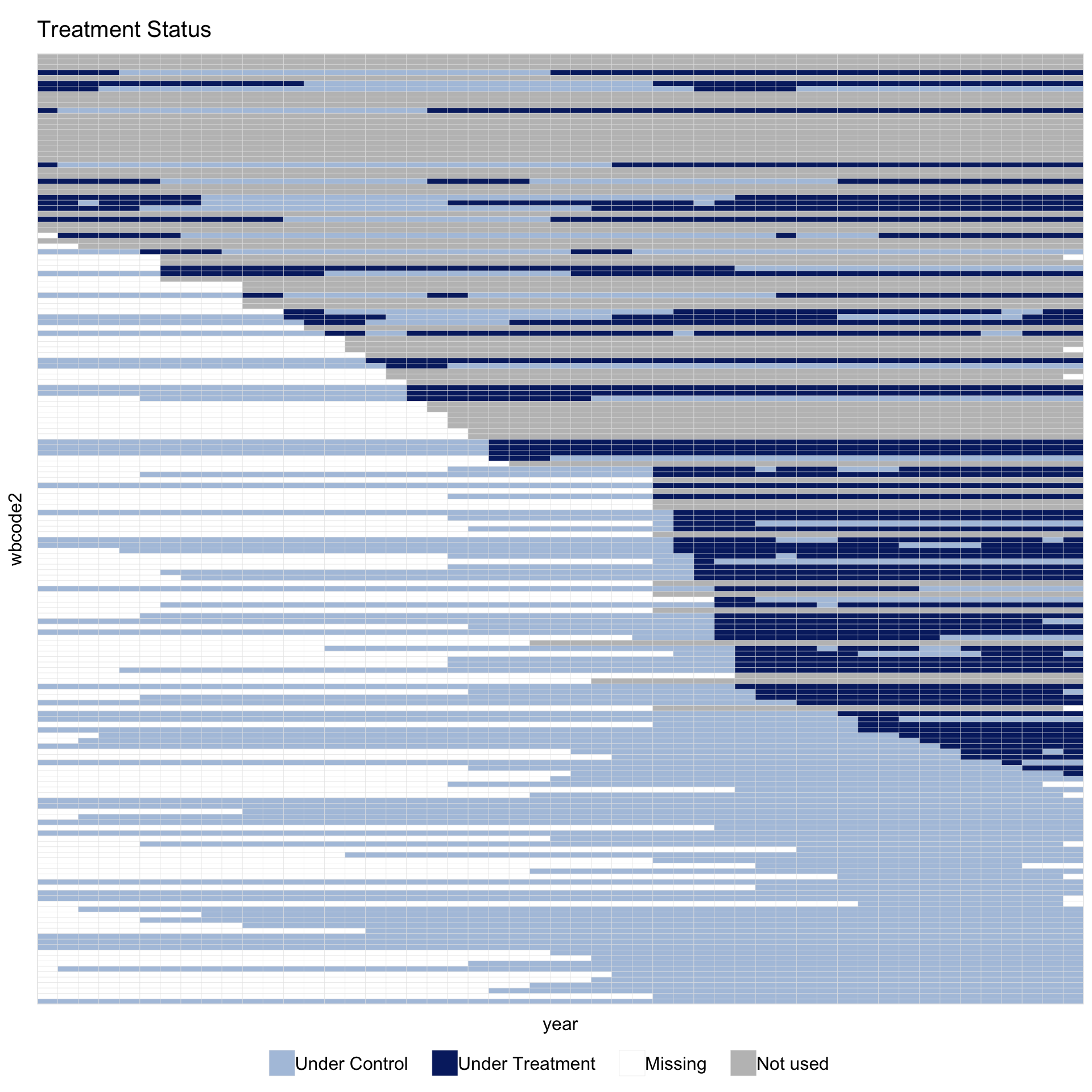
Before fitting any estimator, the standard treatment plot shows the status of every cell:
By default, dropped controls and dropped treated units share a single neutral grey. The control vs. treated distinction is already shown by the colors of used cells, so a single unused color keeps the main contrast in the figure between what the estimator used and what it did not. A two-color split for unused cells is available as an option; the PanelMatch section below shows when it is useful.
1.10.2 PanelMatch
Imai, Kim, and Wang’s PanelMatch matches each treated event to a set of control units on the basis of pre-treatment history. Its output is a list of matched sets rather than a fitted panel of counterfactuals. The helper panelmatch_to_sample() turns those matched sets into a \(T \times N\) logical matrix that panelview() can shade. It reads only the public fields of PanelMatch (pm$att, pm$atc, and the unit.id, time.id, lag, lead attributes), so no changes to PanelMatch are needed.
Run PanelMatch on the same pd:
pm <- PanelMatch(panel.data = pd, lag = 4,
                 refinement.method = "mahalanobis",
                 covs.formula = ~ I(lag(tradewb, 1:4)),
                 size.match = 5,
                 qoi = "att", lead = 0:3, match.missing = TRUE)
1.10.2.1 Pass the matched-set object directly
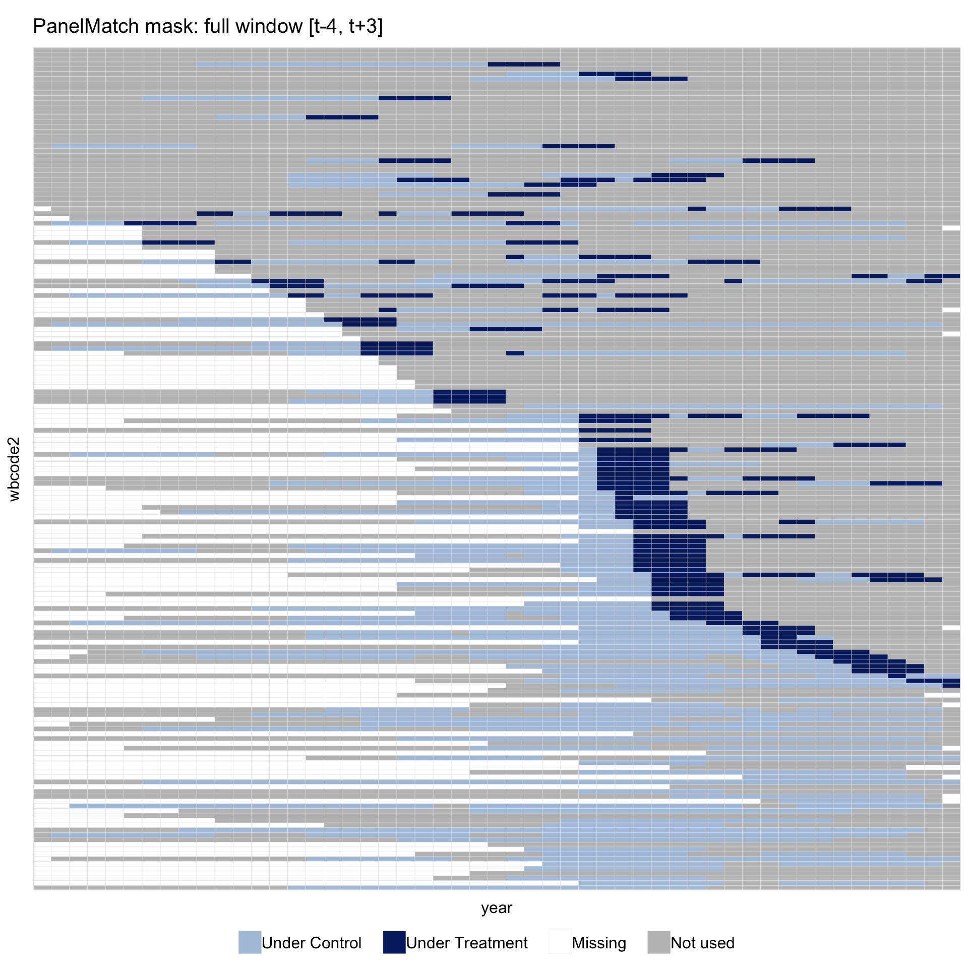
panelview() recognises a PanelMatch object and calls panelmatch_to_sample() automatically. The helper marks the window \([t-\text{lag},\,t+\max(\text{lead})]\) around each treated event \(t\): the lag part covers periods used for matching, the lead part covers periods on which outcomes are evaluated. Within each event the light-blue pre-period and dark-blue post-onset cells therefore appear as one continuous bright band.
Bright cells appear in at least one matched-set window. Grey cells fall outside every window. The grey area has several distinct sources: never-treated countries that never served as a matched control under this refinement; treated countries whose event window extends past the start or end of the panel; and periods of in-sample units that sit outside any nearby event.
1.10.2.2 Split unused into control and treated
To separate dropped controls from dropped treated units in the figure, pass different colors to unused.control and unused.treated:
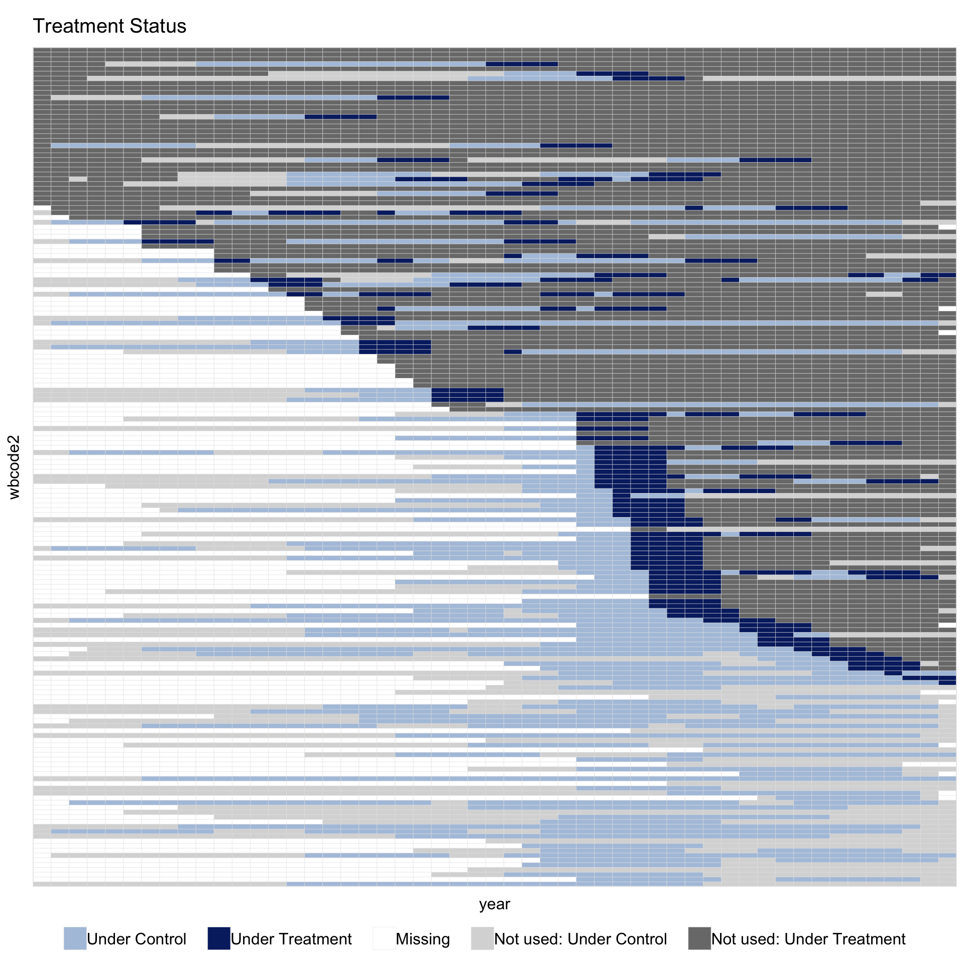
The legend now shows “Not used: Under Control” and “Not used: Under Treatment” as two entries instead of one. Setting both colors to the same value collapses them back to a single “Not used” entry. Under PanelMatch both kinds are visible: the light-grey rows are never-democratised countries that never served as a matched control under this refinement, and the darker-grey rows are always-democratised countries that had no valid event to match.
1.10.2.3 Customise the full palette
All five used-cell colors are controlled through the same color = argument, which accepts a named vector. Any name not supplied keeps its theme default:
panelview(data = pd, formula = y ~ dem,
          index = c("wbcode2", "year"), type = "treat",
          by.timing = TRUE, sample = pm,
          color = c(control        = "#A8C686",
                    treated        = "#D87C2A",
                    missing        = "white",
                    unused.control = "#F0E0CC",
                    unused.treated = "#F0E0CC"),
          axis.lab = "off")
#> Set used-cell colors for: control, treated, missing.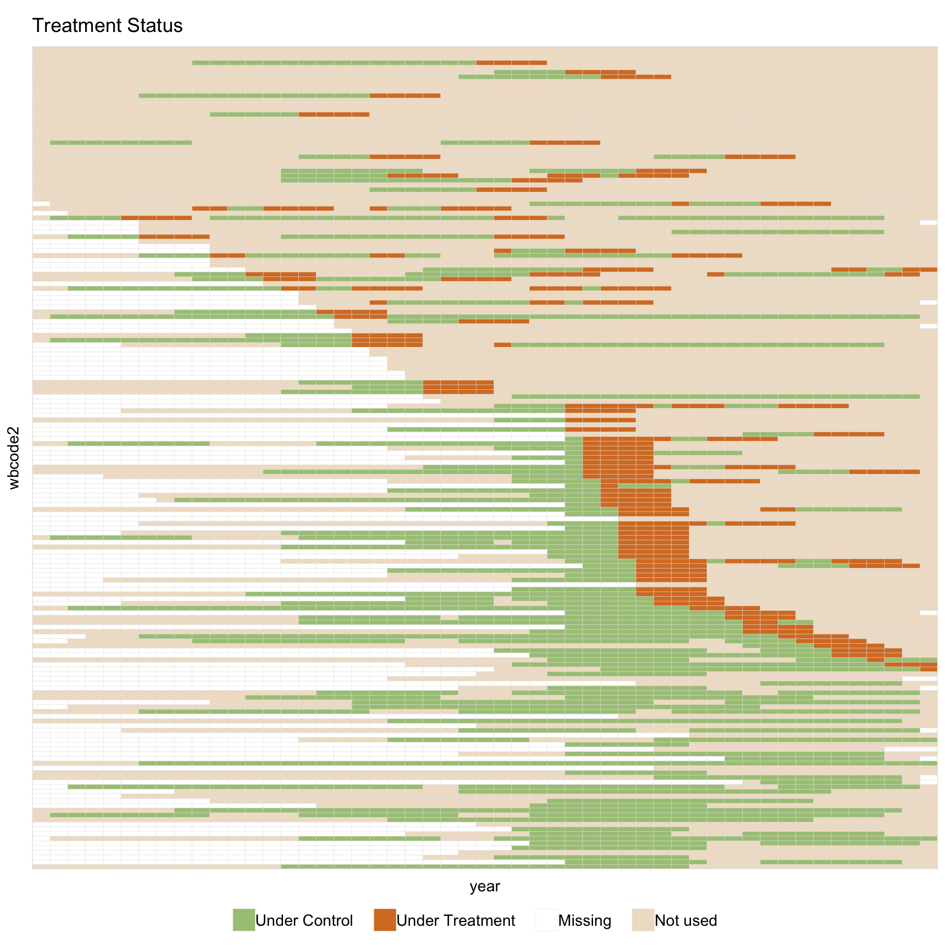
Allowed names are control, treated, treated.pre (three-state binary only), missing, unused.control, and unused.treated. An unnamed positional vector is also accepted, preserving the older color = c("#color1", "#color2", ...) form.
To change how matched sets are turned into the mask, call panelmatch_to_sample(pm, pd) directly. Useful arguments are include (limit the mask to treated units or matched controls only), weight.threshold (set the cutoff for positive weights when the refinement returns continuous weights), and qoi = "atc" (use the ATC matched sets when pm carries both).
1.10.2.4 A wider matching spec
Doubling the matching window to lag = 8 and extending the outcome window to lead = 0:6 widens each event’s bright band from 8 cells to 15. It also drops events too close to either edge of the panel: events before 1968 have no \([t-8, t-1]\) history, and events after 2004 have no \([t, t+6]\) leads.
pm_wide <- PanelMatch(panel.data = pd, lag = 8,
                      refinement.method = "mahalanobis",
                      covs.formula = ~ I(lag(tradewb, 1:8)),
                      size.match = 5,
                      qoi = "att", lead = 0:6, match.missing = TRUE)
panelview(data = pd, formula = y ~ dem,
          index = c("wbcode2", "year"), type = "treat",
          by.timing = TRUE, sample = pm_wide,
          main = "PanelMatch mask: lag = 8, lead = 0:6",
          axis.lab = "off")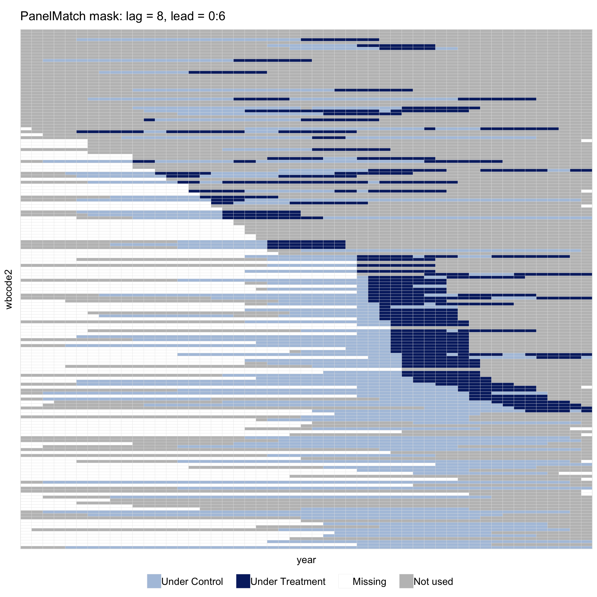
1.10.3 Imputation estimators (fect / gsynth)
1.10.3.1 Pass the fitted object directly
panelview(fit, type = "treat", by.timing = TRUE,
          axis.lab = "off", display.all = TRUE)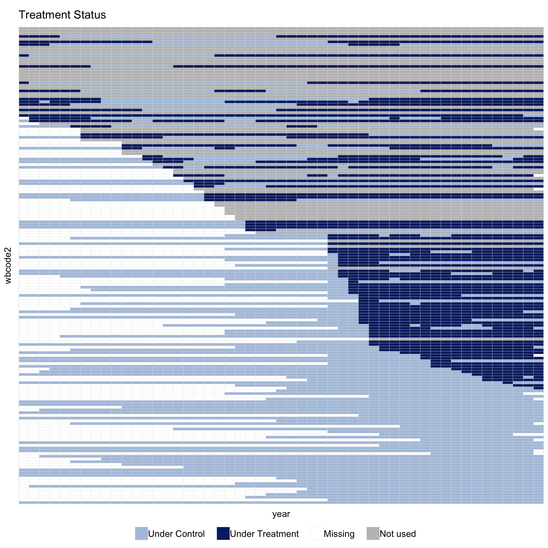
No data, no formula, no index is required: panelview() reads them from the fit object. This is the simplest call because the figure shows exactly the panel the estimator used; the data shown in the plot cannot differ from the data used in estimation.
Reading the figure from top to bottom: a grey “Not used” band of always-treated countries (democratic since 1960, with no control periods for fect to use) and a smaller number of never-treated countries whose outcome is too sparse to fit a counterfactual; then a dark-blue staircase of in-sample treated units ordered by year of transition, with light-blue cells marking their pre-transition years; and finally a light-blue block of never-democratised in-sample controls. White cells are originally missing outcomes.
1.10.3.2 Red theme
theme = "red" switches to a higher-contrast palette intended for print:
panelview(fit, type = "treat", by.timing = TRUE,
          theme = "red", axis.lab = "off", display.all = TRUE)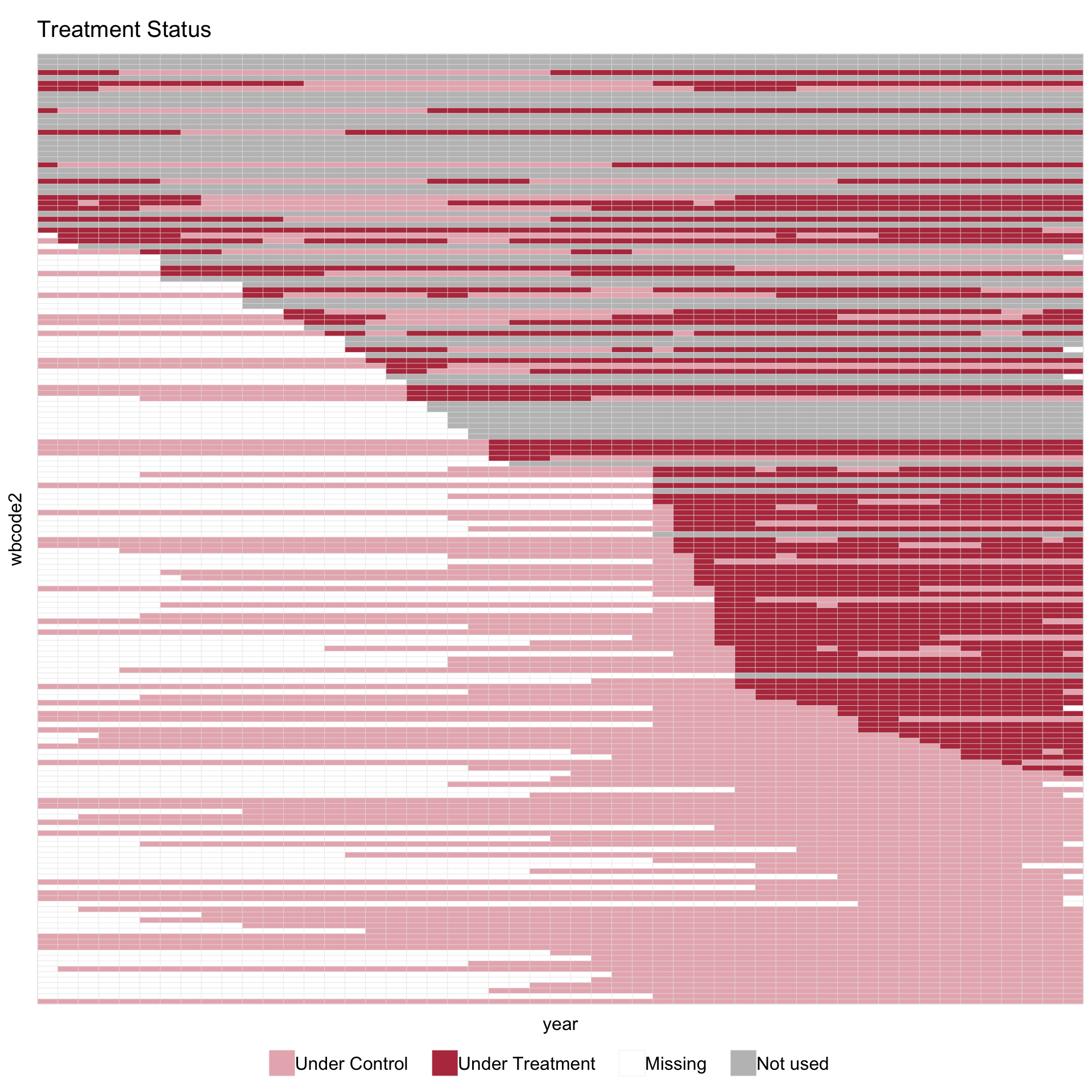
The red theme uses dusty pink (#E8B5BC) for “Under Control” and dark red (#B83A4B) for “Under Treatment”. Cells in either treatment state share a warm hue; grey “Not used” cells sit visually apart. White cells indicate original missingness.
To put the in-sample band at the top of the figure instead of the dropped band, set sample.sort = TRUE. Combined with by.timing, the four options cover the common row orderings:
by.timing |
sample.sort |
Row order |
|---|---|---|
FALSE |
FALSE |
alphabetical / natural order |
TRUE |
FALSE |
sorted by treatment timing only (default for fits) |
FALSE |
TRUE |
in-sample first, out-of-sample below |
TRUE |
TRUE |
in-sample first, by treatment timing within |
1.10.3.3 A stricter spec drops more units
The shading is also useful for checking how sensitive the in-sample set is to specification choices. Raising min.T0 from 2 to 10 requires every kept unit to have at least 10 untreated periods; about 14 more countries fail this requirement and the “Not used” band widens accordingly:
The in-sample share of cells drops from about 56% to about 51%. The “Not used” band at the top thickens compared with fit above. Originally missing cells remain white.
1.10.3.4 Pass sample = fit alongside explicit data + formula
The original (data, formula, index) form still works, and sample = accepts the fit object directly. The figure matches the fit-as-input view above. This form is useful when the original data object is not loaded in the current session — for example, after reading a saved .rds fit:
sample = accepts any fect, gsynth, or tjbal fit that exposes a $sample field; the same call works across the three packages. A logical \(T \times N\) matrix can also be passed directly, which makes the feature available to custom estimators.
Alignment by name. The sample matrix and the panel data must agree on which units and times appear. panelview() follows two asymmetric rules:
-
Data has units or periods the sample does not. The extra cells are filled with
FALSE. This is useful when the estimator was fit on a subset of a larger panel; the extra units appear in the “Not used” band. -
Sample has units or periods the data does not.
panelview()stops with an error that lists the mismatched cells. This usually means the sample is stale or came from a different fit.
If sample has rownames and colnames, those are used to align by name. A bare matrix without dimnames is aligned by position.