# Bivariate Relationships {#sec-bivariate}
```{r setup, include=FALSE}
knitr::opts_chunk$set(echo = TRUE, message = FALSE, warning = FALSE,
fig.width = 10, fig.height = 5)
library(panelView)
data(panelView)
```
This chapter shows how to plot the time series of an outcome *Y* and a treatment *D* together, using `type = "bivariate"`. The plot can show either **aggregate** averages over time (`by.unit = FALSE`, the default) or **unit-level** panels (`by.unit = TRUE`).
**Plot style** is controlled via `style = c("<Y-style>", "<D-style>")`, where each element is one of `"line"` / `"l"`, `"connected"` / `"c"`, or `"bar"` / `"b"`. The defaults depend on the types of *Y* and *D*:
| Y type | D type | Default style |
|---|---|---|
| continuous | discrete | `c("l", "b")` |
| continuous | continuous | `c("l", "l")` |
| discrete | discrete | `c("b", "b")` |
| discrete | continuous | `c("l", "b")` |
## In aggregate
When `by.unit = FALSE` (default), **panelView** plots the cross-sectional average of *Y* and *D* against time.
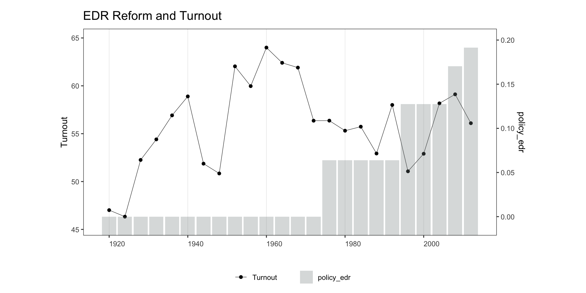
**Continuous Y, discrete D:**
```{r bivar1-1}
panelview(turnout ~ policy_edr + policy_mail_in + policy_motor,
          data = turnout, index = c("abb", "year"),
          type = "bivariate", style = c("c", "b"),
          main = "EDR Reform and Turnout", ylab = "Turnout")
```
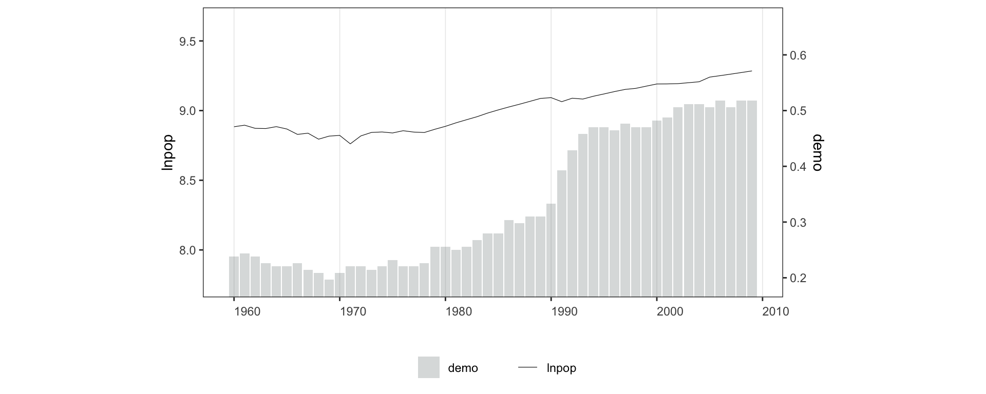
Adjust y-axis ranges with `ylim = list(c(lo, hi), c(lo, hi))`, where the first vector covers the outcome and the second covers the treatment.
```{r bivar1-2, fig.height=4}
panelview(lnpop ~ demo, data = capacity,
          index = c("country", "year"),
          ylim = list(c(8, 9.4), c(0.25, 0.6)), type = "bivariate")
```
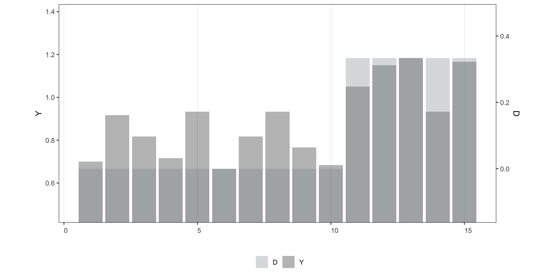
**Discrete Y, discrete D** — default `style = c("b", "b")`:
```{r bivar1-3}
panelview(Y ~ D, data = simdata, index = c("id", "time"),
          type = "bivariate", outcome.type = "discrete")
```
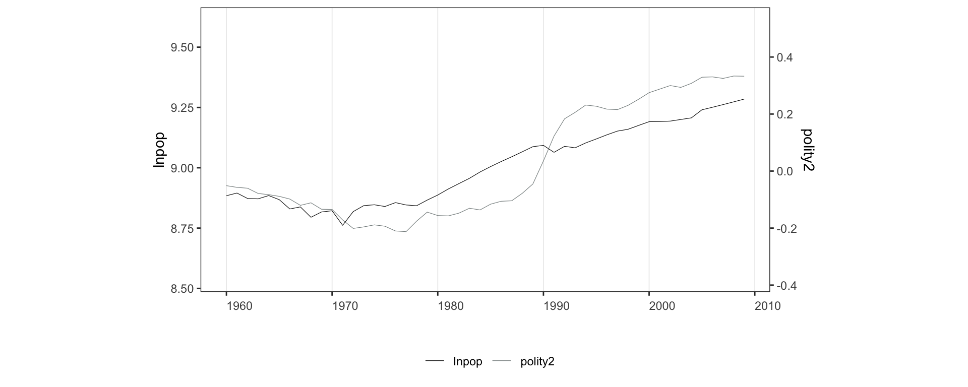
**Continuous Y, continuous D** — default `style = c("l", "l")`:
```{r bivar1-4, fig.height=4}
panelview(lnpop ~ polity2, data = capacity,
index = c("country", "year"),
ylim = list(c(8.75, 9.4), c(-0.2, 0.35)), type = "bivariate")
```
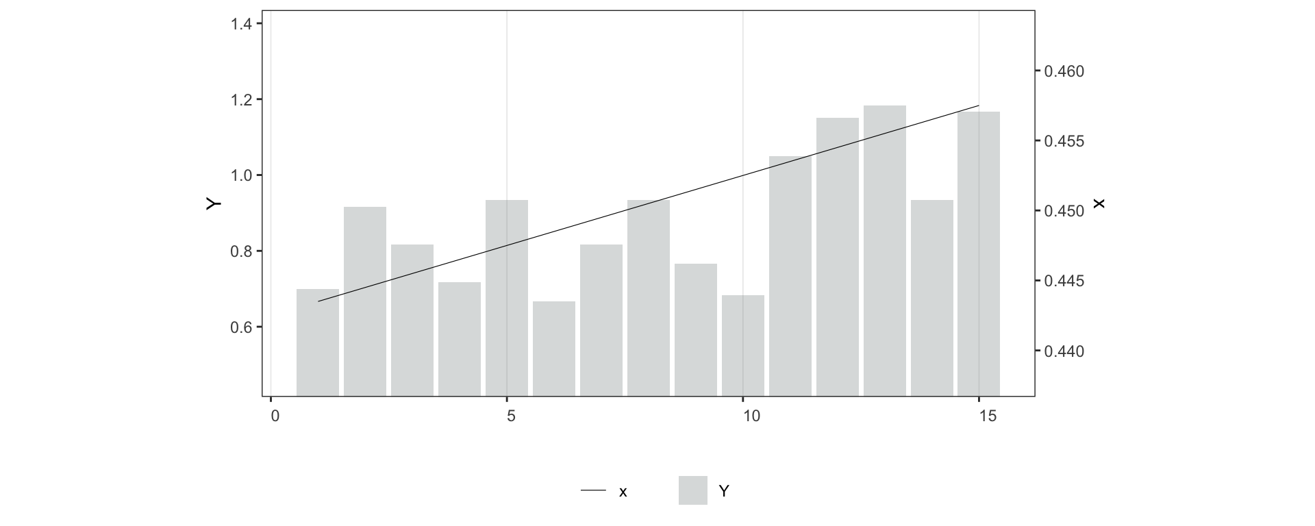
**Discrete Y, continuous D** — default `style = c("l", "b")`:
```{r bivar1-5, fig.height=4}
simdata$x <- seq(0.001, 0.9, 0.001)
panelview(Y ~ x, data = simdata, index = c("id", "time"),
type = "bivariate", outcome.type = "discrete")
```
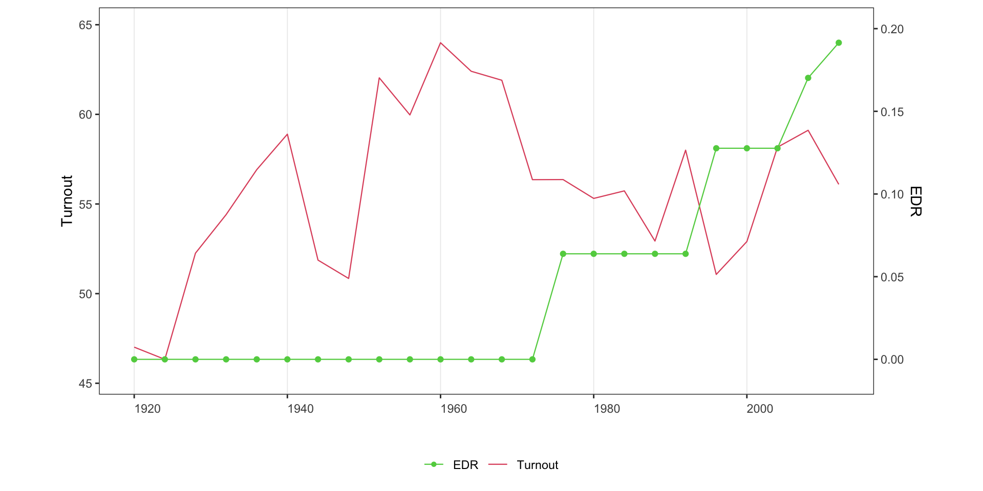
Line style for a discrete treatment; `lwd` controls line width (default 0.2):
```{r bivar1-6}
panelview(turnout ~ policy_edr + policy_mail_in + policy_motor,
          data = turnout, index = c("abb", "year"),
          xlab = "EDR", ylab = "Turnout", type = "bivariate",
          style = c("line", "connected"), color = c(2, 3), lwd = 0.4)
```
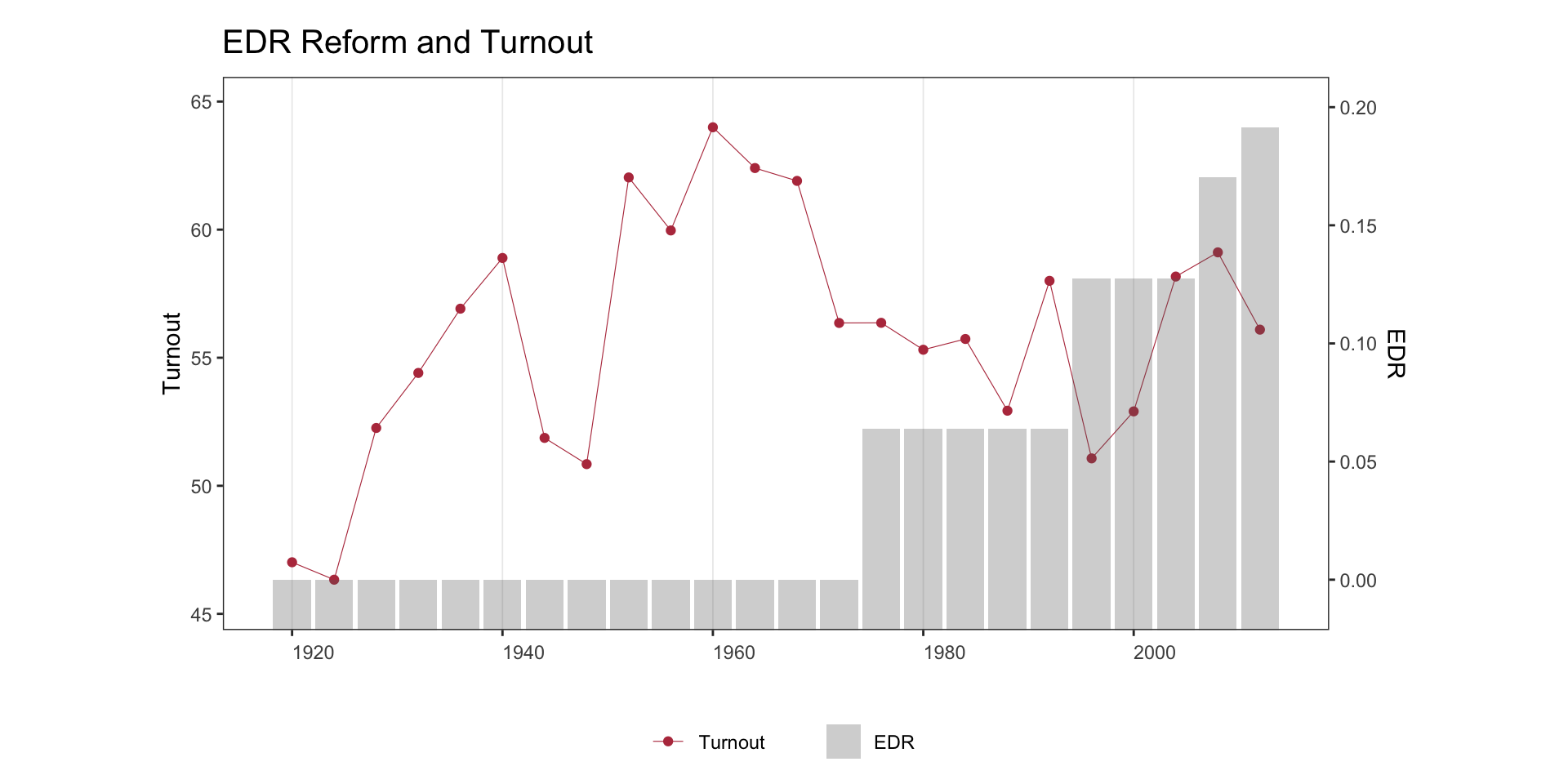
Activate the high-contrast `red` theme: the treatment line picks up the
brick-red accent and the outcome line drops to a neutral gray, so the
treatment series visually dominates.
```{r bivar1-6b}
panelview(turnout ~ policy_edr + policy_mail_in + policy_motor,
          data = turnout, index = c("abb", "year"),
          xlab = "EDR", ylab = "Turnout", type = "bivariate",
          style = c("c", "b"), theme = "red",
          main = "EDR Reform and Turnout")
```
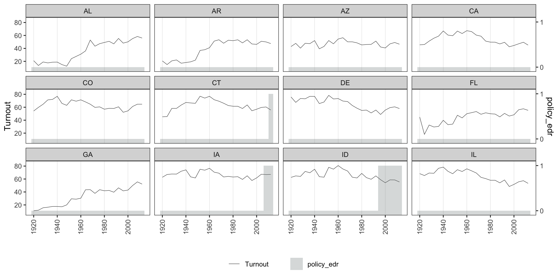
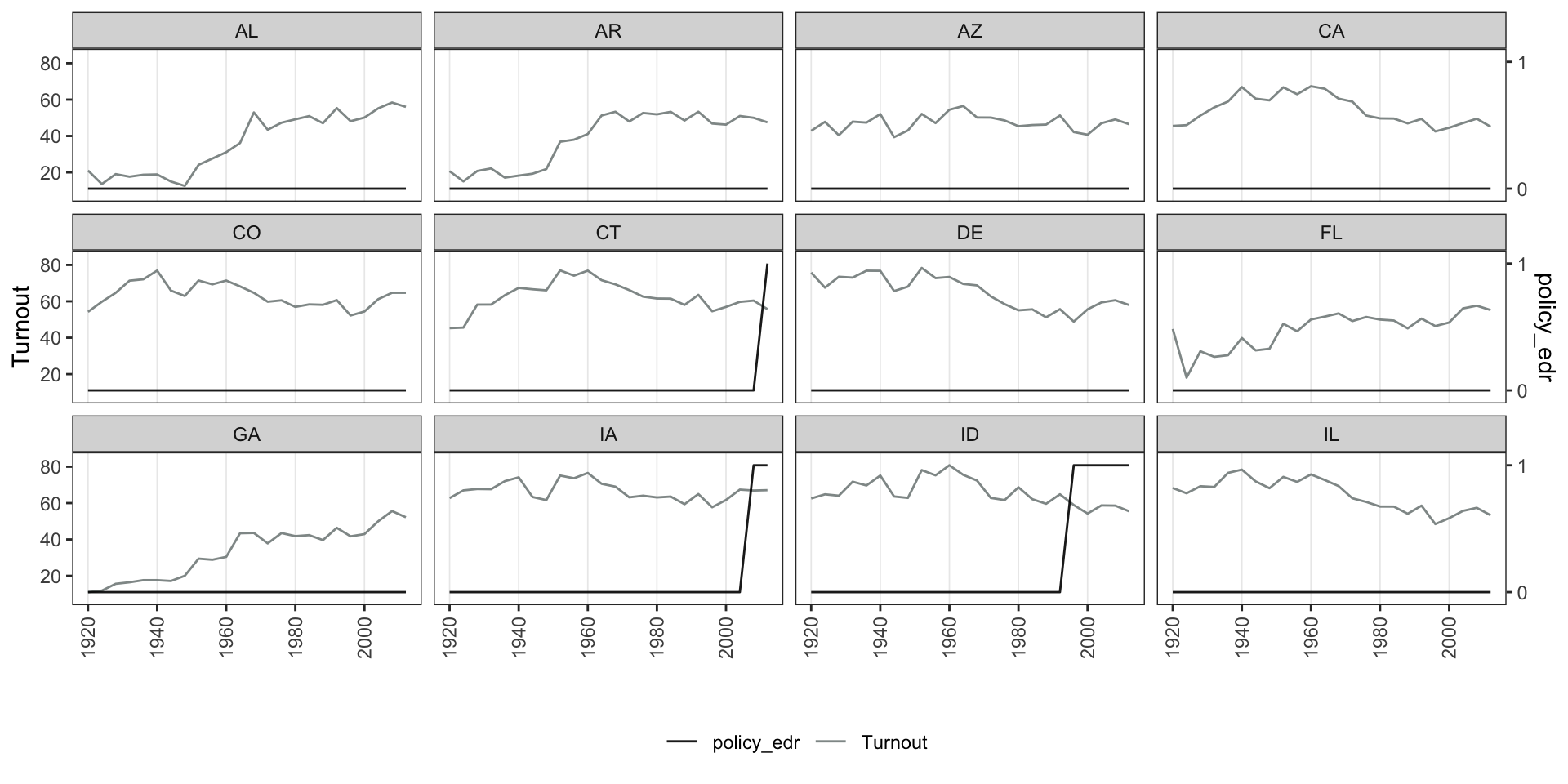
## By unit
Set `by.unit = TRUE` to plot *Y* and *D* as separate panels for each unit. Use `show.id` or `id` to select units.
**Continuous Y, discrete D:**
```{r bivar2-1}
panelview(turnout ~ policy_edr,
          data = turnout, index = c("abb", "year"),
          ylab = "Turnout", type = "bivariate",
          by.unit = TRUE, show.id = 1:12)
```
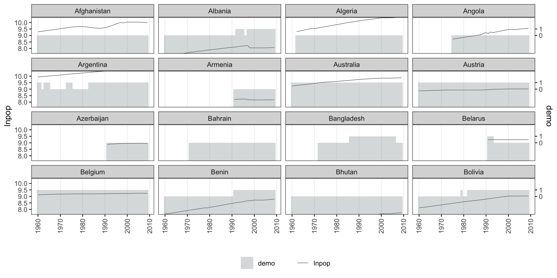
```{r bivar2-2}
panelview(lnpop ~ demo, data = capacity,
          index = c("country", "year"), type = "bivariate",
          by.unit = TRUE, ylim = list(c(8, 10), c(-2, 2)),
          show.id = 1:16)
```
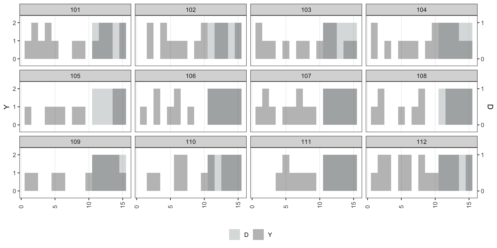
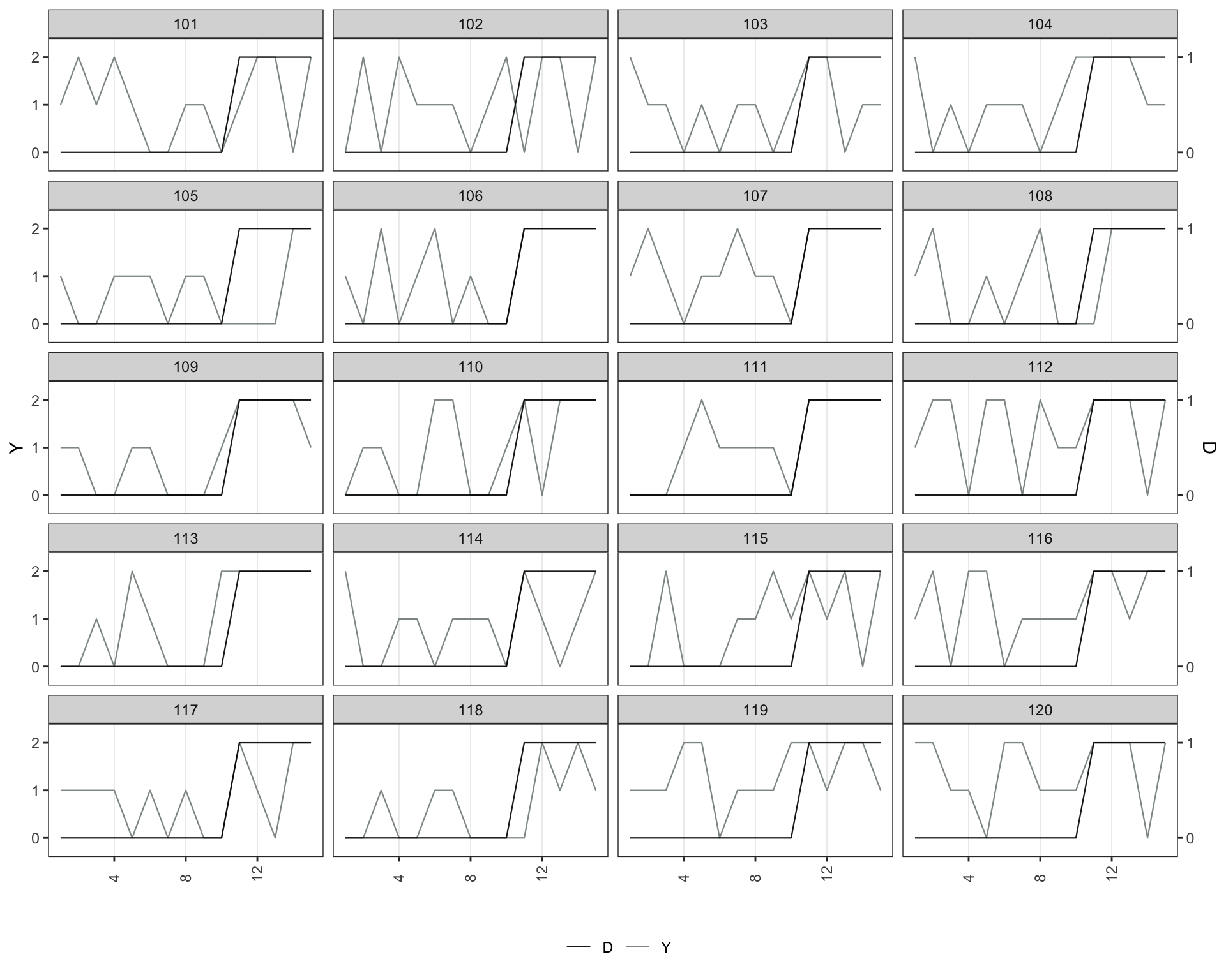
**Discrete Y, discrete D:**
```{r bivar2-3}
panelview(Y ~ D, data = simdata,
          index = c("id", "time"), type = "bivariate",
          by.unit = TRUE,
          outcome.type = "discrete",
          id = unique(simdata$id)[1:12])
```
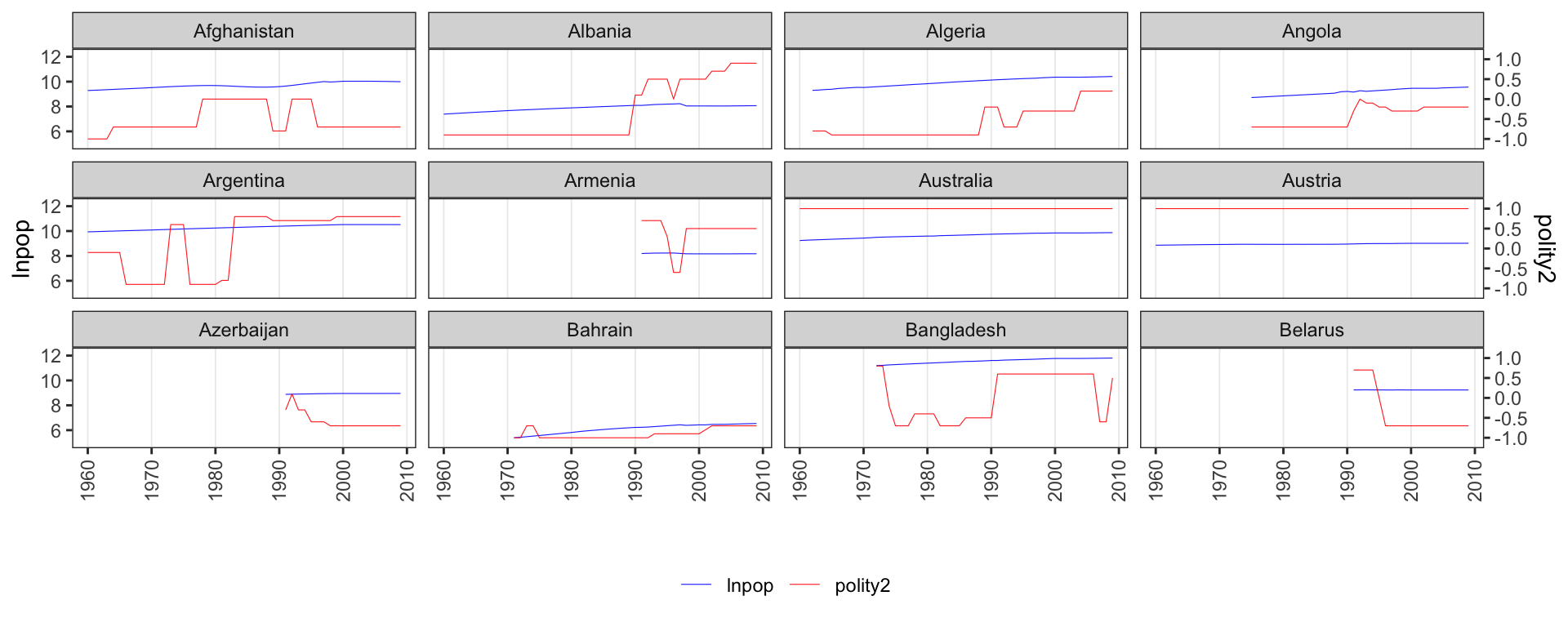
**Continuous Y, continuous D:**
```{r bivar2-4, fig.height=4}
panelview(lnpop ~ polity2, data = capacity,
index = c("country", "year"), type = "bivariate",
by.unit = TRUE,
color = c("blue", "red"), show.id = 1:12)
```
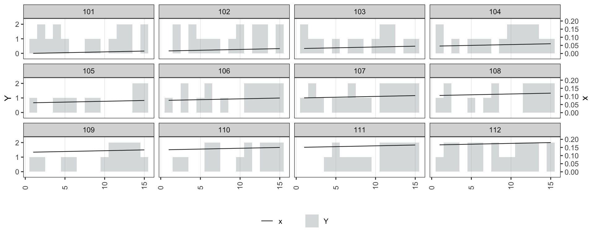
**Discrete Y, continuous D:**
```{r bivar2-5, fig.height=4}
simdata$x <- seq(0.001, 0.9, 0.001)
panelview(Y ~ x, data = simdata,
index = c("id", "time"), type = "bivariate",
by.unit = TRUE, outcome.type = "discrete",
lwd = 0.4, id = unique(simdata$id)[1:12])
```
Use `style = "line"` to draw both *Y* and *D* as lines:
```{r bivar2-6}
panelview(turnout ~ policy_edr + policy_mail_in + policy_motor,
          data = turnout, index = c("abb", "year"),
          type = "bivariate", by.unit = TRUE,
          style = "line",
          lwd = 0.5, show.id = 1:12, ylab = "Turnout")
```
```{r bivar2-7, fig.height=8}
panelview(Y ~ D, data = simdata,
          index = c("id", "time"), type = "bivariate",
          by.unit = TRUE, outcome.type = "discrete",
          style = "line",
          lwd = 0.4, id = unique(simdata$id)[1:20])
```