3 Fect Plot Options
In this chapter, we explore various visualization options available in the fect package using data from Grumbach and Sahn (2020). Download the R code used in this chapter here.
plot.fect is an S3 method that offers various options for customizing data and results visualization. Below is a brief summary of the most commonly used options.
-
Starting Period:
-
start0: IfTRUE, shifts the time axis so that treatment begins at Period 0 instead of Period 1.
-
-
Confidence Intervals:
-
plot.ci: Options include"none","0.9", or"0.95"to hide confidence intervals or display 90% or 95% confidence intervals.
-
-
Axis and Legend Customization:
-
xlim/ylim: Set the x- and y-axis ranges.
-
xlab/ylab: Customize axis labels.
-
xbreaks/ybreaks: Specify tick marks.
-
xangle/yangle: Adjust the rotation angle of axis text.
-
legend.pos,legend.nrow,legend.labs: Control legend placement, number of rows, and labels.
-
-
Theme and Text:
-
theme.bw: IfTRUE, applies a black-and-white theme. -
preset: IfNULL, will be the default color preset, which is mostly black and white with a bit of color. Other options include"vibrant"and"grayscale".
-
cex.main,cex.axis,cex.lab,cex.text: Adjust text sizes for the title, tick labels, axis labels, and annotations.
-
-
Lines and Bounds:
-
color/est.lwidth: Define the color and width of main lines.
-
lcolor/lwidth/ltype: Set the color, width, and line type for the axes. Takes a vector, where the first value is applied the horizontal axis and the second is applied the vertical axis. If only one value is given, both axes will take on the same value.
-
While these customization options are demonstrated using the default gap plot, they can be applied universally, with only a few exceptions.
3.1 Load Data
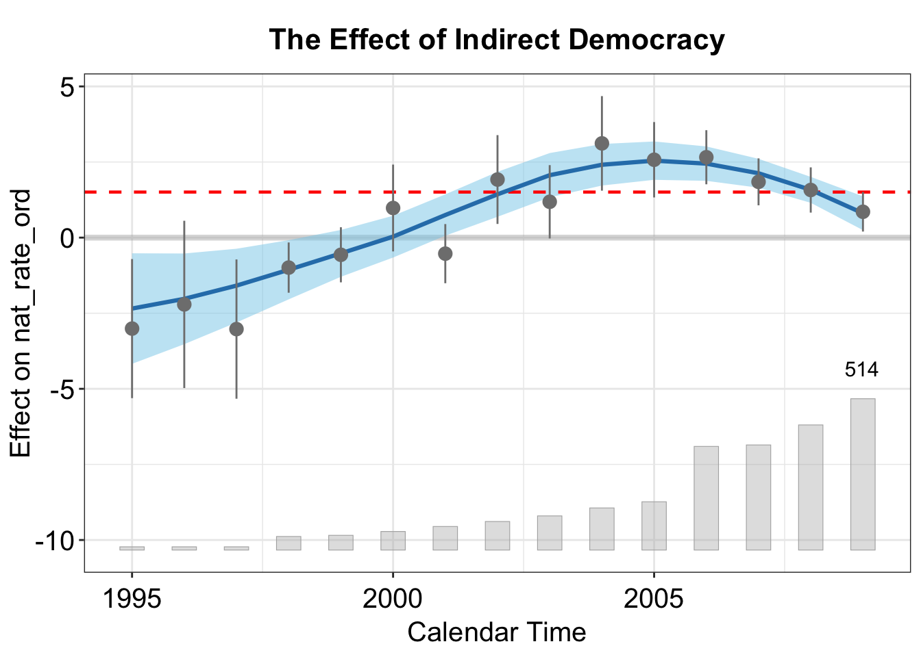
We will be using two datasets in this chapter. As explained in Chapter 5, Grumbach and Sahn (2020) examines the mobilizing effect of minority candidates on coethnic support in U.S. congressional elections. The treatment variable indicates the presence of an Asian candidate, and the outcome variable represents the proportion of general election contributions from Asian donors. Hainmueller and Hangartner (2019) study the effects of indirect democracy versus direct democracy (treatment) on naturalization rates (outcome) in Switzerland using municipality-year panel data from 1991 to 2009.
First, we load the required packages. The datasets, hh2019 and gs2020, are included with the fect package and can be loaded using data(fect).
3.2 Gap Plot
To create the gap plot, also known as the event study plot, we first apply fect, the fixed effects counterfactual estimator. For details, see Chapter 2.
out <- fect(Y = "general_sharetotal_A_all",
D = "cand_A_all",
X = c("cand_H_all", "cand_B_all"),
index = c("district_final", "cycle"),
data = gs2020, method = "fe",
force = "two-way", se = TRUE,
parallel = TRUE, nboots = 1000)
#> Some units are totally removed after drop missing values of the outcome or covariates.
#> Parallel computing ...
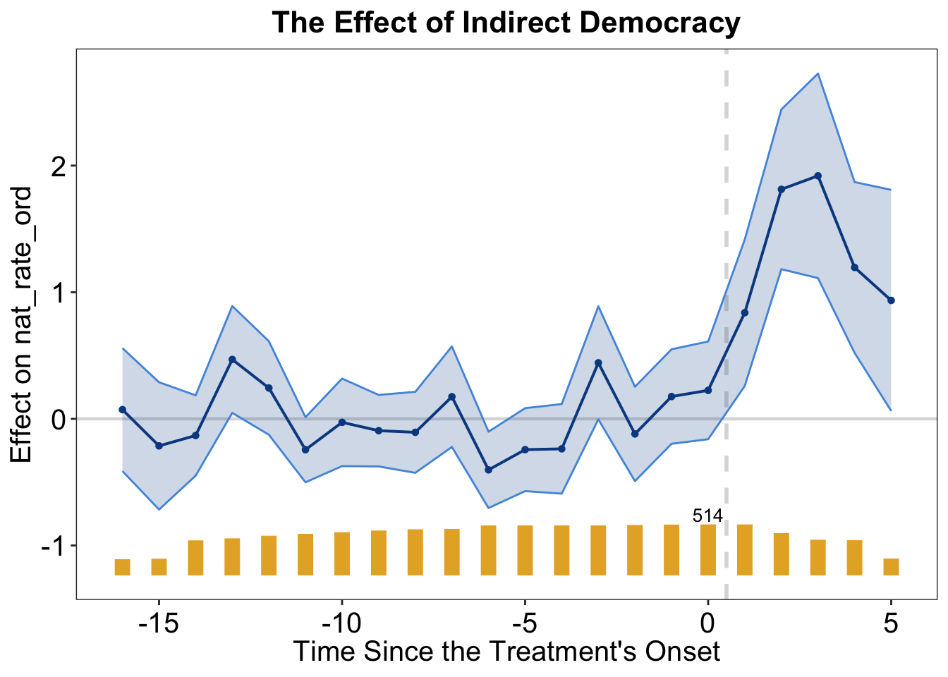
out.hh <- fect(nat_rate_ord ~ indirect,
data = hh2019,
index = c("bfs","year"),
method = 'fe', se = TRUE,
parallel = TRUE, nboots = 1000,
keep.sims = TRUE)
#> For identification purposes, units whose number of untreated periods <1 are dropped automatically.
#>
#> Parallel computing ...After running the model, we can plot the dynamic treatment effects over (relative) time, including confidence intervals if se = TRUE is specified in the estimation. Note that type = "gap" is the default option, so we omit it here.
plot(out) # the effect co-ethnic mobilization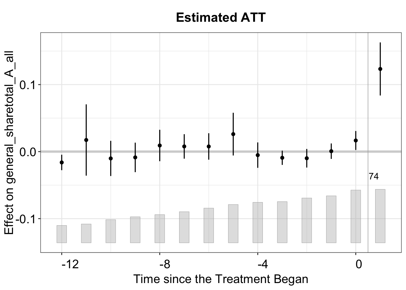
plot(out.hh) # the effect of indirect democrazy on naturalization rate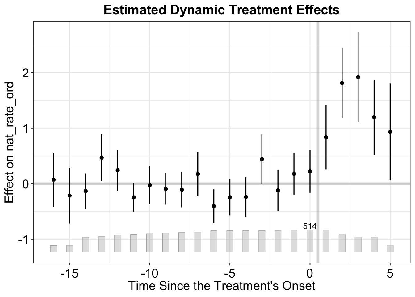
3.2.1 Starting Period
By default, the first post-treatment period is set to 0, and the last pre-treatment period is set to -1. However, some researchers prefer to designate the former as 1 and the latter as 0. To achieve this, set start0 = TRUE.
plot(out, start0 = TRUE,  # Shift time so treatment begins at 0
     main = "Custom Starting Period")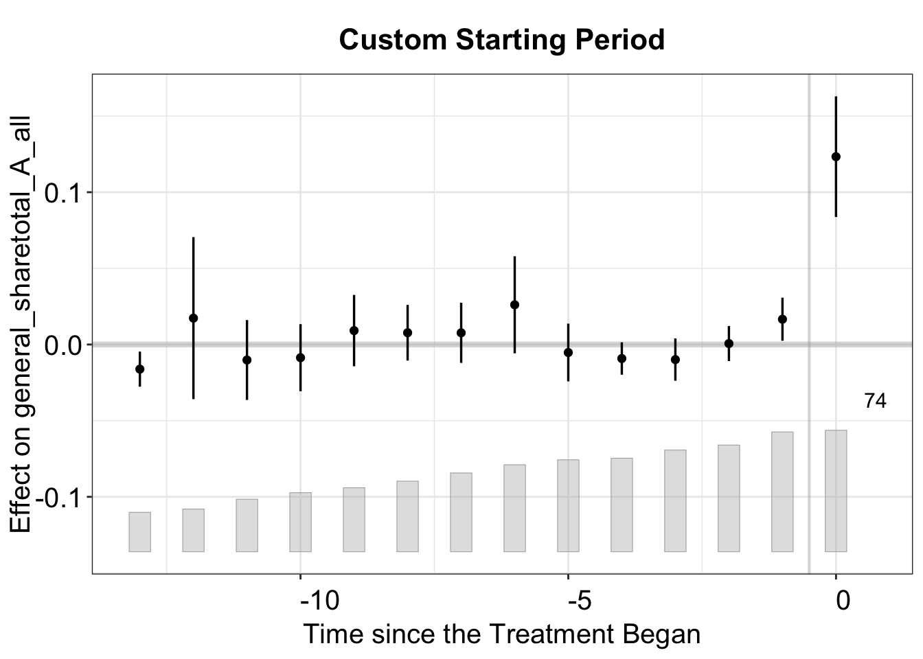
3.2.2 Axis and Legend
Below, we customize the x- and y-axis ranges, labels, tick breaks, and legend. The x-axis labels are rotated for clarity. Moreover, by setting xlim = c(-10, 1), the x-axis is restricted to time periods -8 to 1, with the treatment shifted to begin at period 0 instead of period 1. We also remove grid lines by setting gridOff = TRUE.
plot(out,
     xlim = c(-10, 1),  # only show time periods -8 to 1
     ylim = c(-0.15, 0.30),  # set y-range
     xlab = "Custom Time Axis", # x-axis label
     ylab = "Estimated ATT", # y-axis label
     xangle = 90, # rotate x-axis labels by 90°
     xbreaks = seq(-10, 1, by = 2),
     gridOff = TRUE,
     # Label x-axis from -12 to 1 with a break of 2
     main = "Axis and Legend Customization")
#> Scale for x is already present.
#> Adding another scale for x, which will replace the existing scale.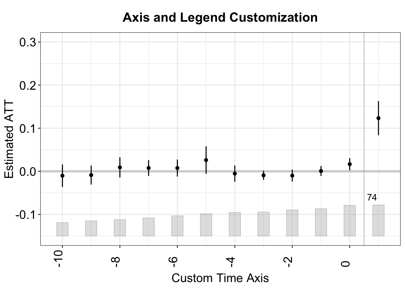
3.2.3 Confidence Intervals
Below, we plot the treatment effect with 90% confidence intervals instead of 95%.
plot(out, plot.ci = "0.9",
     main = "90% confidence intervals")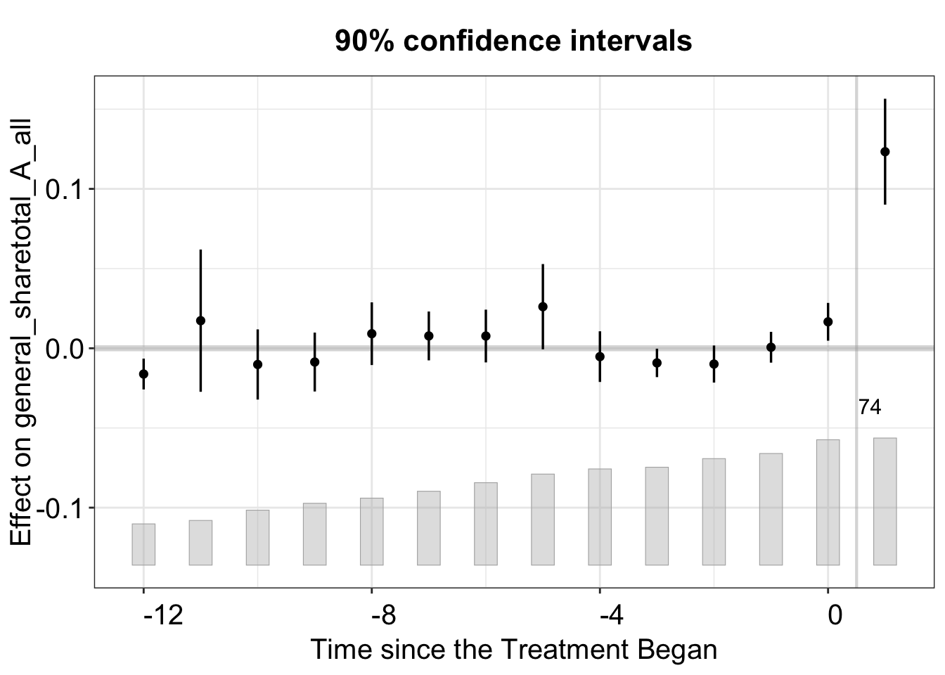
3.2.4 Text and ggplot2 Theme
This plot adjusts text sizes with a series of cex options and turns off the theme.bw option.
plot(out,
     ylim = c(-0.15, 0.3), # set yrange
     theme.bw = FALSE,      # Change the color theme
     cex.main = 1.25,     # Scale for the main title
     cex.axis = 1.2,      # Axis tick label size
     cex.lab = 1.2,       # Axis label size
     cex.legend = 1,    # Legend text size
     cex.text = 1.2,        # Annotation text size
     main = "Text and Theme Customization")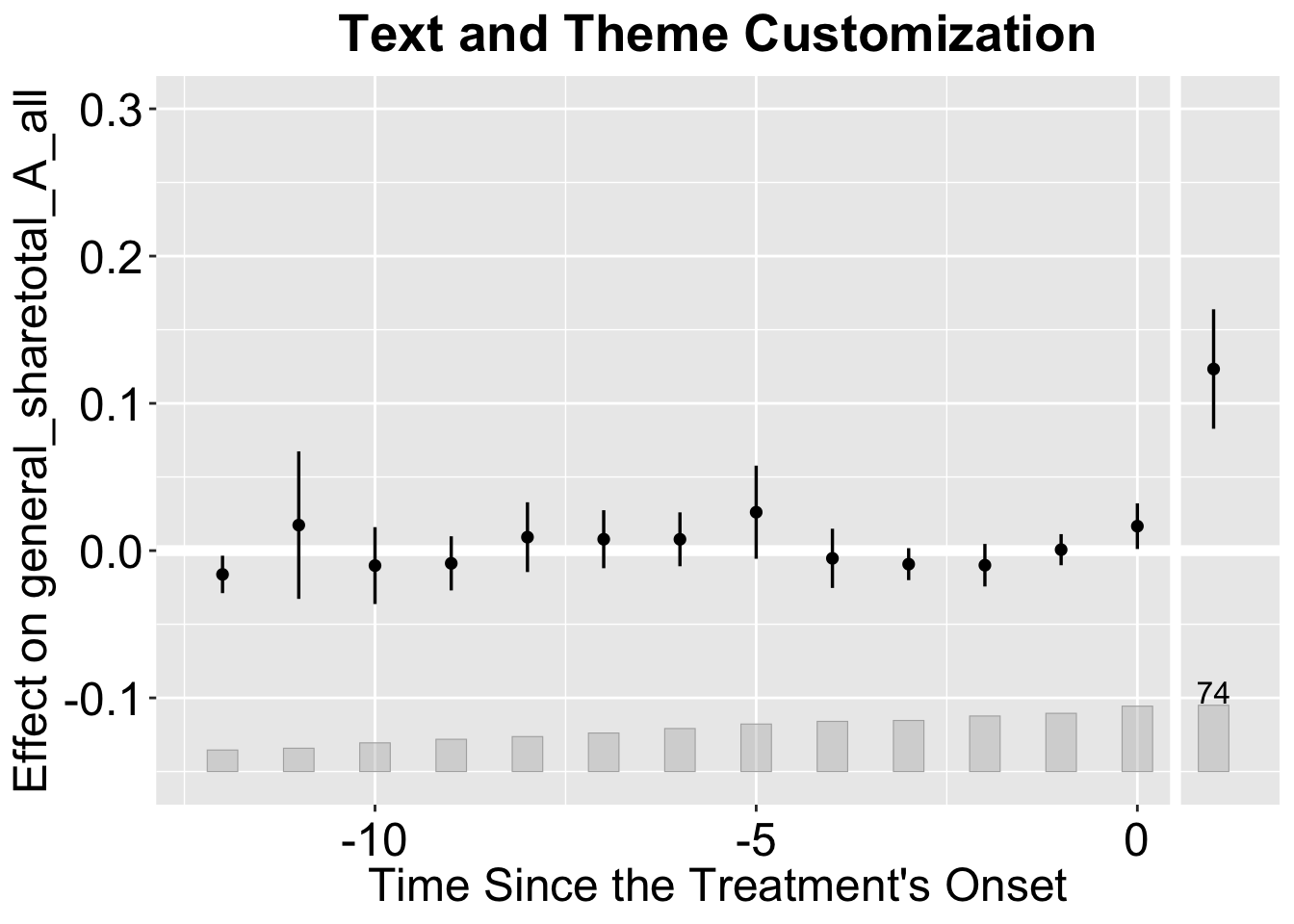
3.2.5 Presets
For convenience, we can use the preset argument to apply preset colors. The default is "default", which is mostly black and white with a bit of color. Other options include "vibrant" and "grayscale", which can be used to create more colorful or monochromatic plots, respectively.
plot(out,
     preset = "vibrant", # Use vibrant colors
     main = "Vibrant Preset Colors: Grumbach and Sahn (2020)")
plot(out.hh,
     preset = "vibrant", # Use vibrant colors
     main = "Vibrant Preset Colors: Hainmueller and Hangartner (2019)")
We can change the color of the estimates (and their confidence intervals) using the color option.
plot(out.hh,
     preset = "vibrant", # Use vibrant colors
     color = "green4", # Color of the estimates and CIs
     main = "Change Estimates' Color: Hainmueller and Hangartner (2019)")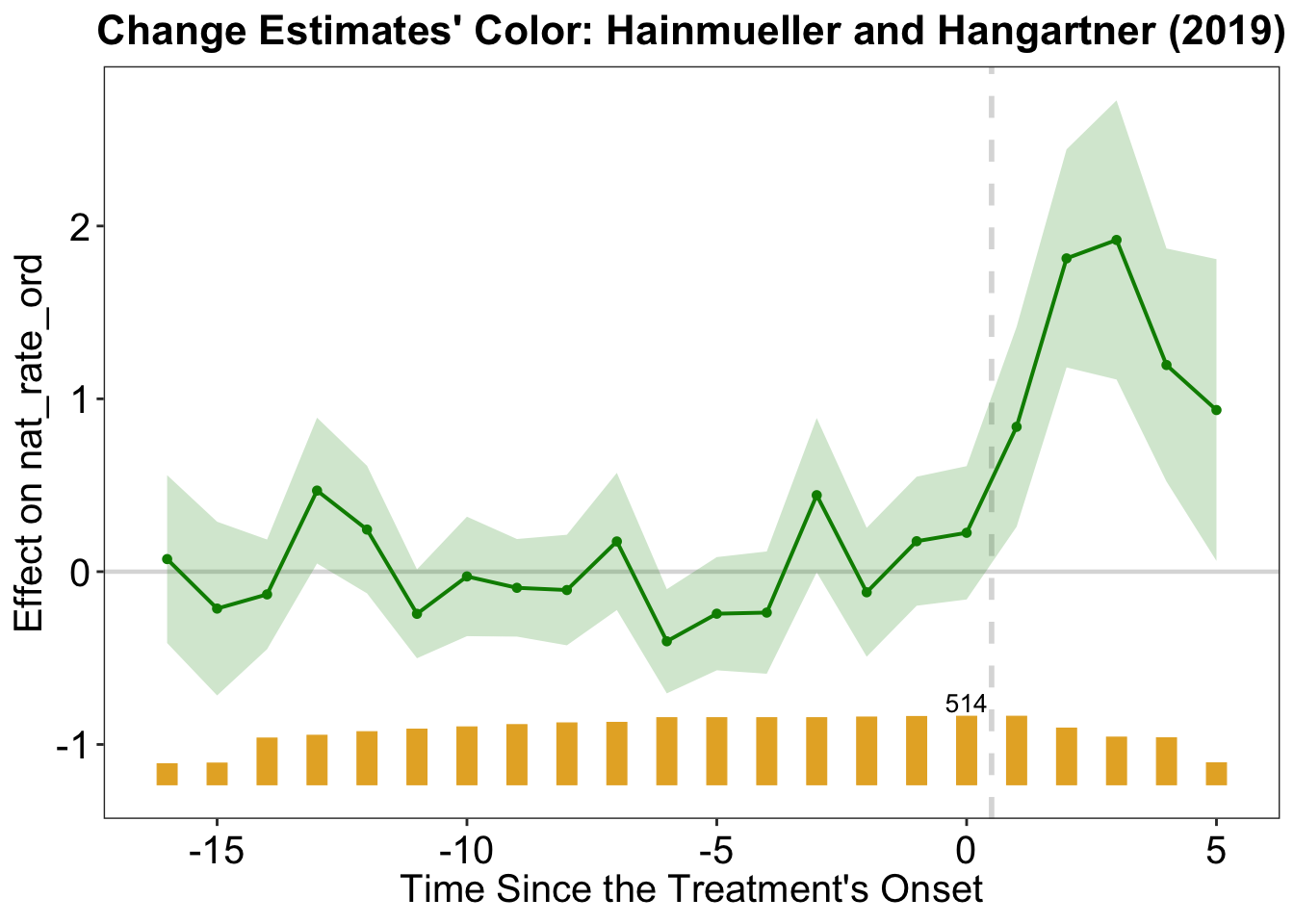
plot(out,
     preset = "grayscale", # Use grayscale colors
     main = "Grayscale Preset Colors")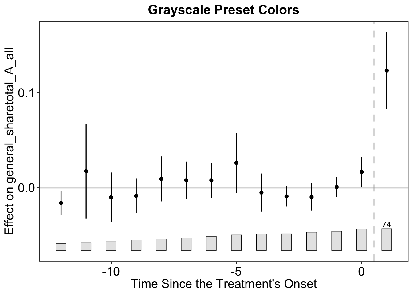
3.2.6 Connected Estimates
By default, the estimates are plotted as points. To connect the points with lines, set connected = TRUE. The width of the line and size of the points can be adjusted with est.lwidth and est.pointsize, respectively.
plot(out,
     color = "green4", # color of the estimates and CIs
     connected = TRUE, # Connect the points with lines
     est.lwidth = 1.2, # Makes the lines thicker
     est.pointsize = 3 # Makes the points larger
)
Moreover, in any plot that uses a shaded band to represent the CIs, we can set ci.outline to TRUE to draw an outline around the shaded band to improve visibility.
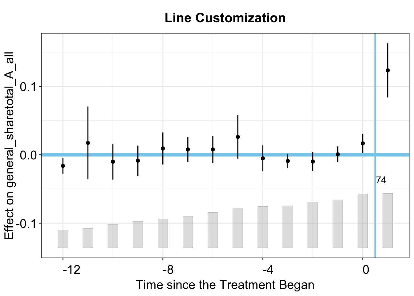
3.2.7 Line and Point Customization
Here, we demonstrate how to change main and the horizontal reference lines, as well as the points and lines in the plot.
3.2.8 Count Histogram Customization
The count histogram on the bottom of the graph shows the number of treated units in each period. To customize its color, outline color, and opacity, we can use the count.color, count.outline.color, and count.alpha options, respectively.
plot(out,
     count.color = "lightblue", # Color of the histogram bars
     count.outline.color = "darkblue", # Outline color of the histogram bars
     count.alpha = 0.2, # Opacity of the histogram bars
     main = "Count Histogram Customization")
3.3 Counterfactual Plot
While the gap plot shows the difference (ATT) over time, researchers often want to see the levels: the observed outcome for the treated unit(s) and the model‑predicted counterfactual path side‑by‑side. To do this, set type = "counterfactual":
plot(out, type = "counterfactual",
     main = "Grumbach & Sahn (2020): Treated vs. Counterfactuals",
     ylab = "Proportion of Asian Donation",
     legend.pos = "bottom")
plot(out.hh, type = "counterfactual",
     main = "Hainmueller & Hangartner (2019): Treated vs. Counterfactuals",
     ylab = "Naturalization Rate",
     legend.pos = "top")
We can change the color of the lines in this plot using color, which sets the color of the main line, and counterfactual.color, which sets the color of the counterfactual line (as well as the color of the confidence band but with more transparency). Additionally, we can add an outline to the CIs with ci.outline = TRUE.
plot(out.hh, type = "counterfactual",
     main = "Hainmueller & Hangartner (2019): Treated vs. Counterfactuals",
     ylab = "Naturalization Rate",
     legend.pos = "bottom",
     ci.outline = TRUE, # Outline the confidence interval band
     color = "red3", # Color for the main line
     counterfactual.color = "green4") # Color for the counterfactual line
We can also visualize the paths of the individual units by setting raw = "all"
plot(out, type = "counterfactual", raw = "all")
#> Warning: Removed 331 rows containing missing values or values outside the scale range
#> (`geom_line()`).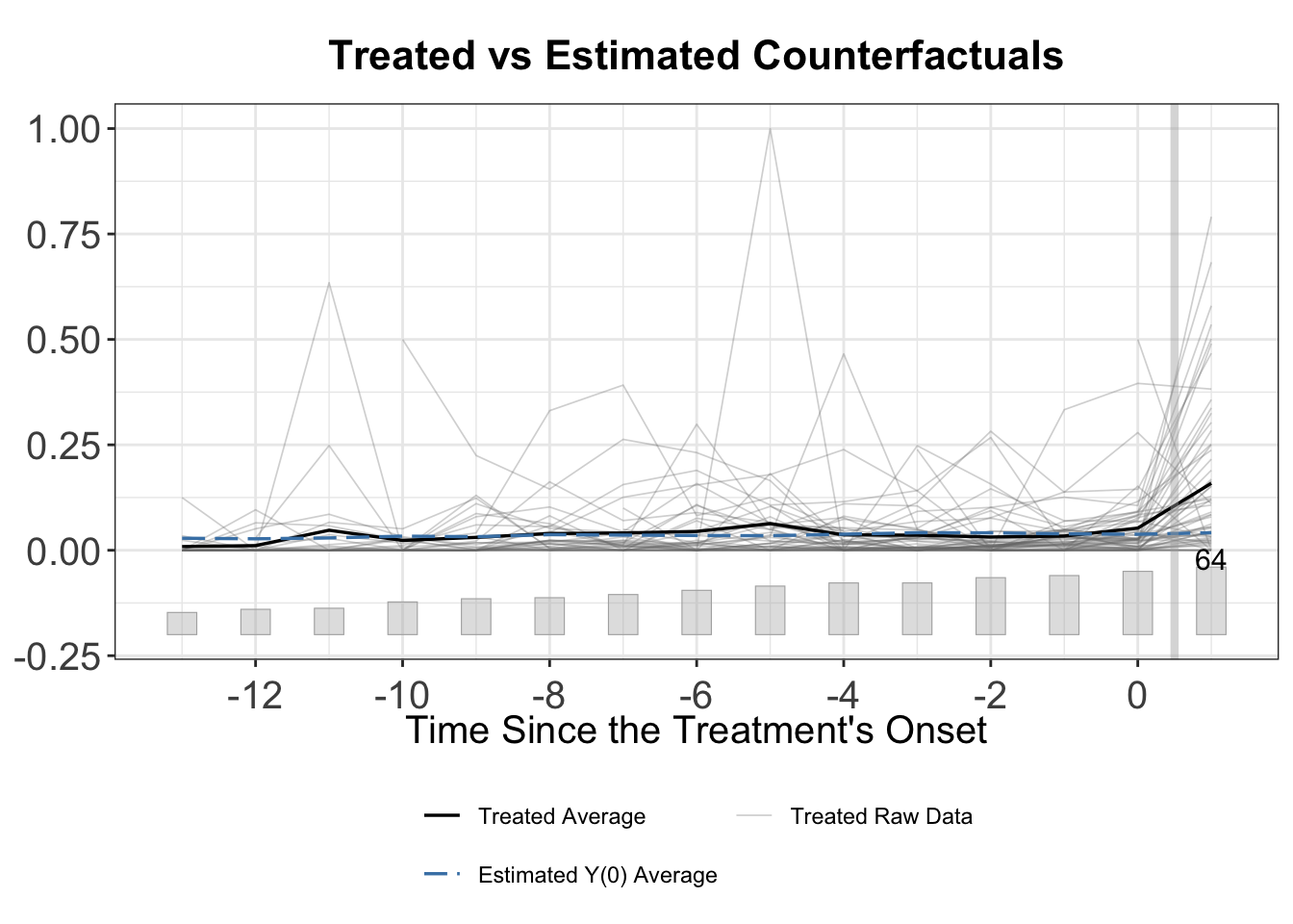
Setting raw = "band displays the the 5-95 interpercentile range of the treated and control units. When adoption is staggered, only the band around the treated units is shown.
plot(out, type = "counterfactual", raw = "band")
We can also change the colors in this plot using the same options as in the gap plot, as well as the counterfactual.color, counterfactual.raw.controls.color, counterfactual.raw.treated.color, and counterfactual.linetype options.
plot(out, type = "counterfactual",
     count.color = "black", # Color for the count histogram
     count.alpha = 1, # Opacity for the count histogram
     color = "red", # Color for the main line
     counterfactual.color = "purple", # Color for the counterfactual line
     counterfactual.raw.treated.color = "orange", # Color for the treated units
     counterfactual.linetype = "dotted", # Line type for the counterfactual line
     raw = "all",
     main = "Counterfactual Plot with Custom Colors")
#> Warning: Removed 331 rows containing missing values or values outside the scale range
#> (`geom_line()`).
3.4 Cumulative Effects
We can also plot cumulative effects by plotting the output of the effect() function. Note that this is only well-defined when there are no treatment reversals, that is, all treated units remain treated for the duration of the study. Additionally, we must set keep.sims = TRUE to keep the unit-level bootstrap results. We first apply it to hh2019.
plot(effect(out.hh), main = "Cumulative Effect of Indirect Democracy",
     ylab = "Cumulative Effect on Naturalization Rate")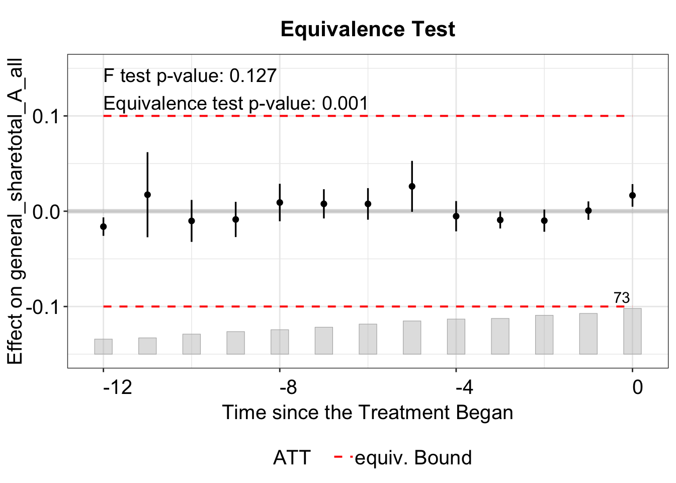
Since the gs2020 datset has treatment reversals, we will first subset the units that remained treated throughout the study period. We do this by checking for any instances where the treatment variable changes from 1 to 0 within a unit.
# flag units that ever have a 1 to 0 change in d
rev_flag <- tapply(gs2020[["cand_A_all"]],
                   gs2020[["district_final"]],
                   function(x) any(diff(x) < 0))

# units with no reversals
good_units <- names(rev_flag)[!rev_flag]

# subset the desired rows
gs2020_no_reversals <- gs2020[gs2020[["district_final"]] %in% good_units, ]
Next we will estimate the function again on these units only.
out_no_reversals <- fect(Y = "general_sharetotal_A_all",
                         D = "cand_A_all" ,
                         X = c("cand_H_all", "cand_B_all") ,
                         index = c("district_final", "cycle"),
                         data = gs2020_no_reversals,
                         method = "fe",
                         force =  "two-way",
                         se = TRUE, parallel = TRUE,
                         nboots = 100,
                         keep.sims = TRUE)
#> Some units are totally removed after drop missing values of the outcome or covariates.
#> Parallel computing ...
#> Can't calculate the F statistic because of insufficient treated units.
Finally, we will plot the cumulative effects.

3.5 Pretrend Tests
We can conduct several tests to shed light on (not directly test) the parallel trends (PT) assumption, including the equivalence test and the placebo test. For details, see Chapter 2 or Liu, Wang, and Xu (2024).
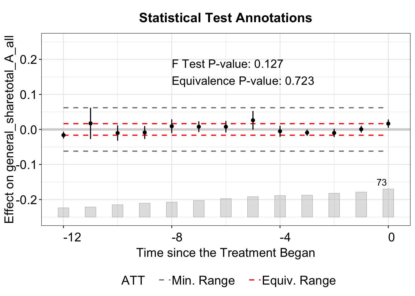
3.5.1 Equivalence Test
In the equivalence plot (type = "equiv"), the equivalence bound is defined by the two-one-sided test (TOST) threshold. For example, in the plot below, the bound is set by tost.threshold = 0.1, with lines at -0.1 and 0.1. This threshold should be set based on the magnitude of the ATT or the standard deviation of the outcome (or residualized outcome).
The bound option has four choices: "none", "min", "equiv", or "both". When set to "none", no bound is displayed.
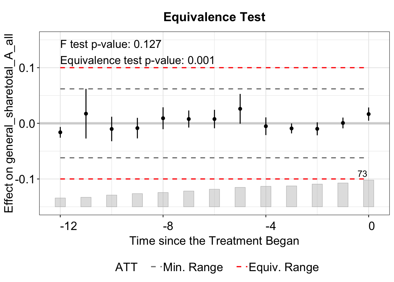
The "min" displays the minimum range bound based on the maximum absolute pre‐treatment residual (e.g., if the largest pre-treatment estimate is 0.3, lines at -0.3 and 0.3).
We can plot both the minimum range and the equivalence bound with bound = "both", which is also the default option.
We use the stats argument to select which results to display, label them with stats.labs, and position the legend with stats.pos. Setting show.stats = FALSE hides the test results entirely.
3.5.2 Placebo Test
A placebo test evaluates whether the “fake” ATT is statistically distinguishable in a placebo period. It artificially assigns treatment during placebo periods and estimates the “placebo effect” in those periods.
Therefore, the model must be re-run. Below, we set placebo.period = c(-2, 0), specifying the pre-treatment periods used for the placebo test.
out_fe_placebo <- fect(Y = "general_sharetotal_A_all", D = "cand_A_all", X = c("cand_H_all", "cand_B_all"), data = gs2020,
                       index = c("district_final", "cycle"), force = "two-way",
                       method = "fe", CV = FALSE, parallel = TRUE,
                       se = TRUE, nboots = 1000, placeboTest = TRUE,
                       placebo.period = c(-2, 0))
#> Some units are totally removed after drop missing values of the outcome or covariates.
#> Parallel computing ...

plot(out_fe_placebo)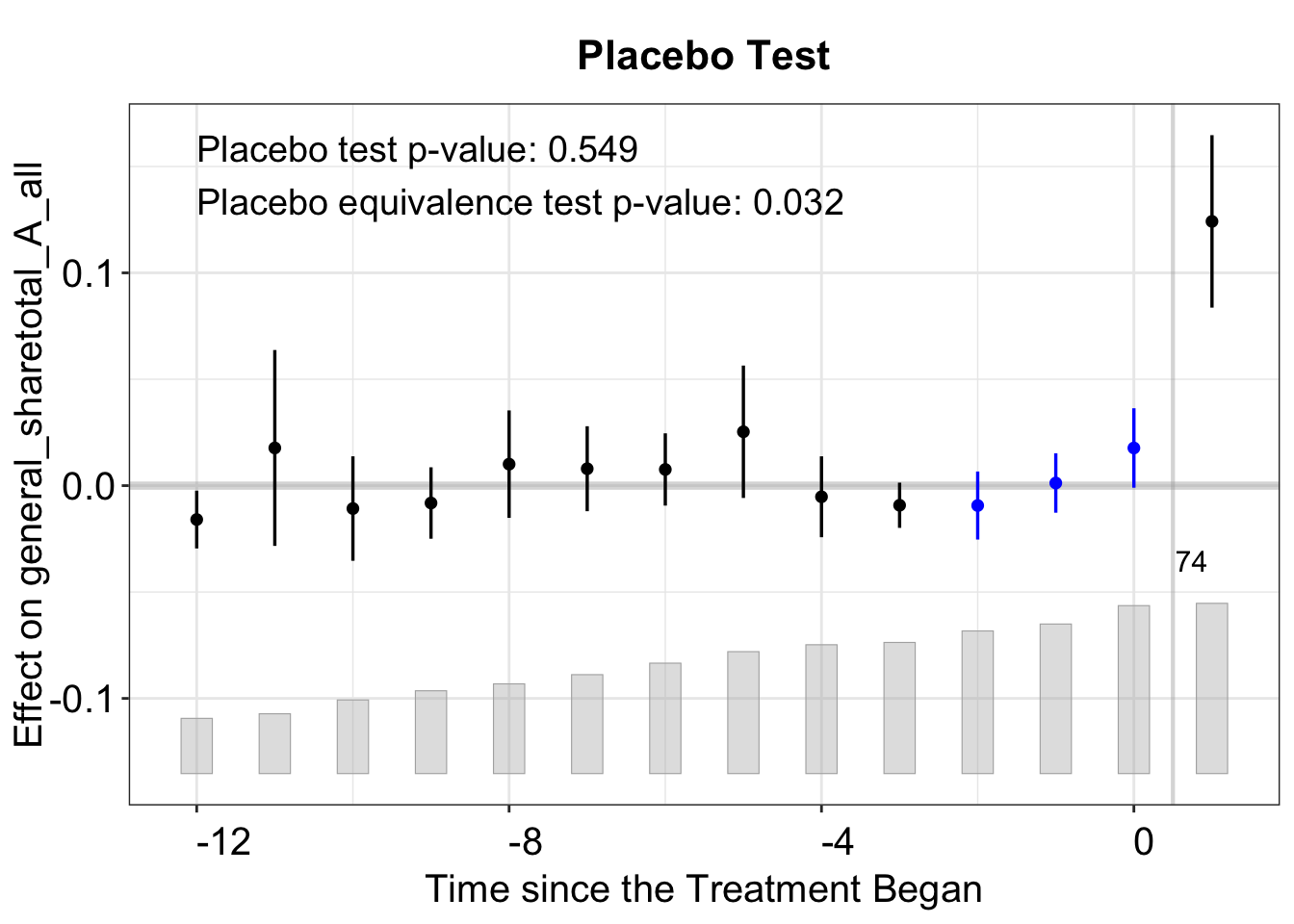
The plot shows the estimated “effects” in the pre-treatment periods (placebo effects). The blue lines in the pre-treatment period suggest that we do not observe significant effects of the treatment in the pre-periods.
We can also change the color of the placebo periods by using the placebo.color argument. Colors for many other plot types can also be adjusted in a similar way, including, but not limited to, the carryover and box plots.
plot(out_fe_placebo, placebo.color = "green4")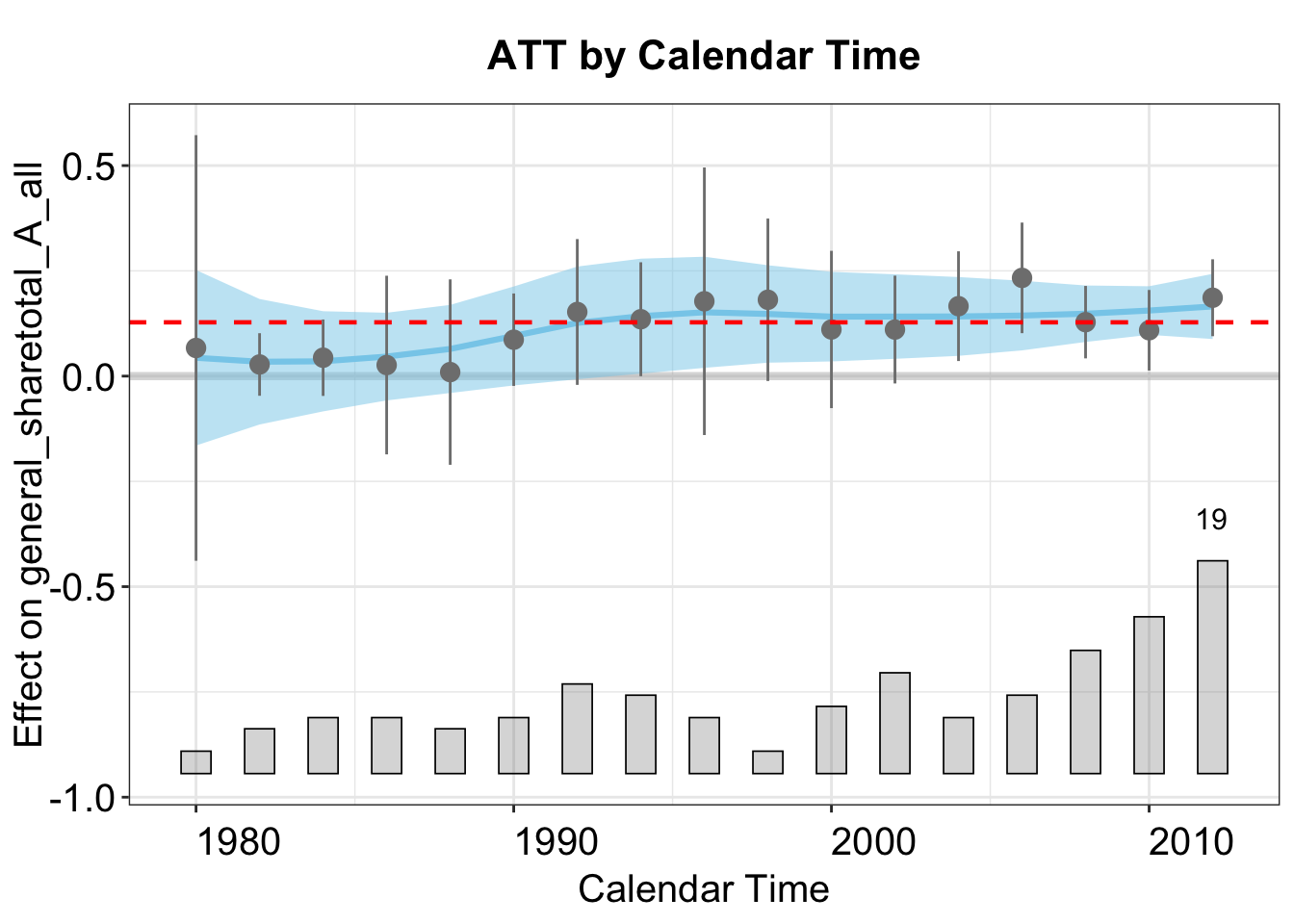
3.6 Carryover Effects
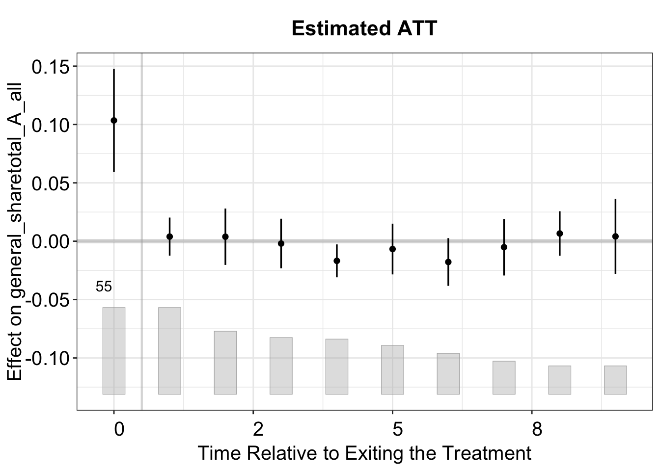
One type of plot rarely seen in the empirical literature is how the difference between treatment and control groups evolves after treatment ends. We call it the "exit" plot, where the x-axis represents time relative to treatment exit. In contrast, the "gap" plot focuses on treatment entry. The "exit" plot is essential for assessing potential carryover effects.
plot(out_fe_placebo, type = "exit")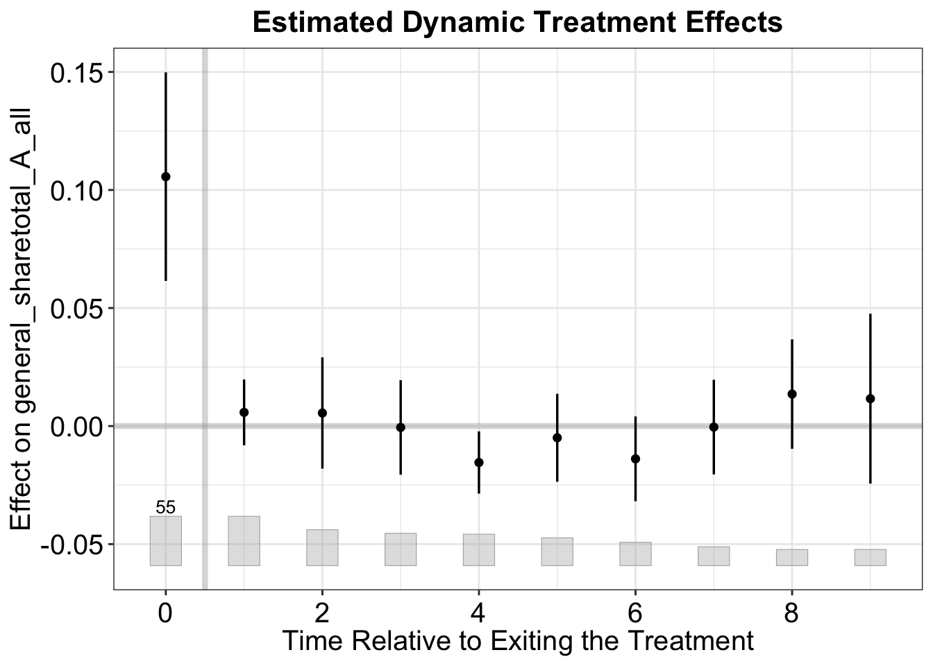
The test for carryover effects examines whether the treatment effect persists after treatment ends. It artificially labels several post-treatment periods as treated and estimates the “placebo effect” in those periods. By setting carryover.period = c(1, 3), we specify a placebo period that includes three post-treatment periods. If the treatment effect is purely contemporaneous (i.e., there are no carryover effects), the test will not reject the null hypothesis. In this application, the average carryover effect is close to zero and statistically indistinguishable from zero.
out_fe_carryover <- fect(Y = "general_sharetotal_A_all", D = "cand_A_all", X = c("cand_H_all", "cand_B_all"), data = gs2020,
                       index = c("district_final", "cycle"), force = "two-way",
                         parallel = TRUE, se = TRUE, CV = FALSE,
                         nboots = 1000, carryoverTest = TRUE,
                         carryover.period = c(1, 3))
#> Some units are totally removed after drop missing values of the outcome or covariates.
#> Parallel computing ...
plot(out_fe_carryover)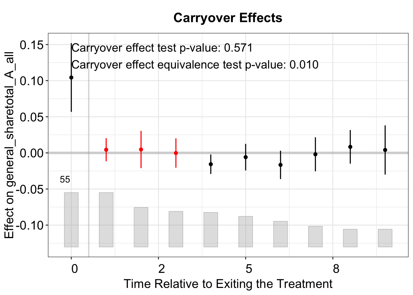
3.7 Status Plot
The status plot (type = "status") displays the treatment status by period for all units in a similar fashion to panelView. Each of the indicator colors can be customized using the status.*.color options.
plot(out_fe_carryover, type = "status",
     status.treat.color      = "#D55E00",  # Color for treated units
     status.control.color    = "#0072B2",  # Color for control units
     status.carryover.color  = "#CC79A7",  # Color for carryover units
     status.missing.color    = "#009E73",  # Color for missing data
     status.background.color = "#F3EAD2",  # Background color
     main = "Status Plot")
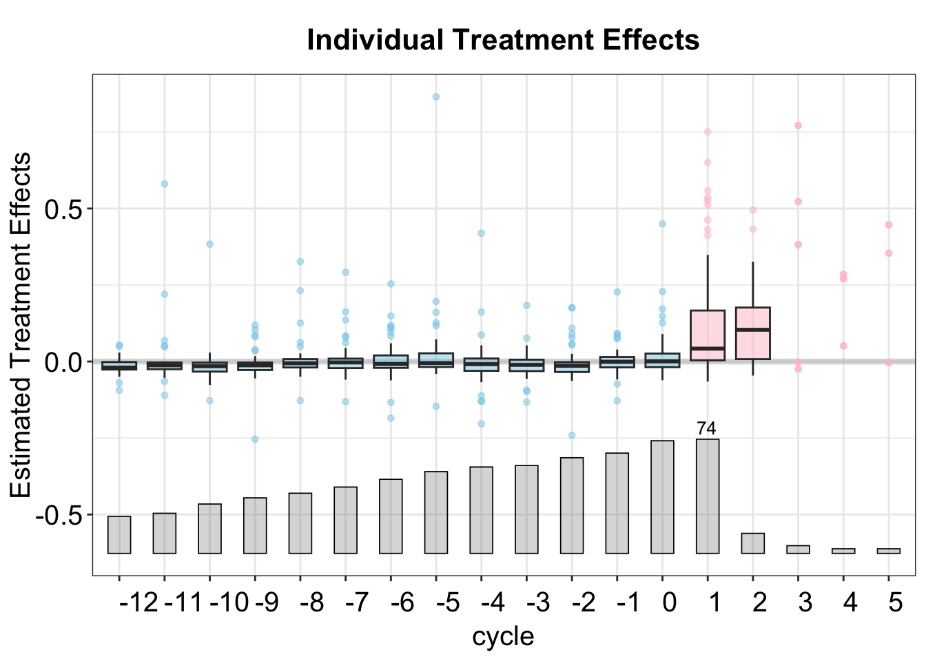
3.8 Effect Heterogeneity
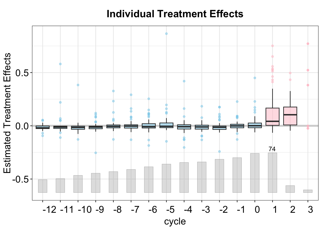
We provide two ways to visualize treatment effect heterogeneity: a "box" plot, which shows the distribution of individual treatment effects, and a "calendar" plot, which depicts the ATT conditional on calendar time. We plan to expand this functionality to allow for more pre-treatment covariates soon.
In the box plot, the box in each period represents the range of the middle 50% of the individual effects, while the whiskers show the 2.5%–95% quantiles and the horizontal line represents the median.
In the calendar plot, the blue ribbon represents a loess fit of the conditional ATT, with 95% confidence intervals.