Tutorial
tutorial.RmdSyntax overview
| R.formula | type | Function |
|---|---|---|
| Y ~ D + X | missing |
show missingness in Y, D, or X. |
| Y ~ 1 | missing |
show missingness in Y. |
| 1 ~ Y | missing |
not allowed. |
| Y ~ D + X | treat |
show treatment status of D given complete data in Y, D, and X. |
| 1 ~ D + X | treat |
show treatment status of D given complete data in D and X. |
| 1 ~ D | treat |
show treatment status of D. |
| Y ~ 1 | treat |
not allowed; force type = “missing”. |
| Y ~ D + X | outcome |
show time-series of Y colored in D given complete data in Y, D, and X. |
| Y ~ 1 | outcome |
show time-series of Y. |
| Y ~ D + X | bivariate |
show relationship of Y and D given complete data in Y, D, and X. |
Note that Y, D, and X in the above table are merely labels; they can be any variables in a panel dataset.
Plot treatment & missingness
First, we show how to visualize the treatment conditions and missing values in a panel dataset. The treatment indicator may be dichotomous or have more than 2 levels. We first load the panelView package, which ships three datasets.
library(panelView)
#> ## See bit.ly/panelview4r for more info.
#> ## Report bugs -> yiqingxu@stanford.edu.
data(panelView)
ls()
#> [1] "a"           "capacity"    "dfdata_R"    "exceldata_R" "simdata"
#> [6] "tf"          "turnout"     "url"
Using the turnout dataset (a balanced panel), we show
the treatment status of Election Day Registration (EDR) in each state in
a given year (Xu
2017). The first variable on the right-hand-side of the regression
formula is designated as the treatment indicator. Including covariates
may change the plot because of missing values in these covariates. The
index option specifies the unit (group) and time
indicators. We can change the labels (titles) of x- and y-axes through
xlab and ylab, respectively.
panelview(turnout ~ policy_edr + policy_mail_in + policy_motor,
          data = turnout, index = c("abb","year"),
          xlab = "Year", ylab = "State")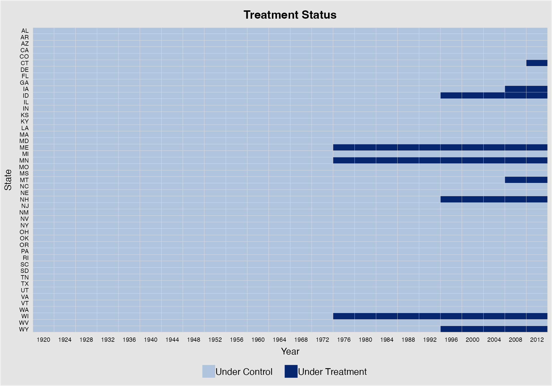
We can use the by.timing option to sort units by the
timing of receiving the treatment (then by the total number of periods
exposed to the treatment). Users can also specify the background color
using the background option and use various
cex options to adjust fontsizes for texts appearing in the
main title (cex.main), axes (cex.axis), axis
labels (cex.lab), and legend (cex.legend).
panelview(turnout ~ policy_edr + policy_mail_in + policy_motor,
          data = turnout, index = c("abb","year"),
          xlab = "Year", ylab = "State", by.timing = TRUE,
          legend.labs = c("No EDR", "EDR"), background = "white",
          cex.main = 20, cex.axis= 8, cex.lab = 12, cex.legend = 12)
#> Specified labels in the order of: Under Control, Under Treatment.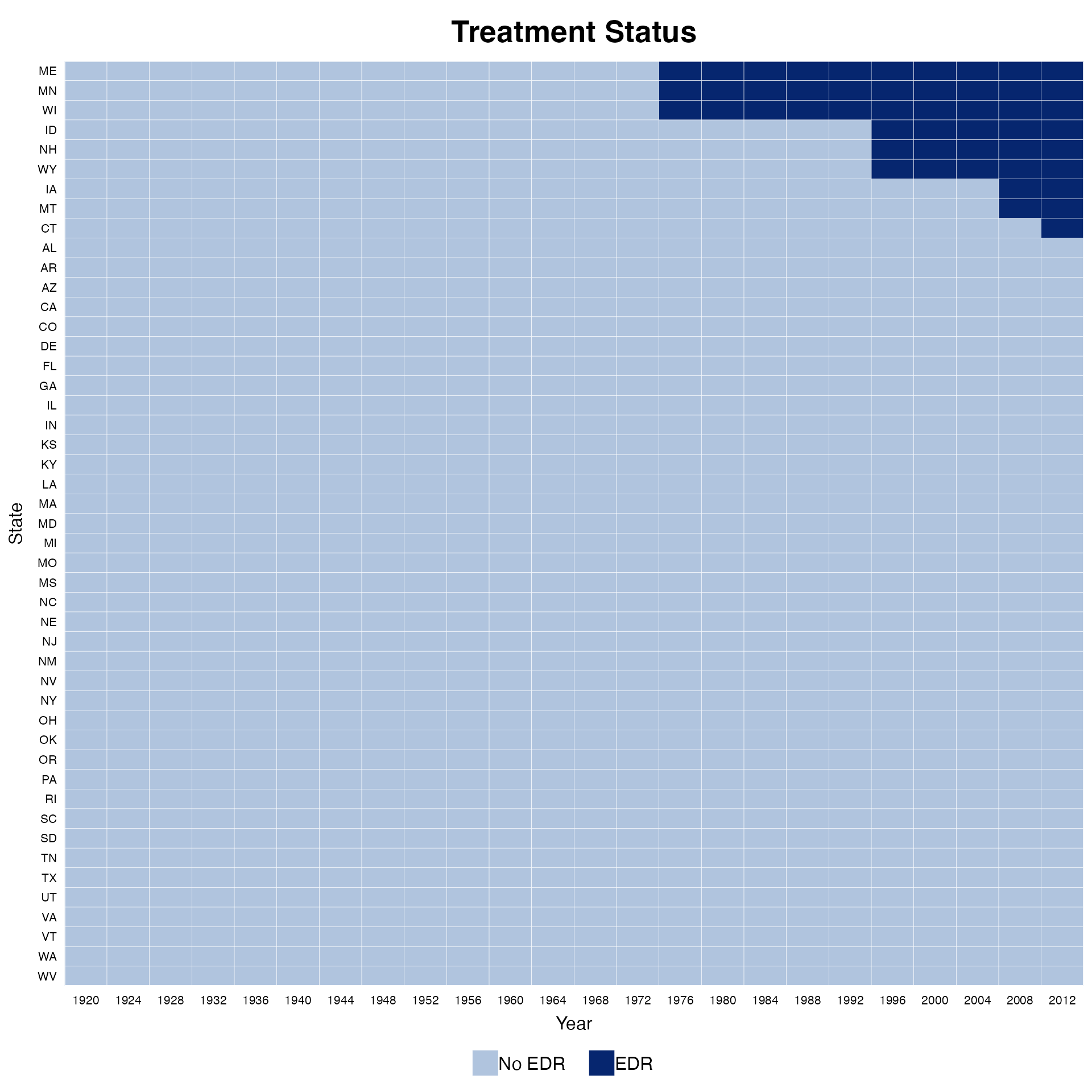
We can use the main option to change the title of the
plot, use the axis.lab.gap option to change the gaps
between labels on the x- and y-axes, and use the
legend.labs option to change the labels shown in the
legend. For DID-type TSCS data with a dichotomous treatment indicator,
we can distinguish the pre- and post-treatment periods for treated units
by specifying pre.post = TURE (which is set as default
prior to v.1.1.0):
panelview(turnout ~ policy_edr + policy_mail_in + policy_motor,
          data = turnout, index = c("abb","year"),
          xlab = "Year", ylab = "State", pre.post = TRUE)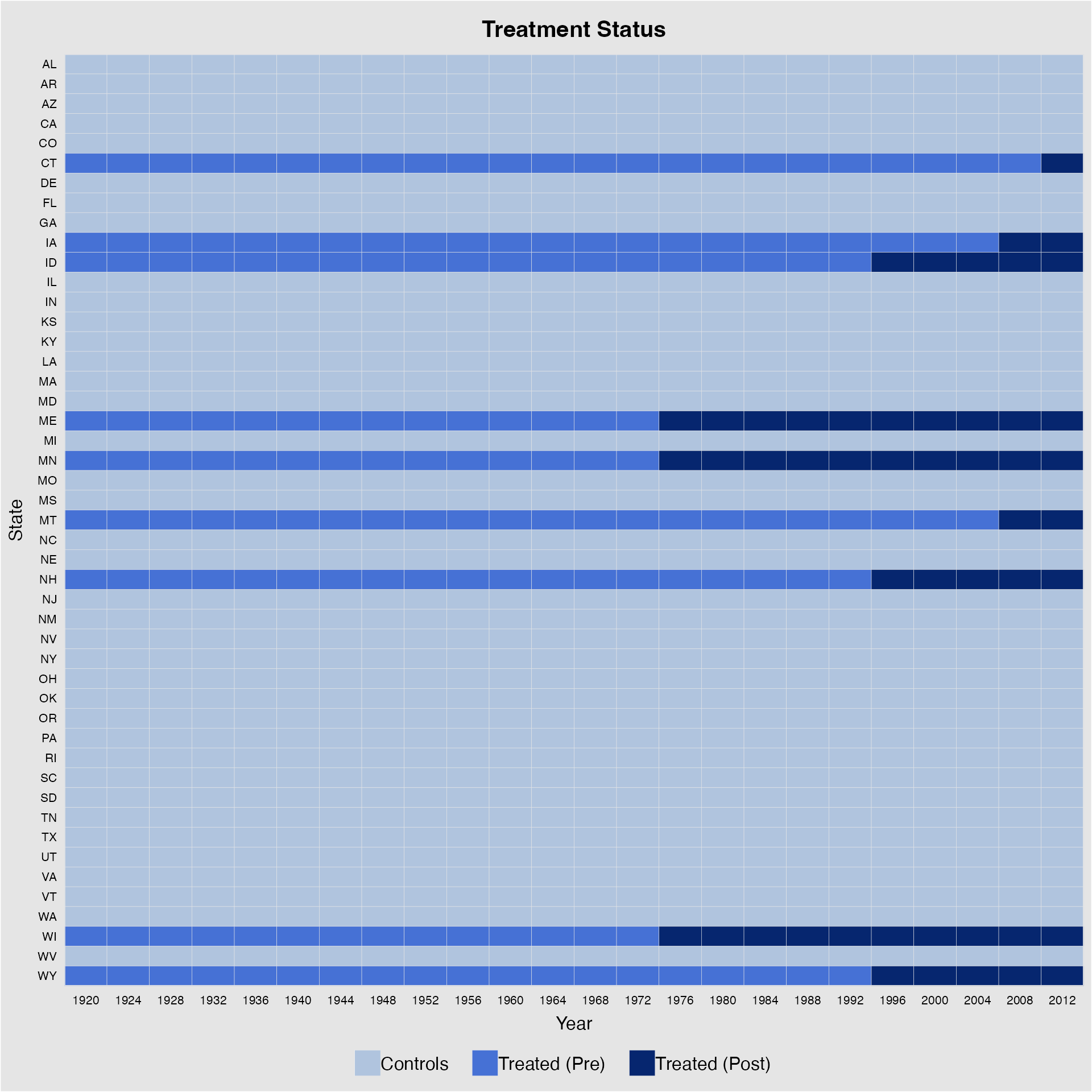
Again, we can change the labels in the legend. Make sure the length
of legend.labs is the same as the number of treatment
statuses (in this case, 3).
panelview(turnout ~ policy_edr + policy_mail_in + policy_motor,
          data = turnout, index = c("abb","year"),
          xlab = "Year", ylab = "State", by.timing = TRUE,
          pre.post = TRUE,
          legend.labs = c("Control States", "Treated States (before EDR)",
                          "Treated States (after EDR)"))
#> Specified labels in the order of: Controls, Treated (Pre), Treated (Post).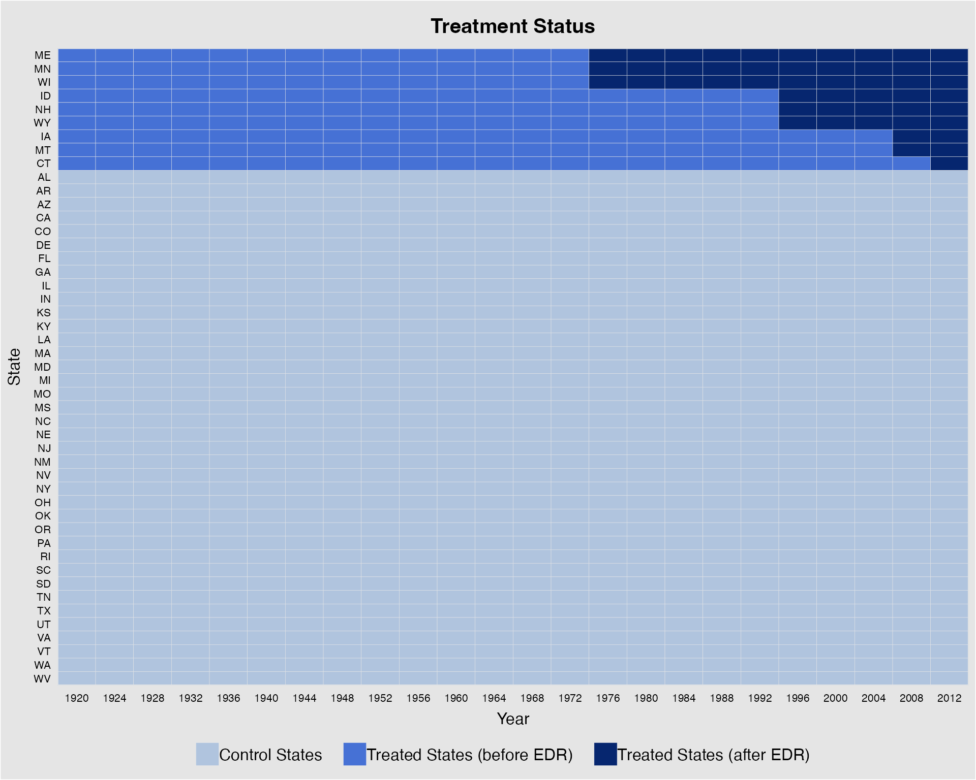
We can remove the labels on the y-axis (or x-axis) by specifying
axis.lab = "time" (or "unit"). Setting
axis.lab = "off" will remove labels on both axes. The
default is axis.lab = "both".
panelview(turnout ~ policy_edr + policy_mail_in + policy_motor,
          data = turnout, index = c("abb","year"),
          main = "EDR Reform", axis.lab = "time")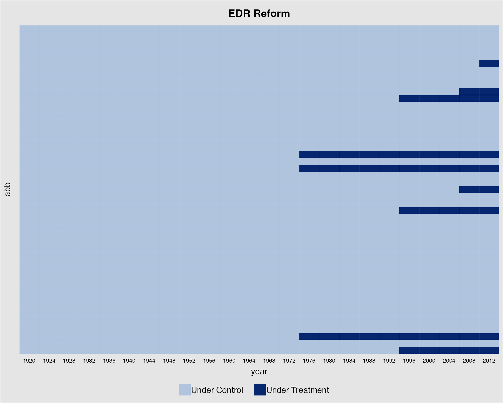
Instead of specifying a formula, we can also directly give the variable name of the treatment indicator:
panelview(D = "policy_edr", data = turnout, index = c("abb","year"),
          xlab = "Year", ylab = "State", pre.post = TRUE,
          main = "EDR Reform", axis.lab = "time")
We can change the colors of the bricks for the controls and treated
using the color option. Colors should be specified in the
order of “treated-pre”, “treated-post” and “control”—plus “missing” if
the dataset contains missing values—if pre.post = TRUE and
in the order of “control”, “treated” if
pre.post = FALSE:
library(dplyr)
#>
#> Attaching package: 'dplyr'
#> The following objects are masked from 'package:stats':
#>
#>     filter, lag
#> The following objects are masked from 'package:base':
#>
#>     intersect, setdiff, setequal, union
turnout %>% panelview(turnout ~ policy_edr + policy_mail_in + policy_motor,
                      color = c("#B0C4DE","white"), by.timing = TRUE,
                      index = c("abb","year"), xlab = "Year", ylab = "State")
#> Specified colors in the order of: Under Control, Under Treatment.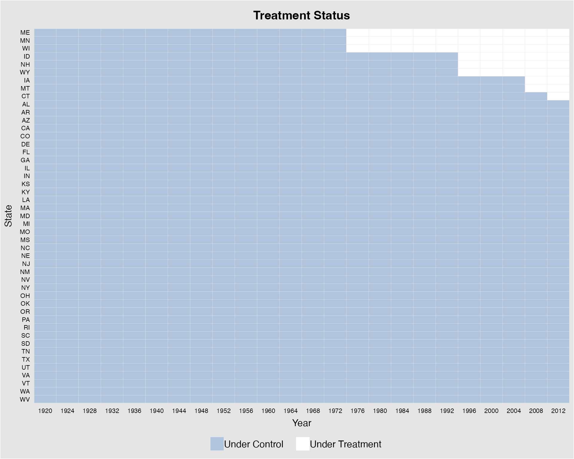
If the time variable is not evenly distributed, we can use
leave.gap = TRUE to show the gaps in time using white bars.
Otherwise, panelview will skip the time gaps and leave an
warning “Time is not evenly distributed (possibly due to missing
data).”
turnout2 <- turnout[!(turnout$year=="1924" | turnout$year=="1928" | turnout$year == "1940"),]
panelview(turnout ~ policy_edr + policy_mail_in + policy_motor,
          data = turnout2, index = c("abb","year"),
          type = "treat", leave.gap = TRUE)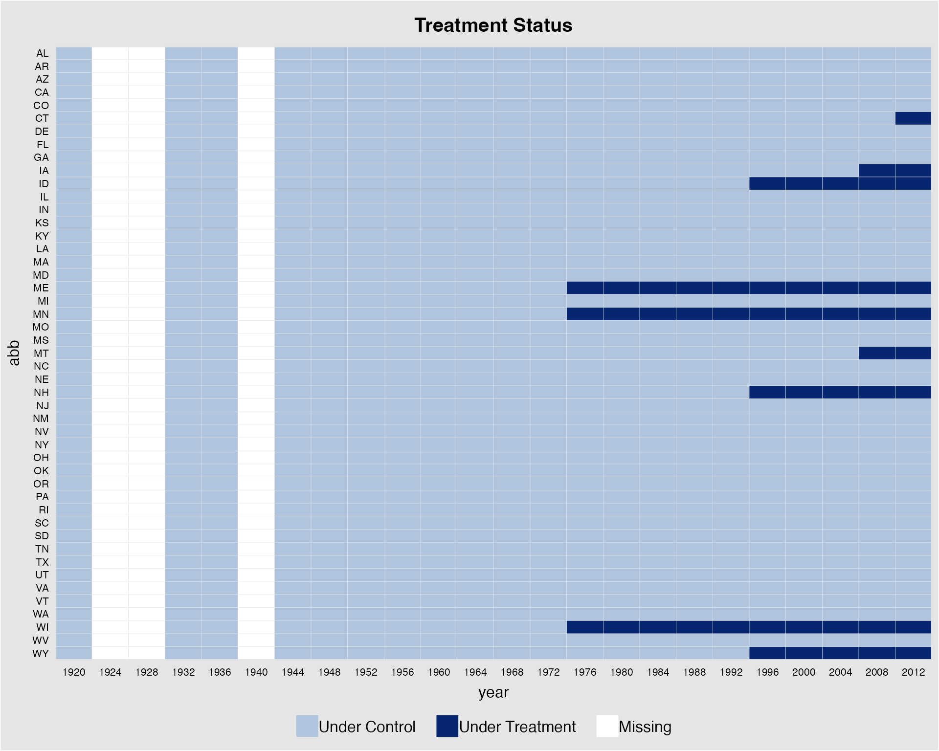
For a panel dataset in which the treatment may switch on and off, we
do not differentiate between pre- and post-treatment statuses. To
demonstrate how panelview can be used in a more general
setting, the following plot uses the capacity dataset,
which is used to investigate the effect of democracy, the treatment, on
state capacity, the outcome (Wang
and Xu 2018). From the figure below, we see quite a few cases of
democratic reversals and that there are many missing values.
panelview(Capacity ~ demo + lnpop + lngdp,
          data = capacity, index = c("ccode", "year"),
          main = "Democracy and State Capacity",
          axis.lab.gap = c(2,10))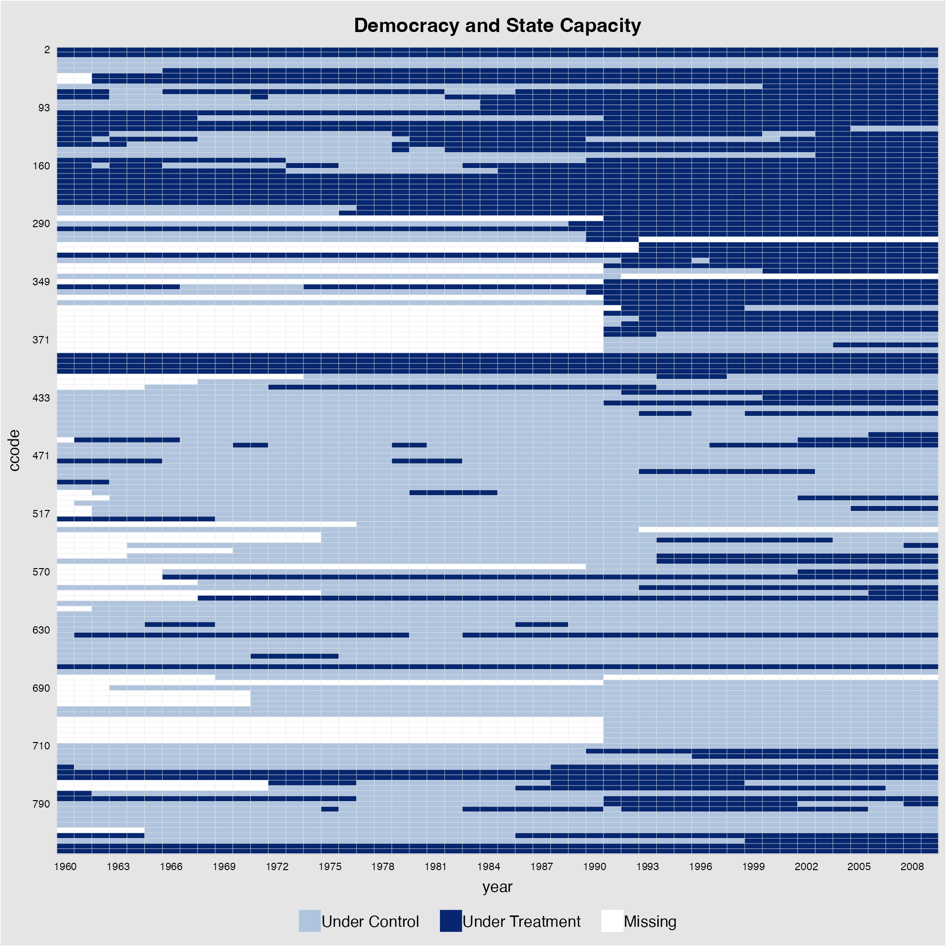
Sorting units based on the first period a unit receives the treatment
gives a more appealing visual; axis.lab.angle allows users
to change the look of the labels on the x-axis:
panelview(Capacity ~ demo + lnpop + lngdp,
          data = capacity, index = c("ccode", "year"),
          main = "Democracy and State Capacity: Treatment Status",
          axis.lab.angle = 90, by.timing = TRUE, axis.lab = "time")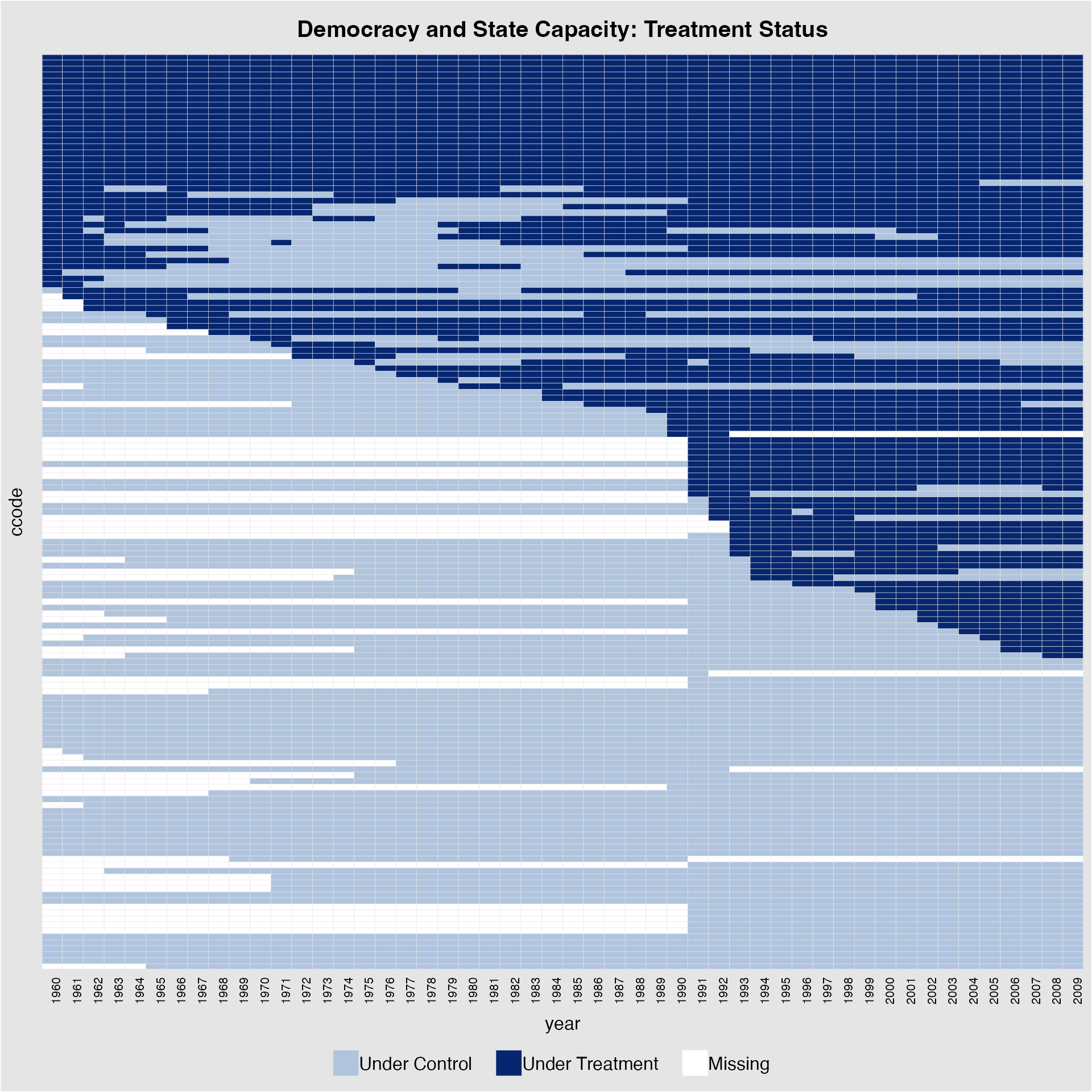
Collapse units by treatment histories
When the number of units is large, sometimes it is helpful to
collapse units based on their treatment histories. We can do so by
setting collapse.history = TRUE. See two examples below.
The units are sorted by the timing of first getting the treatment if
by.timing = TRUE or by the group size of each unique
treatment history, which is shown on the y-axis.
panelview(turnout ~ policy_edr + policy_mail_in + policy_motor,
          data = turnout, index = c("abb","year"), axis.lab.angle = 90,
by.timing = TRUE, collapse.history = "TRUE") 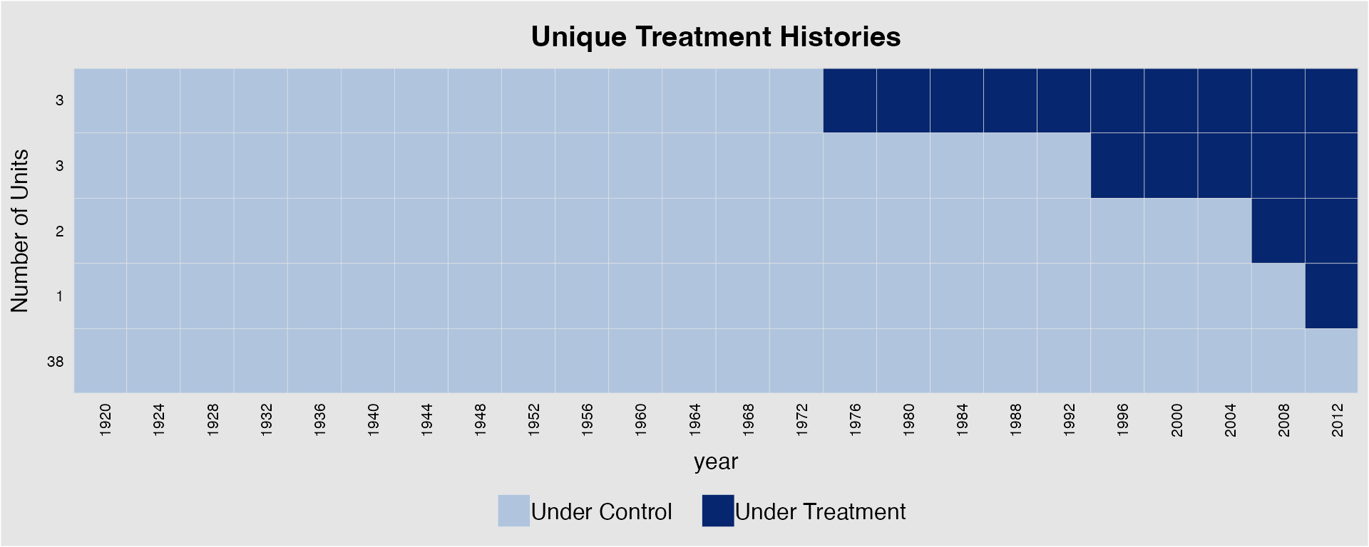
# sorted by treatment timing
panelview(Capacity ~ demo + lnpop + lngdp, data = capacity,
          index = c("ccode", "year"), axis.lab.gap = c(2,0),
axis.lab.angle = 90, collapse.history = "TRUE") 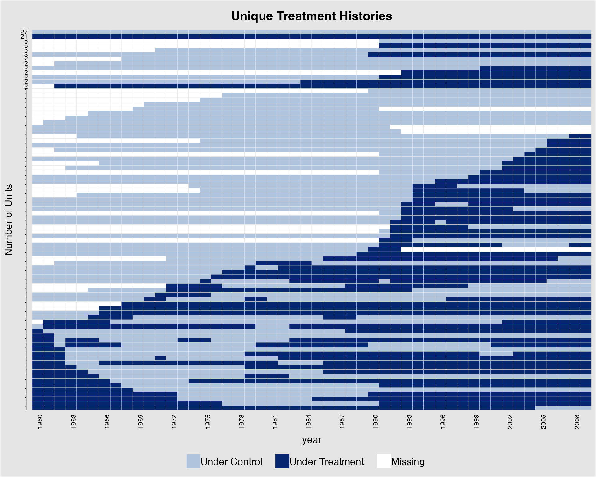
# sorted by cohort sizePlot a subset of units
Sometimes a dataset has many units and we only want to take a peak of
a subset of the units. panelview allows users to
specify the units to be be shown by specifying the show.id
(units in their alphabetical order) or id (original unit
ids recoded in the “unit” variable) options. In the following figure, we
plot the treatment statuses of the first 25 units.
panelview(Capacity ~ demo + lnpop + lngdp, data = capacity,
          index = c("ccode", "year"), axis.lab.gap = c(2,0),
          main = "Democracy and State Capacity", show.id = c(1:25))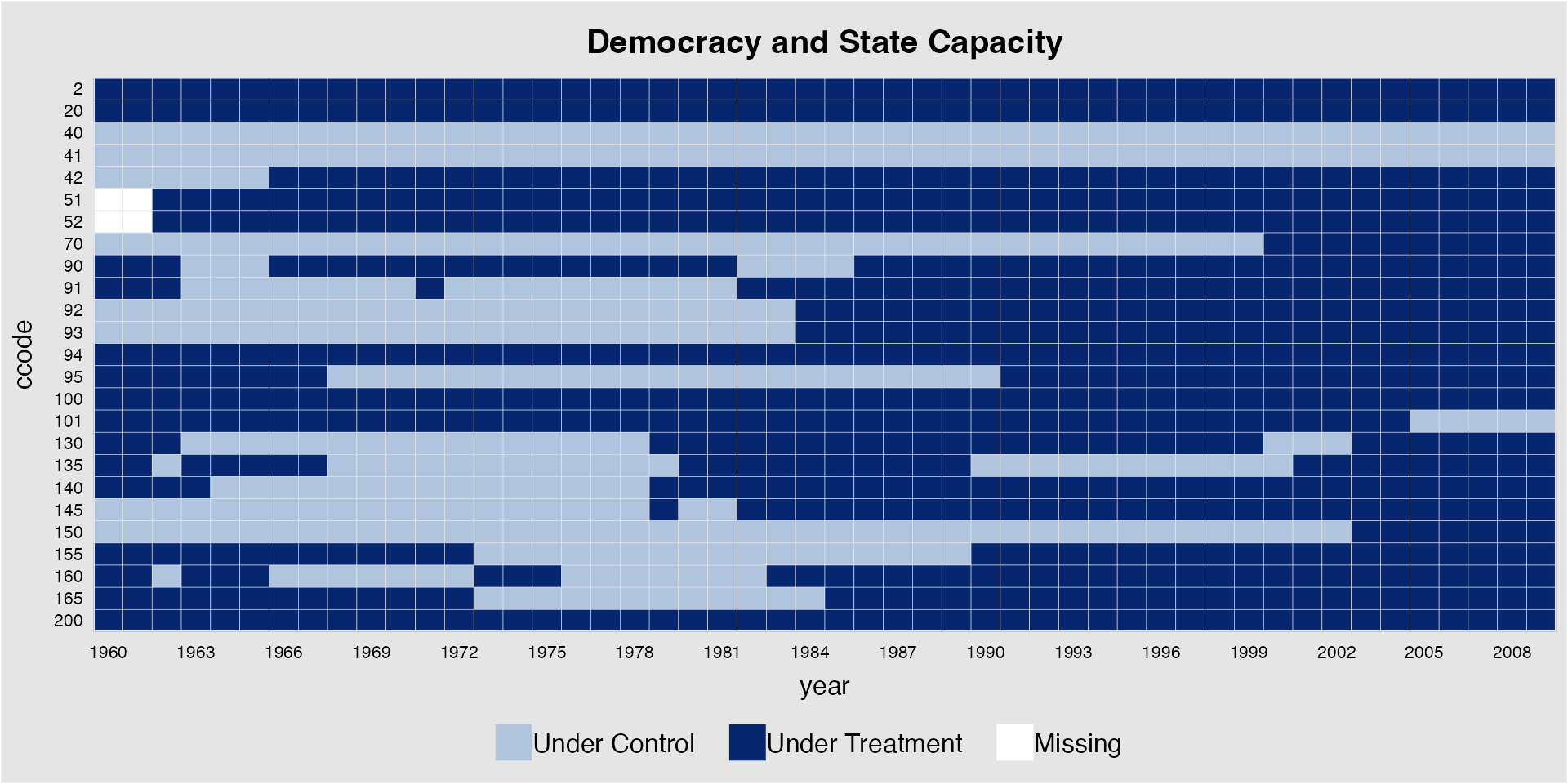
If the formula is not provided, we can use the argument
D to specify the treatment indicator. For example:
panelview(D = "demo", data = capacity, index = c("ccode", "year"),
          axis.lab.gap = c(2,0), main = "Democracy and State Capacity",
          show.id = c(1:25), type = "treat")
Below we plot the treatment statuses of the next 25 units by calling
their names, i.e., their ccode. Note that several countries
are removed from the plot due to missing values in the specified
variables.
panelview(Capacity ~ demo + lnpop + lngdp,
          data = capacity, index = c("ccode", "year"),
          axis.lab.gap = c(2,0),
          main = "Democracy and State Capacity",
          id = unique(capacity$ccode)[26:50], by.timing = TRUE)
#> List of units removed from dataset: 260 265 342 346 347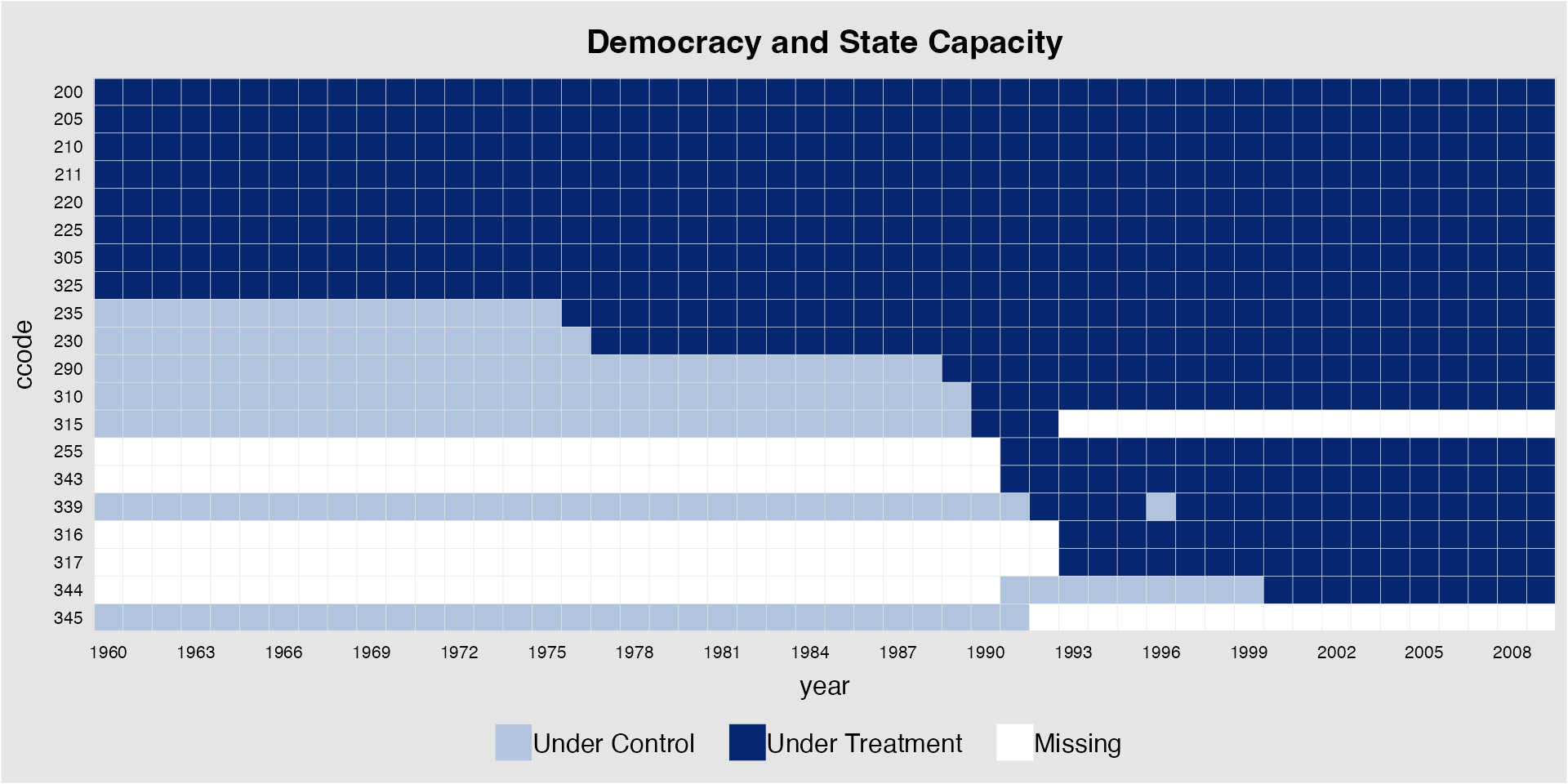
Plot missingness only
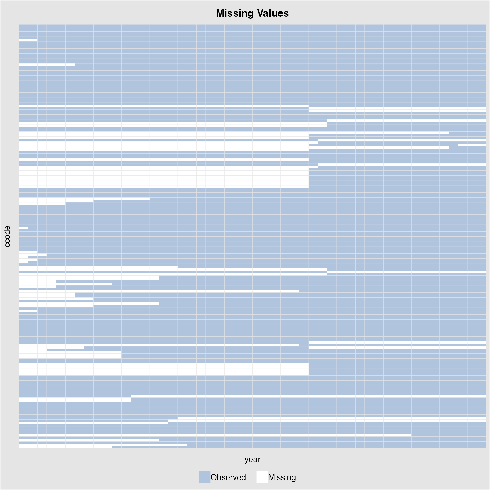
Starting from v.1.1.8, we allow users to plot missingness in by
setting type(missing) or type(miss).
We can also directly supply a variable name without specifying a formula:
capacity %>% panelview(Y = "Capacity",
                       index = c("ccode", "year"),
                       axis.lab.gap = c(2,10),
                       type = "miss")
When leave.gap = TRUE, time gaps are shown in the plot
when the time variable is not evenly distributed (the default is
FALSE):
capacity$demo[capacity$year == "1960" | capacity$year == "1980"] <- NA
capacity$lngdp[capacity$year == "1990"] <- NA
panelview(1 ~ demo + lngdp, data = capacity, index = c("ccode","year"),
          type = "missing", leave.gap = TRUE, axis.lab.gap = c(2,10))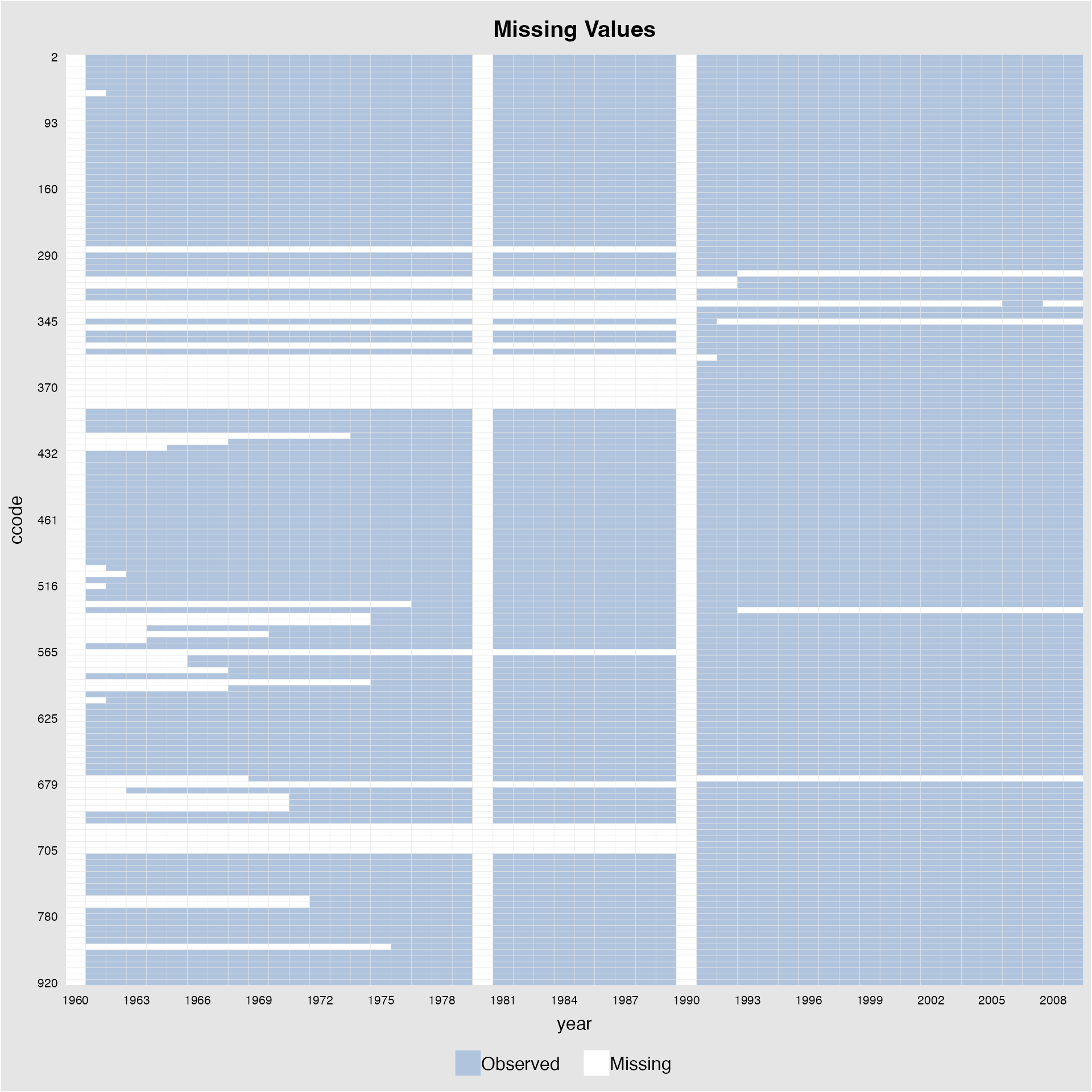
>2 treatment conditions
Starting from v.1.1.0, panelview supports TSCS data with more than 2 treatment levels. For example, we create a measure of regime type with three treatment levels.
demo2 <- rep(0, dim(capacity)[1])
demo2[which(capacity$polity2 < -0.5)] <- -1
demo2[which(capacity$polity2 > 0.5)] <- 1
capacity$demo2 <- demo2

panelview(Capacity ~ demo2 + lngdp,
          data = capacity, index = c("ccode", "year"),
          axis.lab.gap = c(2,10),
          main = "Regime Type")
#> Time is not evenly distributed (possibly due to missing data).
#> 3 treatment levels.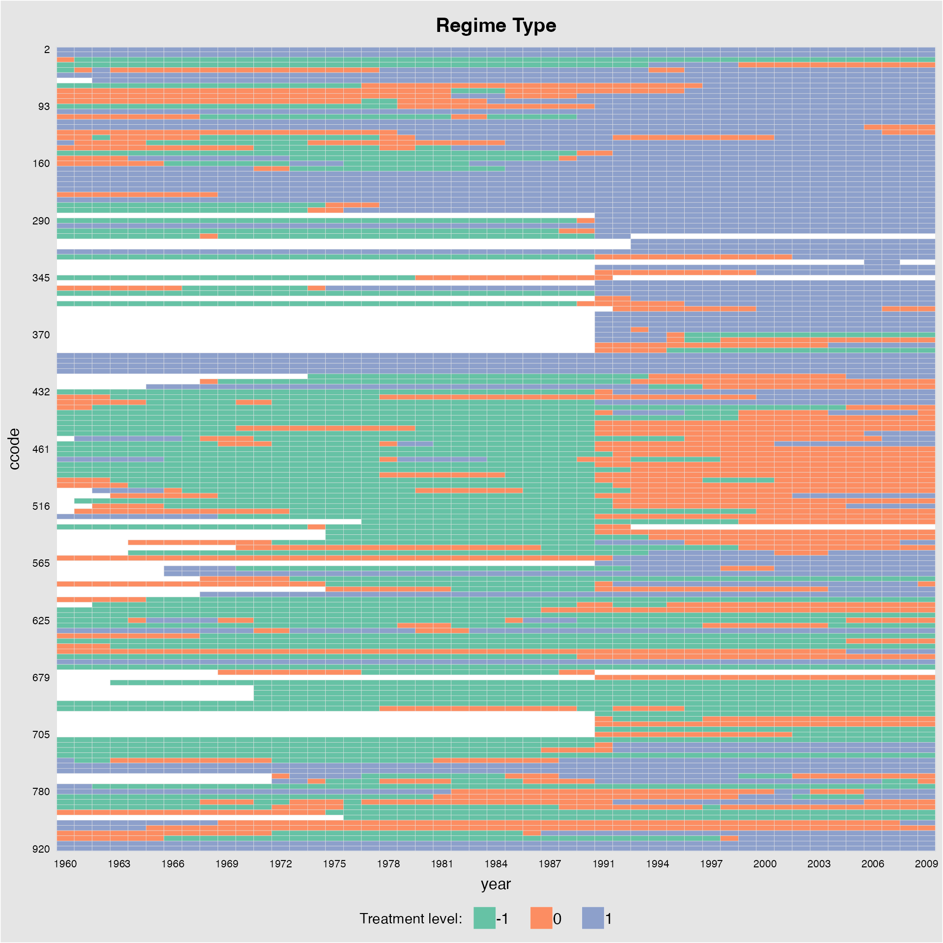
library(RColorBrewer)
mycol<-brewer.pal(3,"Set1")[c(1,3,2)]
panelview(Capacity ~ demo2, data = capacity,
          index = c("ccode", "year"), axis.lab.gap = c(2),
          main = "Regime Type", axis.lab = c("time"),
          color = mycol, legend.labs = c("Autocracy", "Hybrid", "Democracy"))
#> 3 treatment levels.
#> Specified colors in the order of: -1, 0, 1.
#> Specified labels in the order of: -1, 0, 1.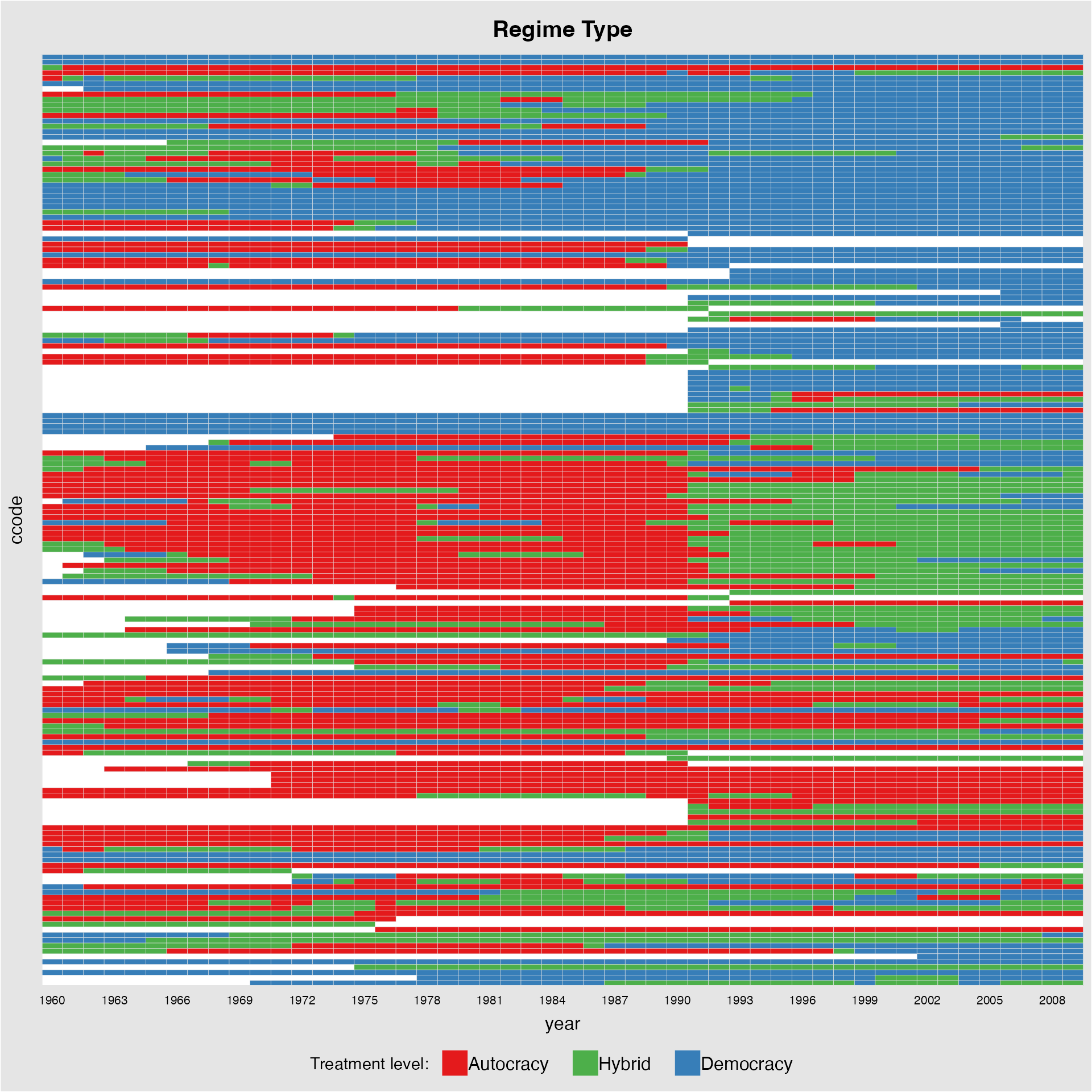
This is equivalent to:
panelview(D = "demo2", data = capacity, index = c("ccode", "year"),
          axis.lab.gap = c(2), main = "Regime Type",
          axis.lab = c("time"), color = mycol,
          legend.labs = c("Autocracy", "Hybrid", "Democracy"))
If the number of treatment levels is greater than 5, then the
treatment indicator will be regarded as a continuous variable. We can
remove the grid lines by specifying gridOff = TRUE:
panelview(Capacity ~ polity2 + lngdp,
          data = capacity, index = c("ccode", "year"),
          axis.lab.gap = c(2,10), main = "Regime Type",
          gridOff = TRUE)
#> Time is not evenly distributed (possibly due to missing data).
#> 21 treatment levels.
#> Continuous treatment.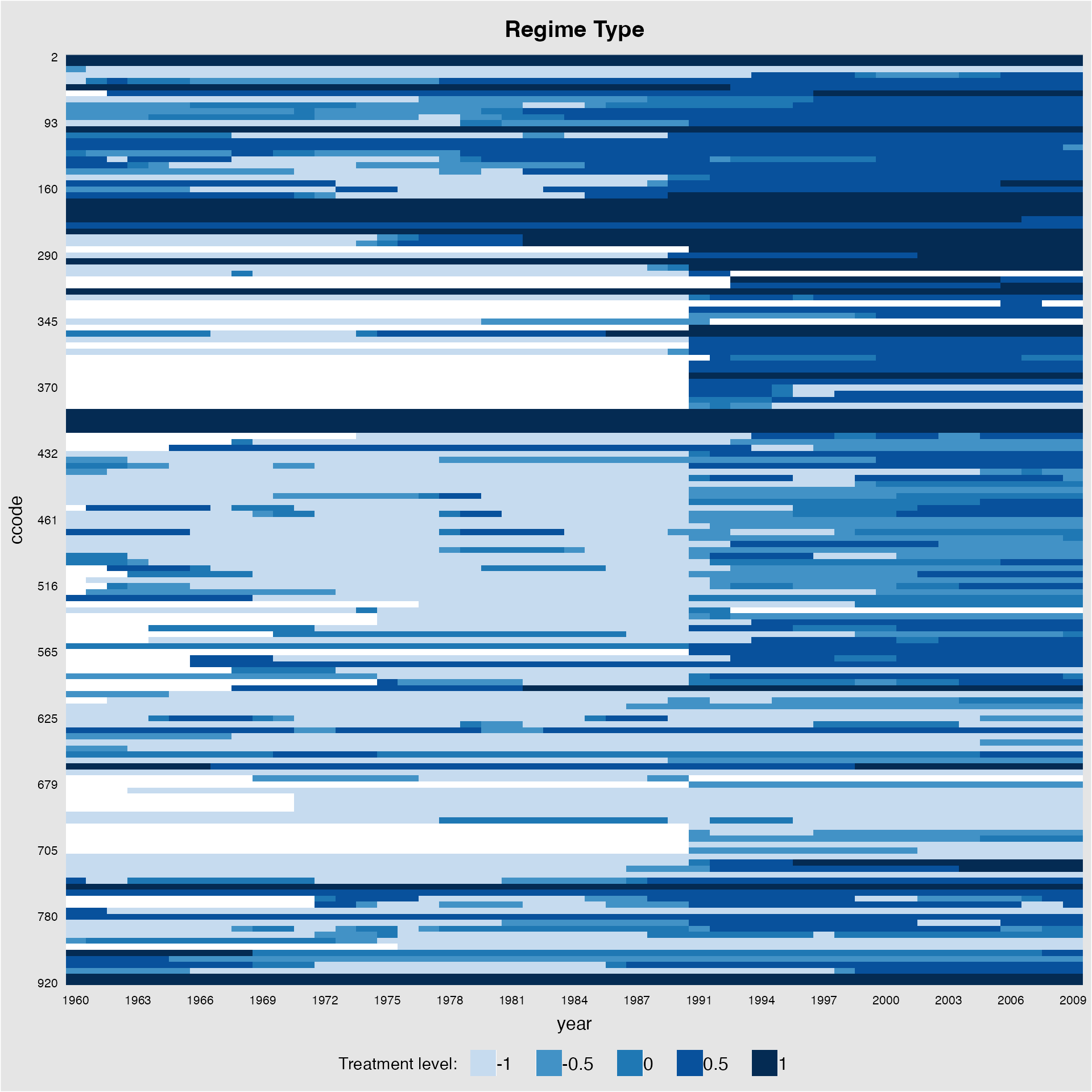
We can also change the colors using the option
color:
panelview(Capacity ~ polity2 + lngdp,
          data = capacity, index = c("ccode", "year"),
          axis.lab.gap = c(2,10), main = "Regime Type",
          color = c("yellow", "orange","red","purple","brown"), background = "white")
#> Time is not evenly distributed (possibly due to missing data).
#> 21 treatment levels.
#> Continuous treatment.
#> Specified colors in the order of: -1, -0.5, 0, 0.5, 1.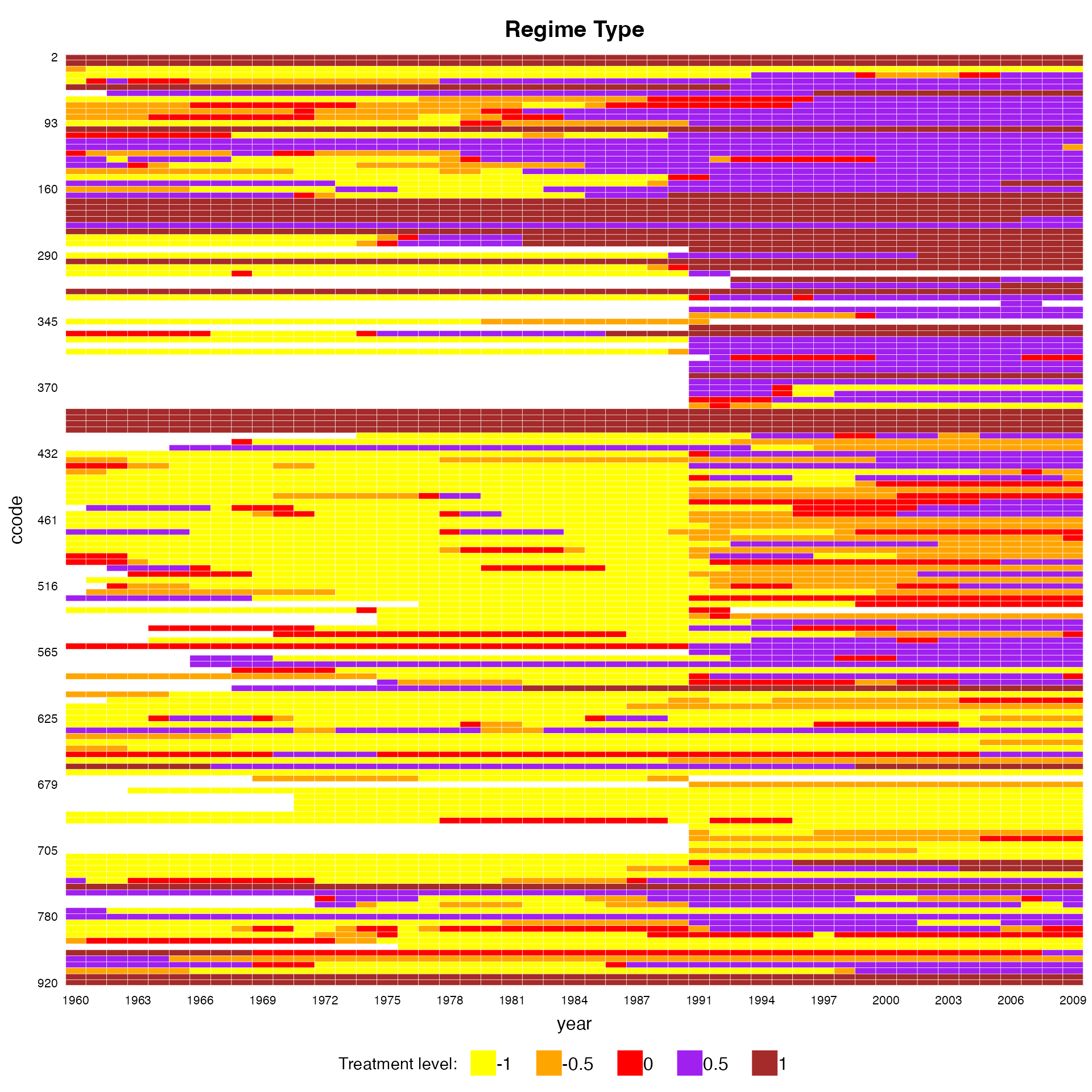
Plot an outcome (or any variable)
The second main function of panelview is to plot the
raw outcome variable of a panel dataset in a time-series fashion. The
syntax is very similar except that we need to specify
type = "outcome". We can control the ranges of the data to
be shown by supplying xlim and ylim. Different
colors represent different treatment conditions.
panelview(turnout ~ policy_edr + policy_mail_in + policy_motor,
          data = turnout, index = c("abb","year"),
          type = "outcome", main = "EDR Reform and Turnout",
          ylim = c(0,100),xlab = "Year", ylab = "Turnout")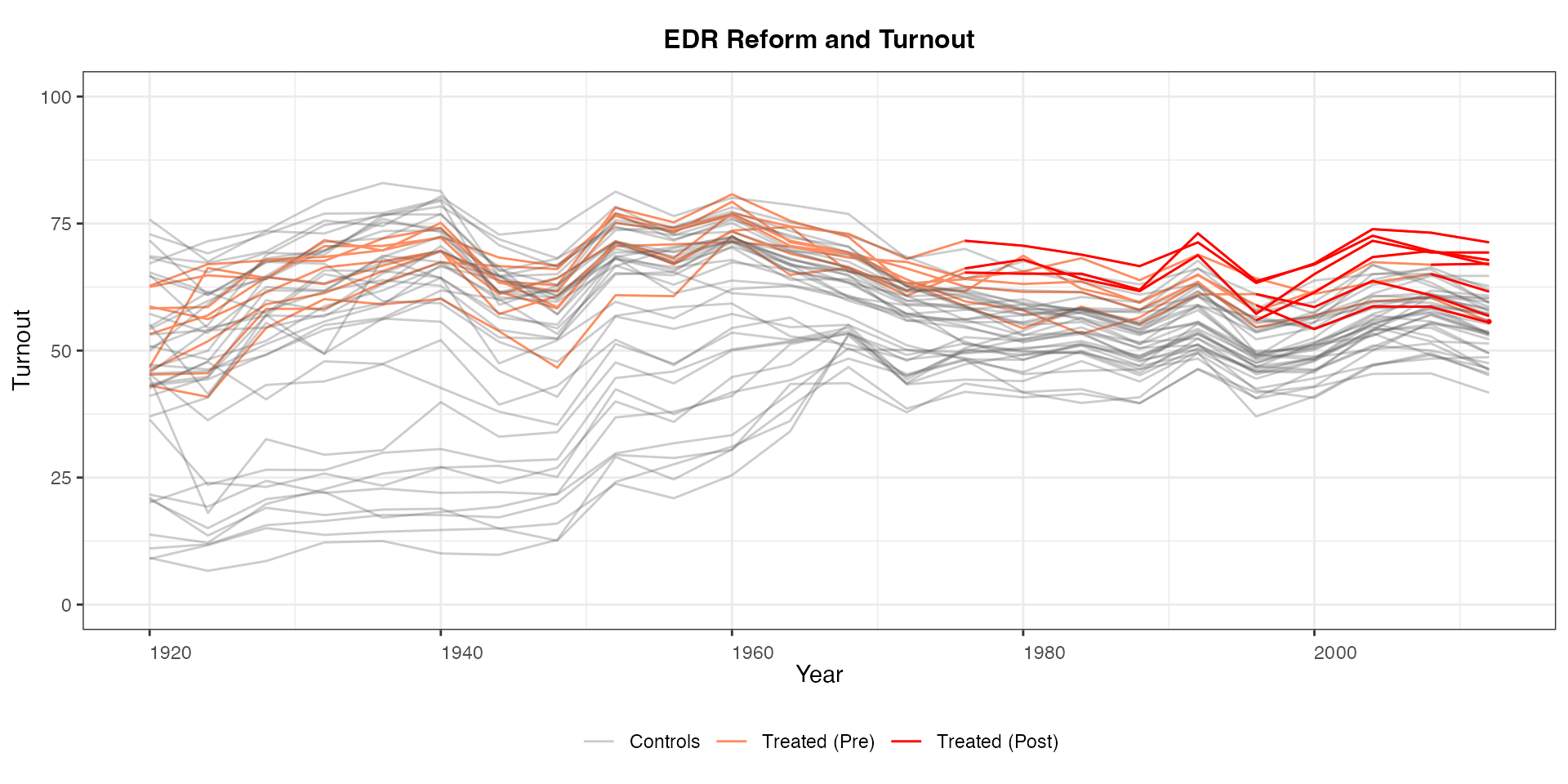
To turn off the coloring for observations in the pretreatment period,
set pre.post = FALSE.
panelview(turnout ~ policy_edr + policy_mail_in + policy_motor,
          data = turnout, index = c("abb","year"), pre.post = FALSE,
          type = "outcome", main = "EDR Reform and Turnout",
          ylim = c(0,100),xlab = "Year", ylab = "Turnout")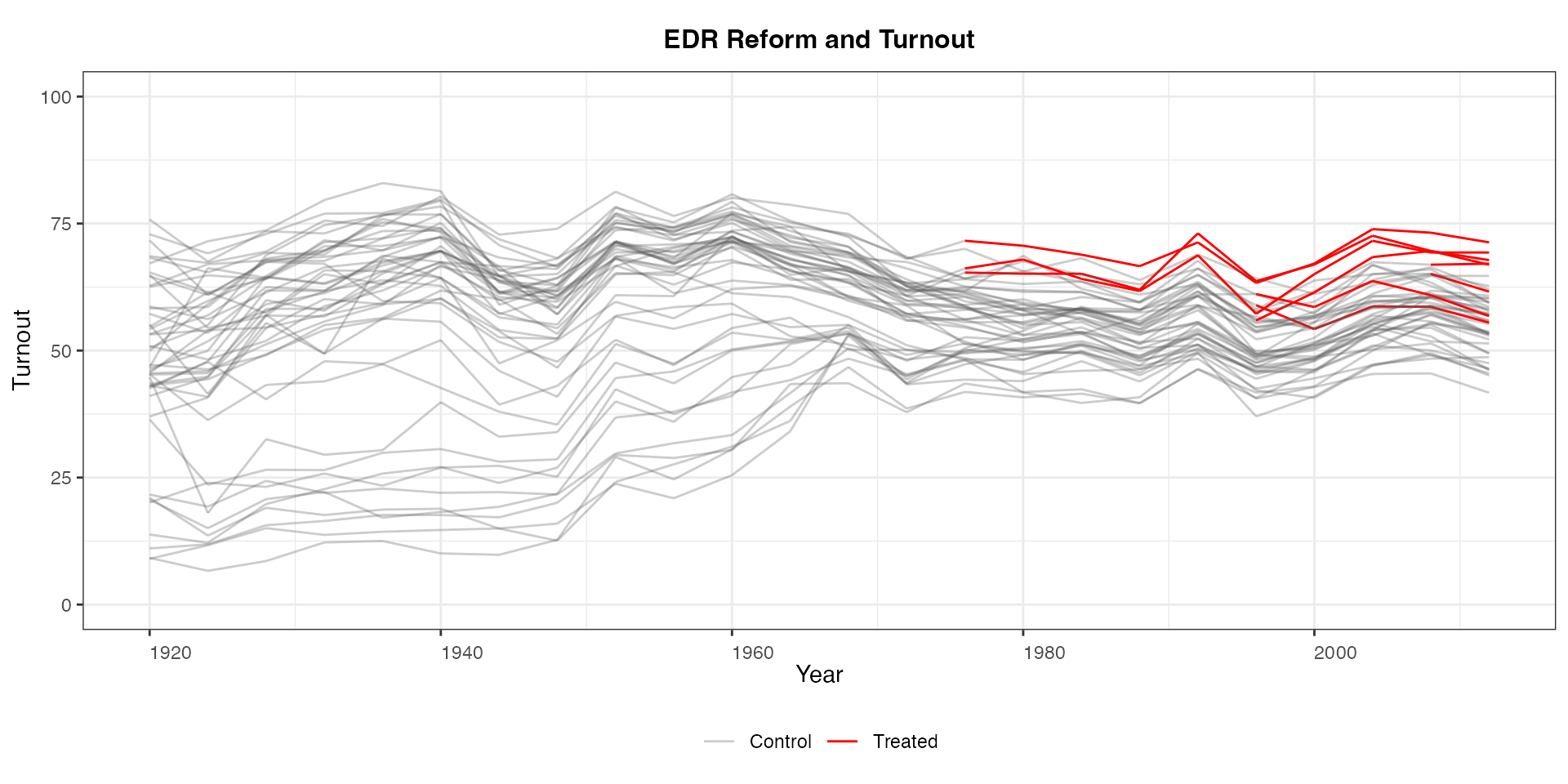
Similarly, we can specify the labels shown in the legend using
legend.labs. Note that we can also turn off legends by
specifying legendOff = TRUE.
panelview(turnout ~ policy_edr + policy_mail_in + policy_motor,
          data = turnout, index = c("abb","year"),
          type = "outcome", main = "EDR Reform and Turnout",
          legend.labs = c("Control States","Treated States (before EDR)",
                          "Treated States (after EDR)"))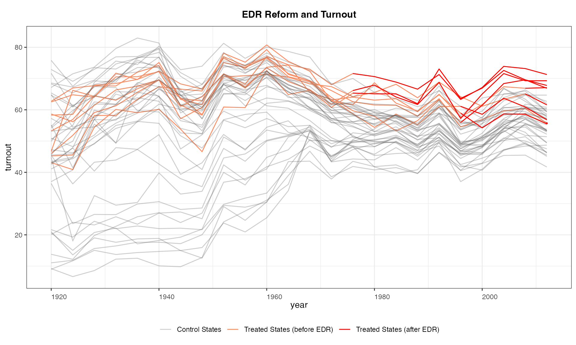
We do not use the black and white theme by specifying
theme.bw = FALSE.
panelview(turnout ~ policy_edr + policy_mail_in + policy_motor,
          data = turnout, index = c("abb","year"), type = "outcome",
          main = "EDR Reform and Turnout", theme.bw = FALSE)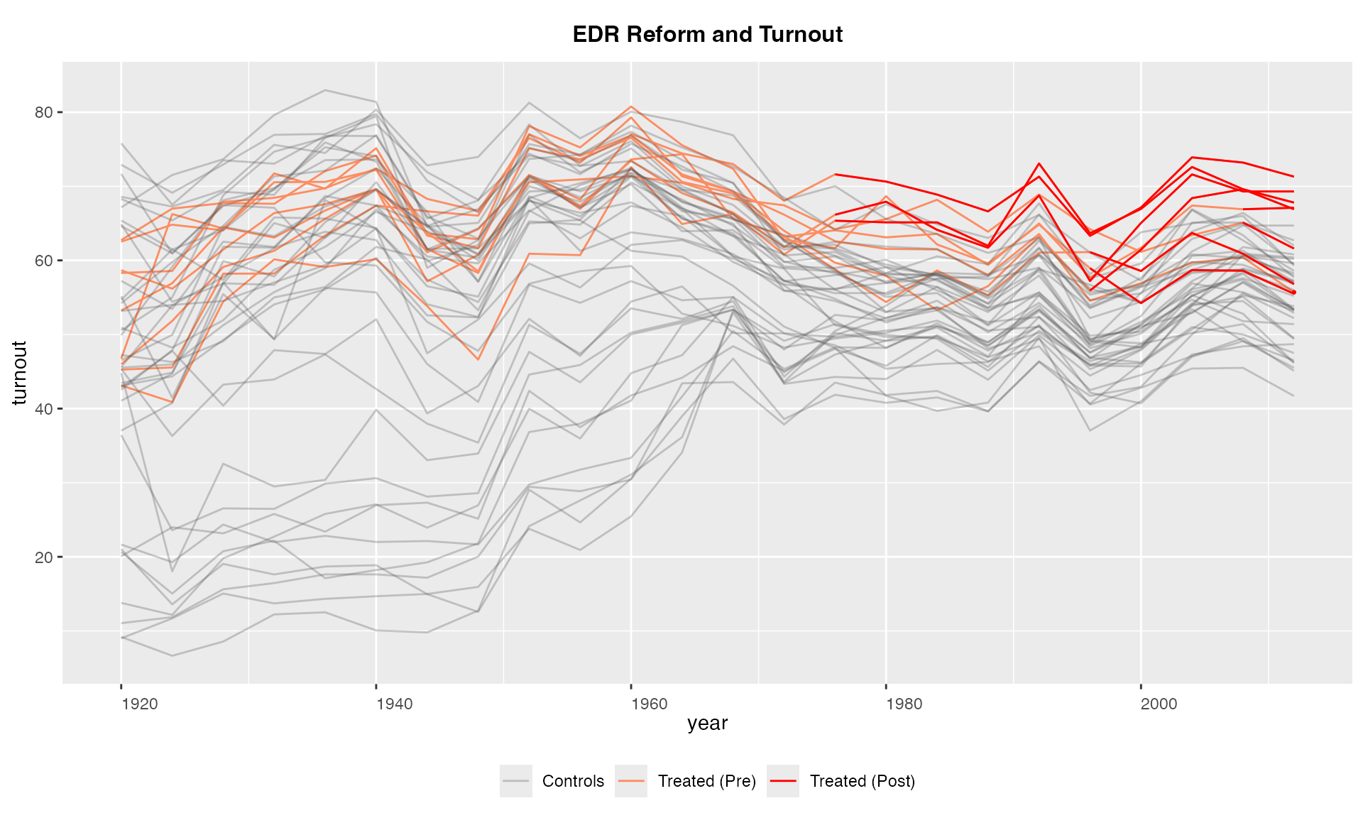
And we can change the colors for observations under different
treatment statuses using the option color and change the
legend labels using legend.labs.
panelview(turnout ~ policy_edr + policy_mail_in + policy_motor,
          data = turnout, index = c("abb","year"),
          type = "outcome", main = "EDR Reform and Turnout",
          color = c("lightblue", "blue", "#99999950"),
          legend.labs = c("Control States","Treated States (before EDR)",
             "Treated States (after EDR)"))
#> Specified colors in the order of "treated (pre)", "treated (post)", "control".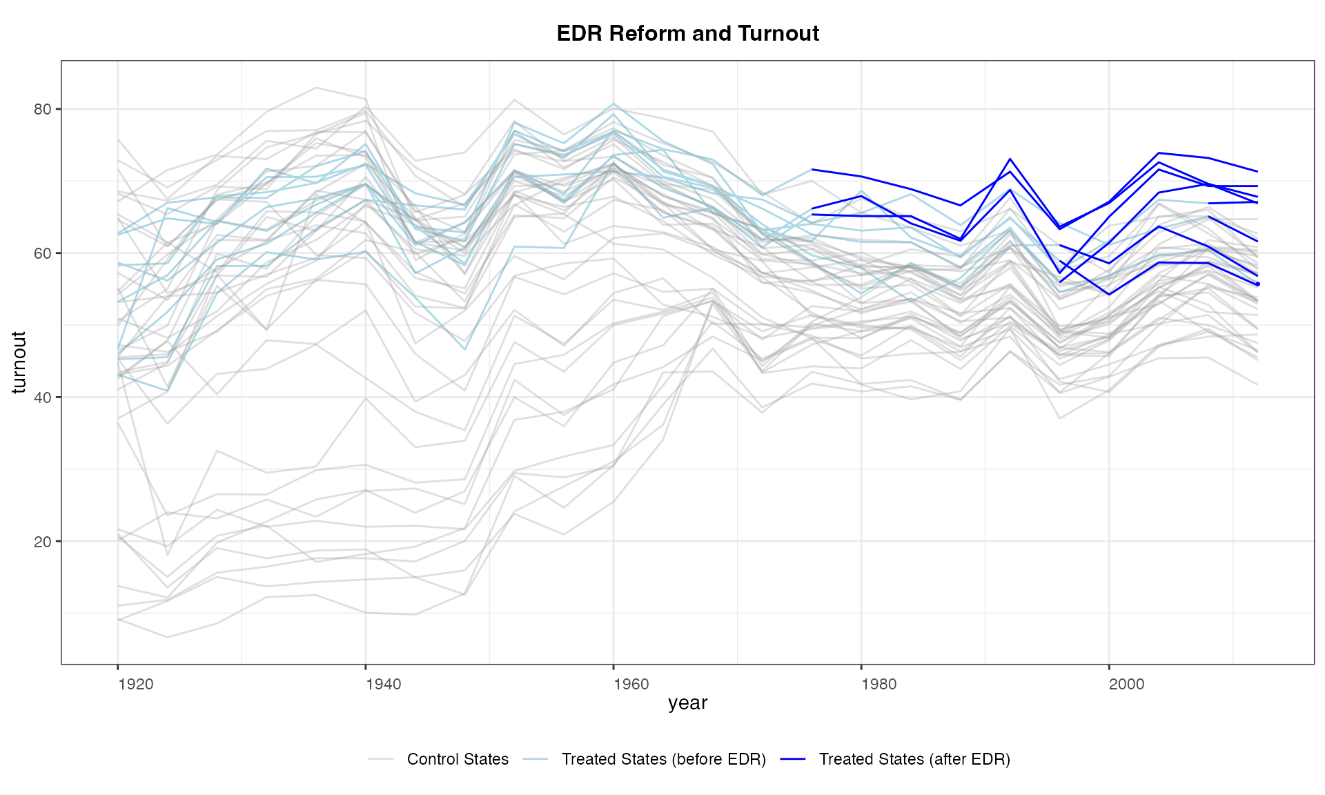
In cases with a staggered treatment and a continous outcome, we can
collapse units based on cohort defined the timing of getting the
treatment by setting by.cohort = TRUE. In the
turnout data, there are five cohorts:
panelview(turnout ~ policy_edr + policy_mail_in + policy_motor,
          data = turnout, index = c("abb","year"),
          type = "outcome", main = "EDR Reform and Turnout",
          by.cohort = TRUE)
#> Number of unique treatment histories: 5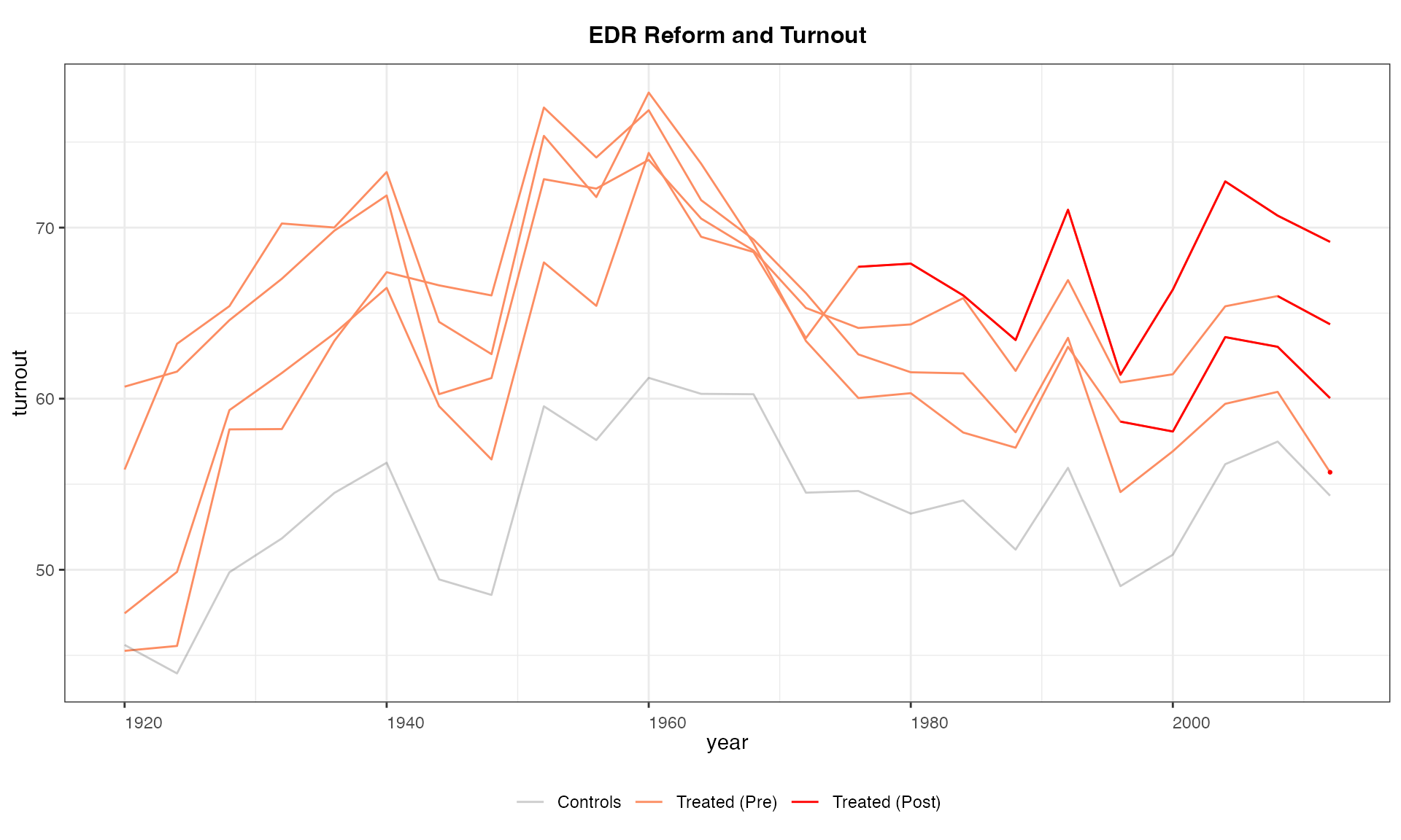
Again, we can specify which unit(s) we want to take a look at:
panelview(turnout ~ policy_edr + policy_mail_in + policy_motor,
          data = turnout, index = c("abb","year"),
          type = "outcome", main = "EDR Reform and Turnout (AL, AR, CT)",
          id = c("AL", "AR", "CT"))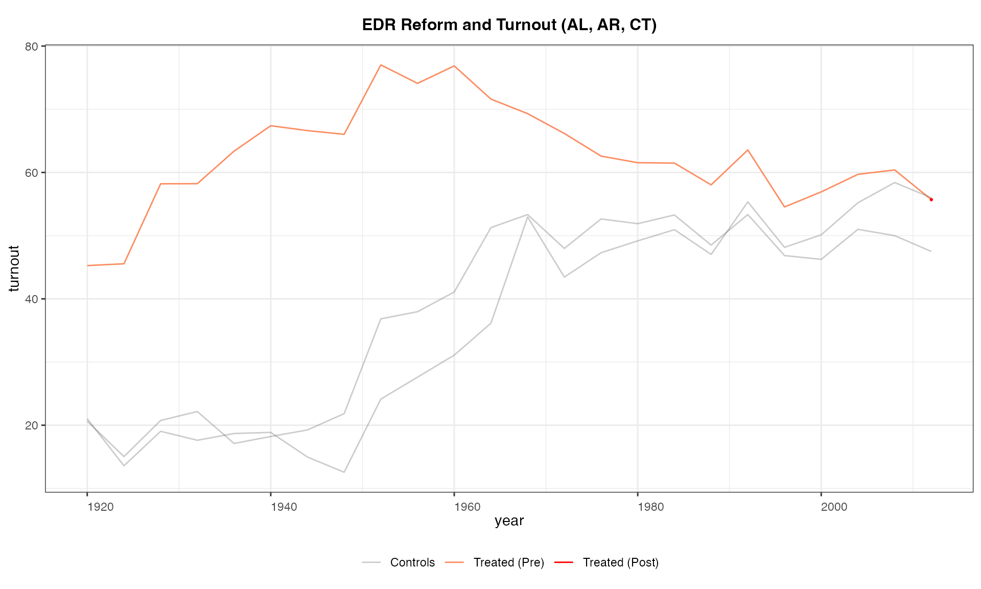
To better understand the data, sometimes we want to plot the outcome
based on whether the treatment status has changed during the observed
time period. We can simply add an option by.group = TRUE.
The algorithm will analyze the data and automatically put each unit into
different groups, e.g. (1) always treated, (2) always in control, (3)
treatment status changed. Users can adjust the fontsizes of the title
and subtitles using the cex.main and
cex.main.sub options, respectively.
panelview(turnout ~ policy_edr + policy_mail_in + policy_motor,
          data = turnout, index = c("abb","year"),
          type = "outcome", main = "EDR Reform and Turnout",
          by.group = TRUE, cex.main = 20, cex.main.sub = 15)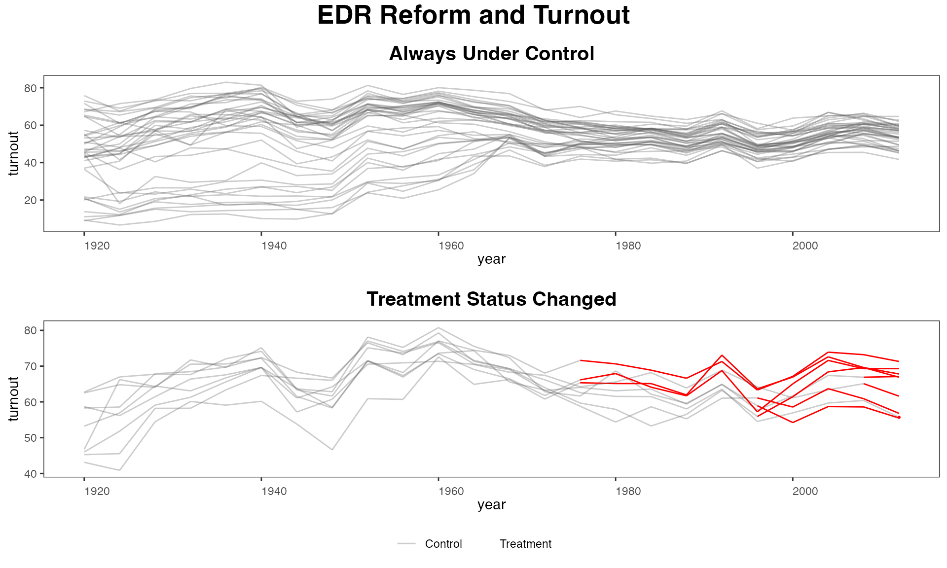
If we want to arrange the subfigures in a row rather than in a
column, use the by.group.side = TRUE option instead of
by.group = TRUE.
panelview(turnout ~ policy_edr + policy_mail_in + policy_motor,
          data = turnout, index = c("abb","year"),
          type = "outcome", main = "EDR Reform and Turnout",
          by.group.side = TRUE, cex.main = 20, cex.main.sub = 15)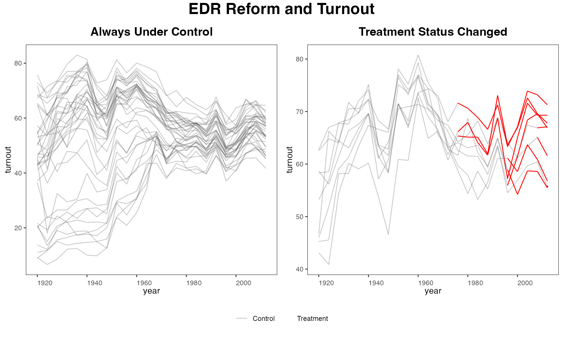
Ignore treatment status
Starting from v 1.0.3, we allow users to omit the treatment indicator. Therefore, panelview can in fact be used to visualize any variable in a panel dataset.
panelview(turnout ~ 1, data = turnout, index = c("abb","year"),
          type = "outcome", main = "Turnout",
          ylim = c(0,100), xlab = "Year", ylab = "Turnout")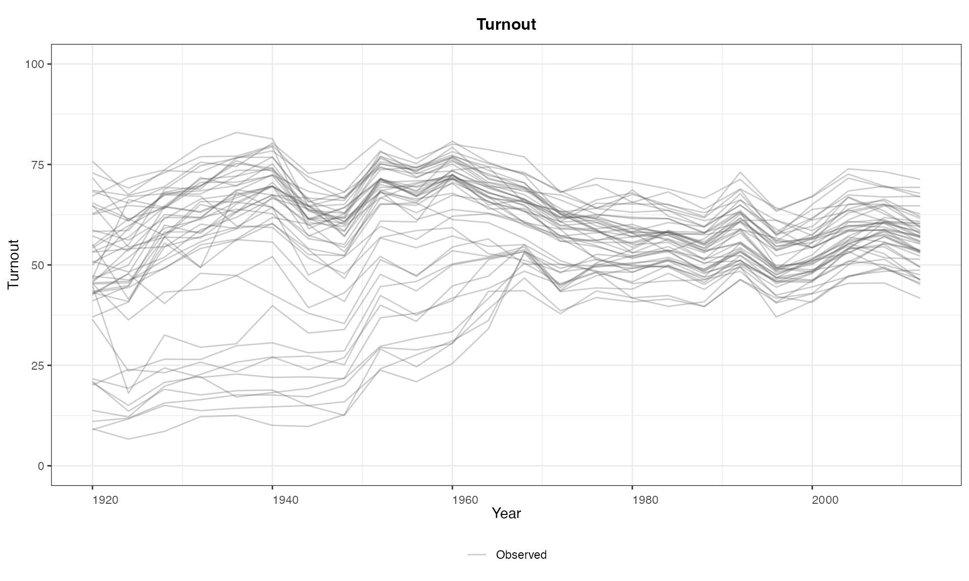
Alternatively, by setting ignore.treat = TRUE. The
right-hand-side variables may change the plot by introducing missing
values.
panelview(Y = "turnout", data = turnout,
          index = c("abb","year"), type = "outcome",
          main = "Turnout", ylim = c(0,100),
          xlab = "Year", ylab = "Turnout")
Outcome trajectories by cohort
Starting from v 1.1.11, users can use the
by.cohort = TRUE option to plot the average outcome
trajectories of units with same treatment history (if the number of
unique treatment history is less than 20). This type of plots can help
users diagnose the extent to which treatment effect heterogeneity may
cause biases of certain estimators (e.g. the two-way fixed effects
estimators).
panelview(turnout ~ policy_edr+policy_motor,
          data = turnout, index = c("abb","year"), type = "outcome",
          main = "EDR Reform and Turnout", by.cohort = TRUE, ylim = c(40, 80),
          legend.labs = c("Control States","Treated States (before EDR)",
                          "Treated States (after EDR)"))
#> Number of unique treatment histories: 5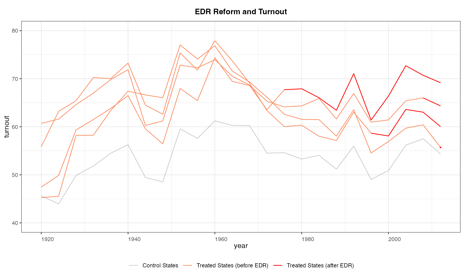
Discrete outcomes
We can accommodate discrete variables by setting
outcome.type = "discrete". Below is an example using the
simdata dataset, in which the outcome variable takes three
values: 0, 1, and 2.
panelview(Y ~ D, data = simdata, index = c("id", "time"),
          outcome.type = "discrete",
          type = "outcome", xlim = c(8, 15))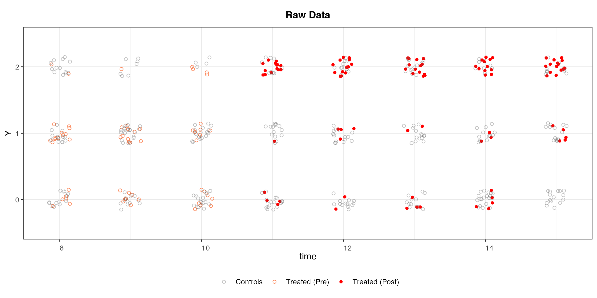
We split the sample based on changes in treatment status and use the black and white theme:
panelview(Y ~ D, data = simdata, index = c("id", "time"),
          by.group = TRUE, outcome.type = "discrete",
          type = "outcome",  xlim = c(8, 15))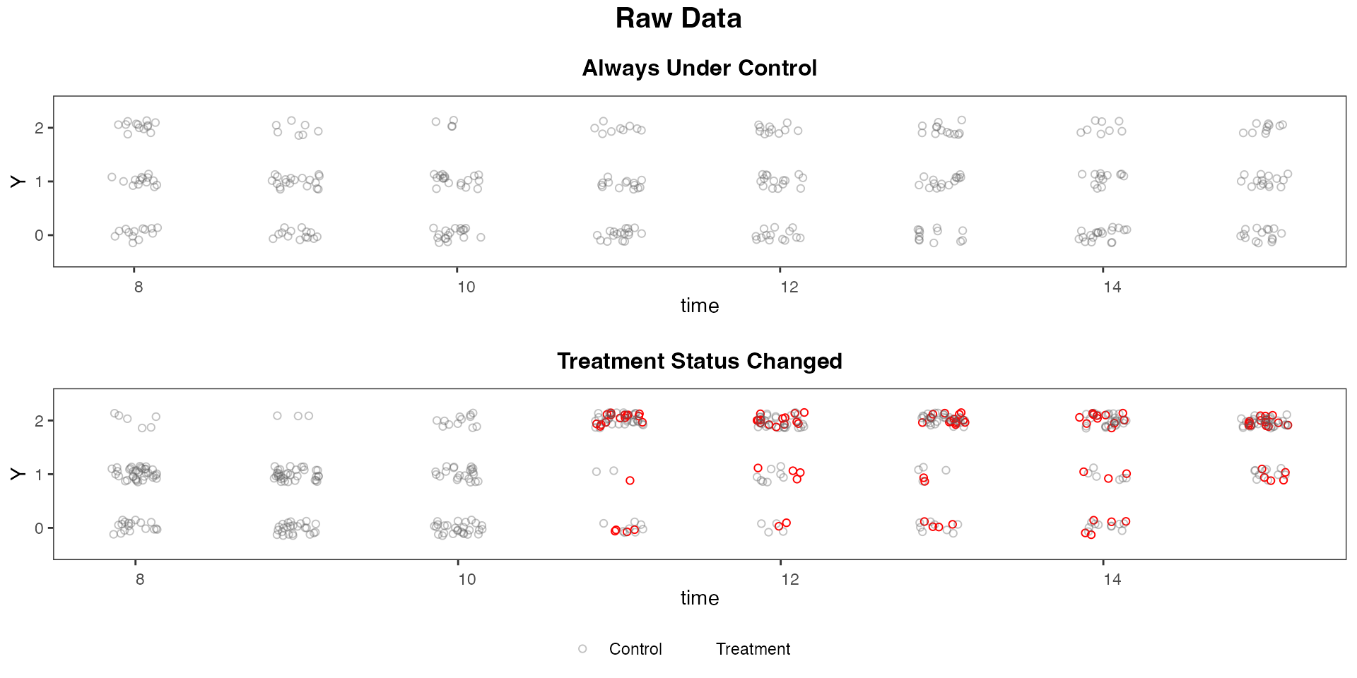
If the treatment indicator has more than 2 treatment levels or a
continuous variable (e.g. polity2), then treatment status
will not be shown on the "outcome" plot:
panelview(Capacity ~ polity2 + lngdp,
          data = capacity, index = c("ccode", "year"),
          main = "Measuring State Capacity",
          type = "outcome", legendOff = TRUE)
#> Time is not evenly distributed (possibly due to missing data).
#> 21 treatment levels.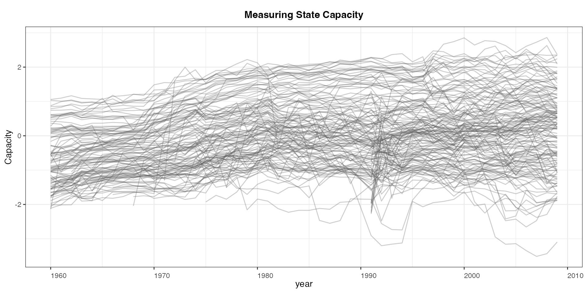
Plot bivariate relationships
Visualize time series of the outcome and treatment in one figure by
specifying type = "bivar" or
type = "bivariate". For continuous variable, we use line
plot as default; for discrete variable, we use bar plot. To plot
connected lines ( "connected" or "c" ), lines
( "line" or "l" ), or bars (
"bar" or "b" ) rather than the default, please
add style = c("",""), where the first element defines the
outcome style, and the second defines the treatment style.
In aggregate
When type = "bivariate", panelview plots the
averages of D and Y against time with the default option
by.unit = FALSE.
Below are two examples with a continuous outcome and a discrete
treatment. In the first example, style = c("c","b")
represents a connected line plot for the outcome and a bar plot for the
treatment—the default is style = c("l","b"), in which “l”
represents a line plot. In the second example, we adjust the y-axes
ranges using ylim = list(c( , ), c( , )), in which the
first vector specifies the range for the average outcome and the second
vector specifies the range for the average treatment.
# 1. Continuous Y, discrete D:
panelview(turnout ~ policy_edr + policy_mail_in + policy_motor, data = turnout,
          index = c("abb","year"),
          type = "bivariate",
          style = c("c","b"),
          main = "EDR Reform and Turnout", ylab = "Turnout")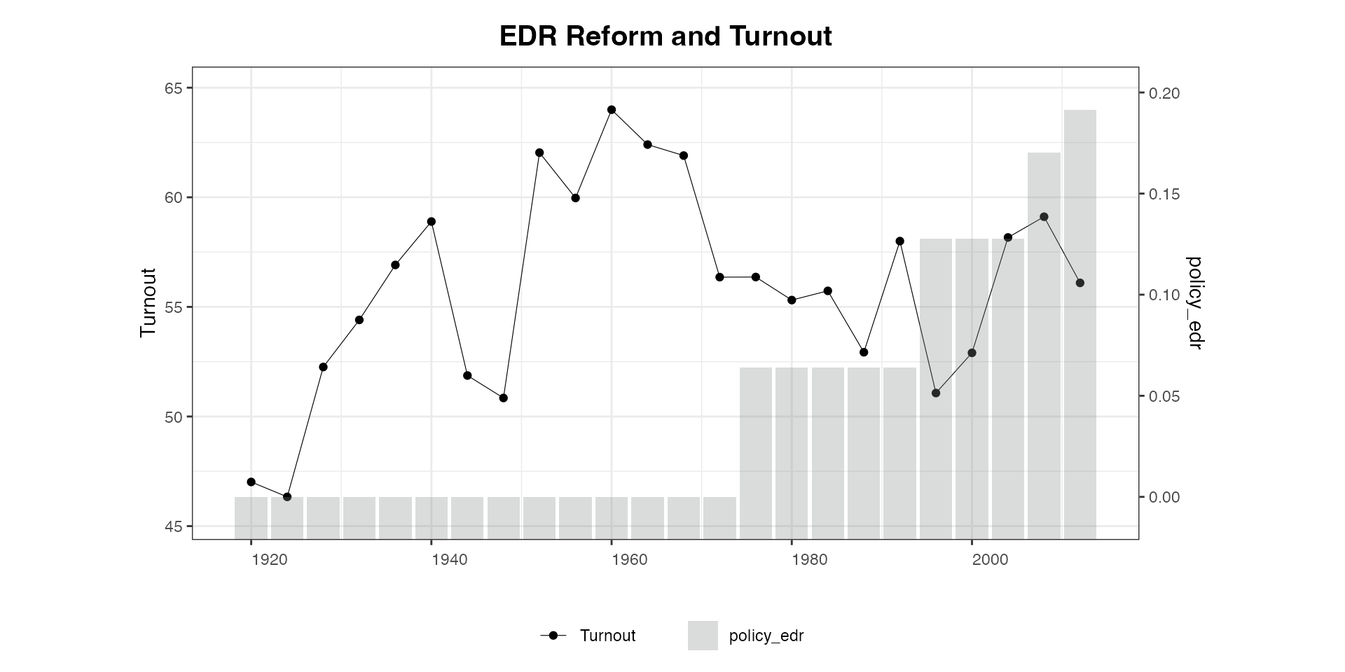
panelview(lnpop ~ demo, data = capacity, index = c("country", "year"),
          ylim = list(c(8, 9.4), c(0.25, 0.6)), type = "bivar")
#> Time is not evenly distributed (possibly due to missing data).
#> Treatment has reversals.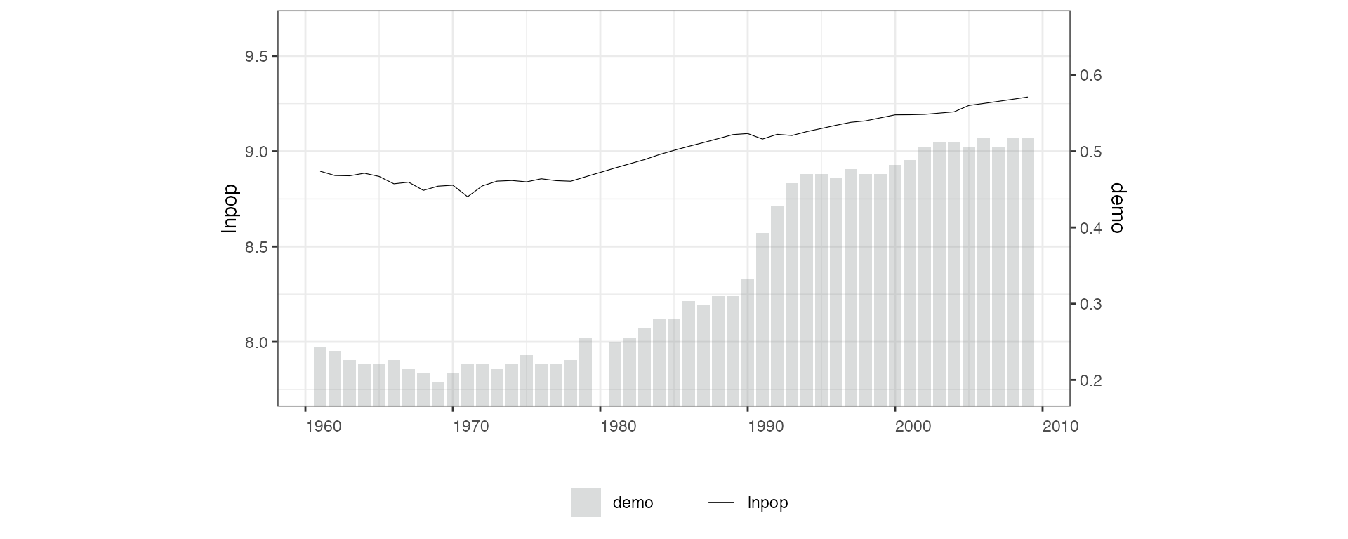
With discrete outcome and treatment variables, the default is
style = c("b","b"):
# 2. Discrete Y, discrete D:
panelview(Y ~ D, data = simdata, index = c("id", "time"),
          type = "bivar", theme.bw = FALSE, outcome.type = "discrete")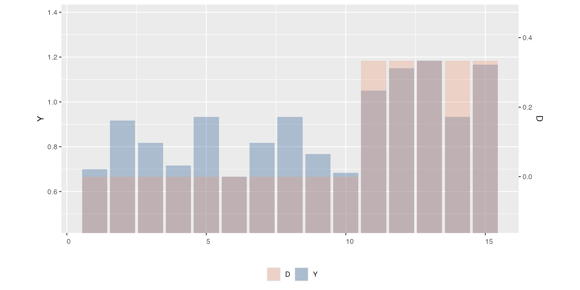
When both variables are continuous, the default is
style = c("l","l"):
# 3. Continuous Y, continuous D:
panelview(lnpop ~ polity2, data = capacity, index = c("country", "year"),
          ylim = list(c(8.75,9.4), c(-0.2, 0.35)), type = "bivar")
#> 21 treatment levels.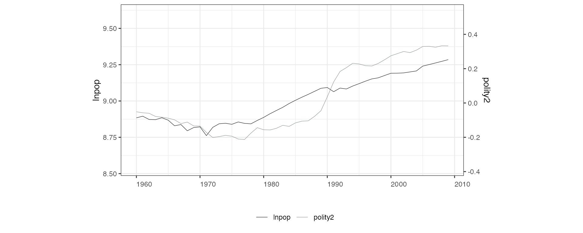
When both variables are discrete, the default is
style = c("l","b"):
# 4. Discrete Y, continuous D
simdata$x <- seq(0.001,0.9,0.001)
panelview(Y ~ x, data = simdata, index = c("id", "time"),
          type = "bivar", outcome.type = "discrete")
#> 900 treatment levels.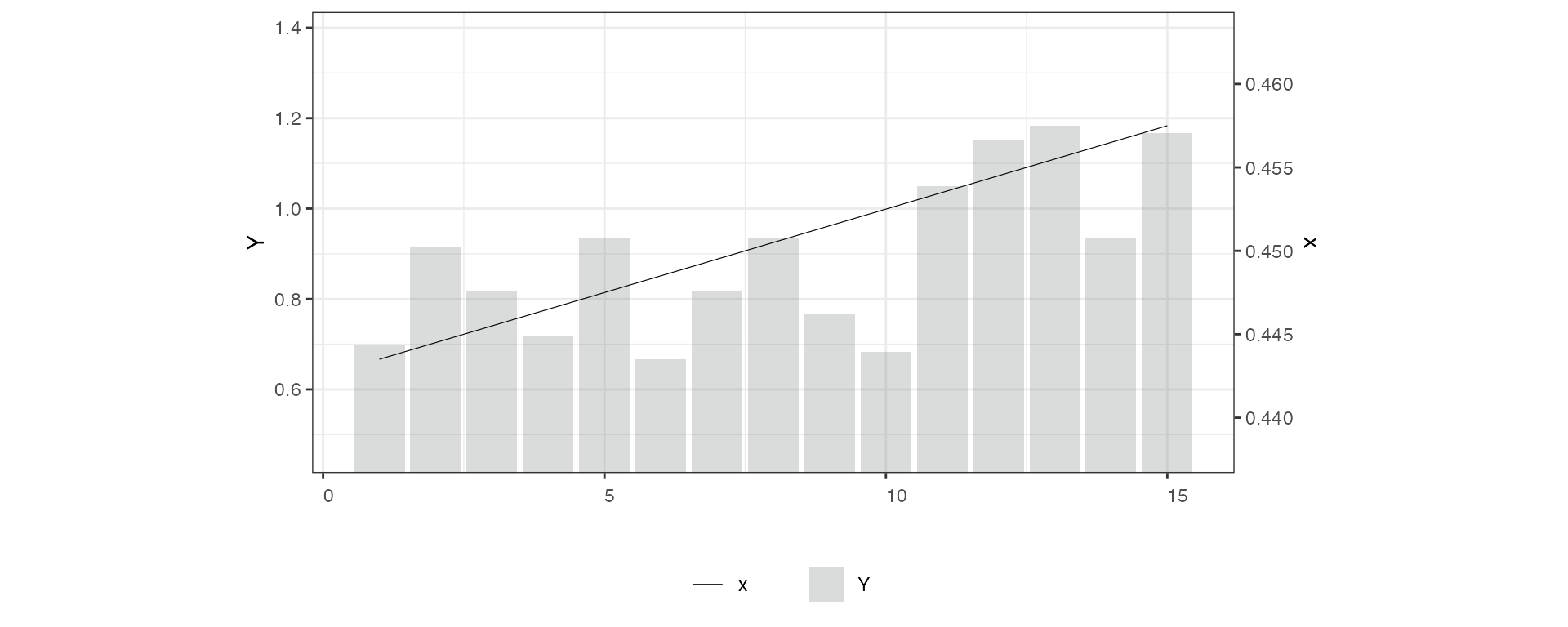
Another example. Option lwd controls the line width
(default is 0.2):
## Line the discete treatment
# 1. Y: continuous; D: discrete
panelview(turnout ~ policy_edr + policy_mail_in + policy_motor, data = turnout,
          index = c("abb","year"), xlab = "EDR", ylab = "Turnout", type = "bivar",
          style = c("line","connected"), color = c(2, 3), lwd = 0.4)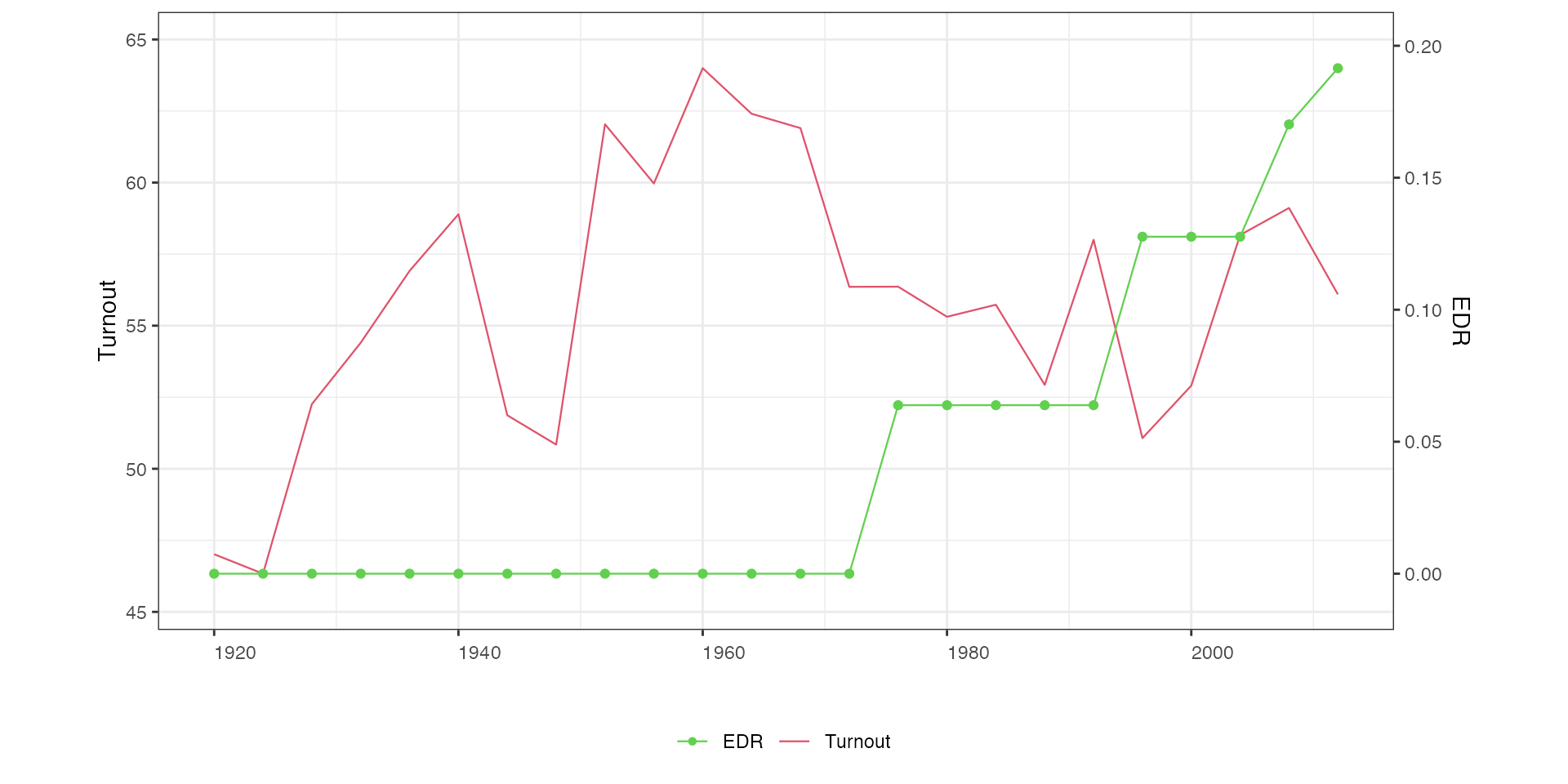
By each unit
We plot Y and D against time for each unit using
by.unit = TRUE. Below are two examples with continuous
outcome and discrete treatment. We arrange four subgraphs in one
row:
# 1. Continuous Y, discrete D:
panelview(turnout ~ policy_edr, data = turnout,
          index = c("abb","year"), ylab = "Turnout", type = "bivar",
          by.unit = TRUE,  show.id = c(1:12))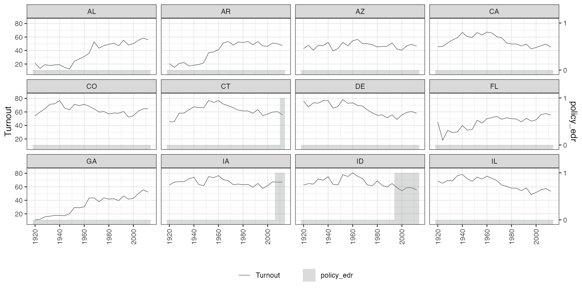
Another example:
panelview(lnpop ~ demo, data = capacity,
          index = c("country","year"), type = "bivar",
          by.unit = TRUE, ylim = list(c(8,10), c(-2, 2)),
          show.id = c(1:16))
#> Time is not evenly distributed (possibly due to missing data).
#> Treatment has reversals.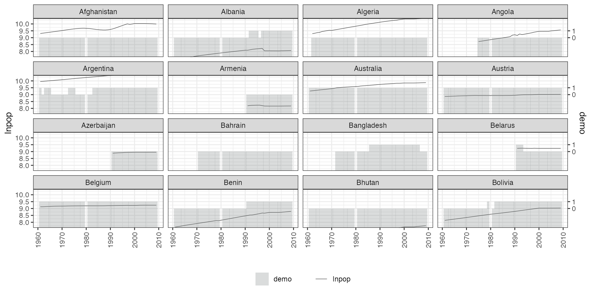
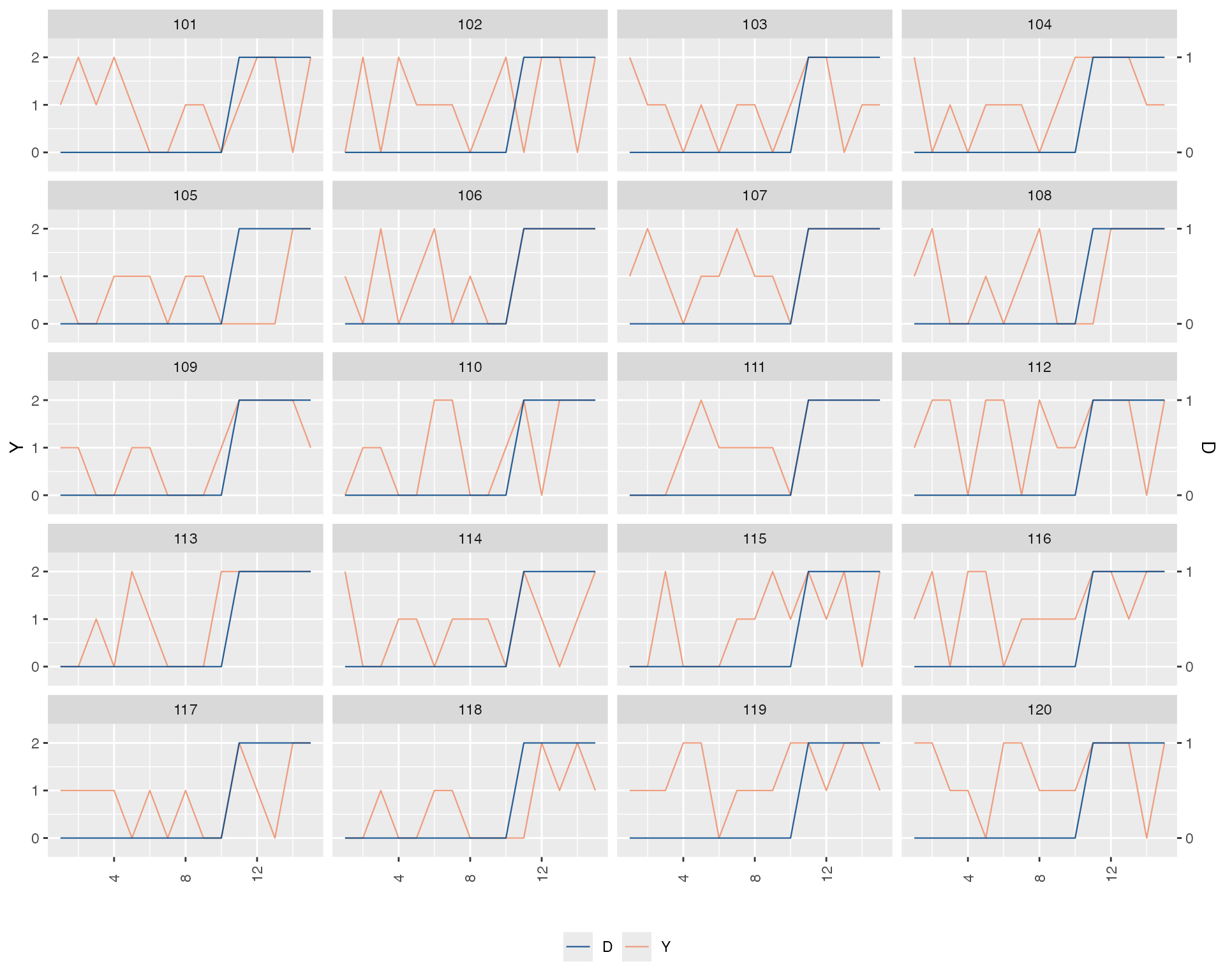
If the outcome is discrete, we can plot outcome and treatment against
time in the same figure, indicating
outcome.type = "discrete":
# 2. Discrete Y, discrete D:
panelview(Y ~ D, data = simdata,
          index = c("id", "time"),
          type = "bivariate",
          by.unit = TRUE,
          theme.bw = FALSE,
          outcome.type = "discrete",
          id = unique(simdata$id)[1:12])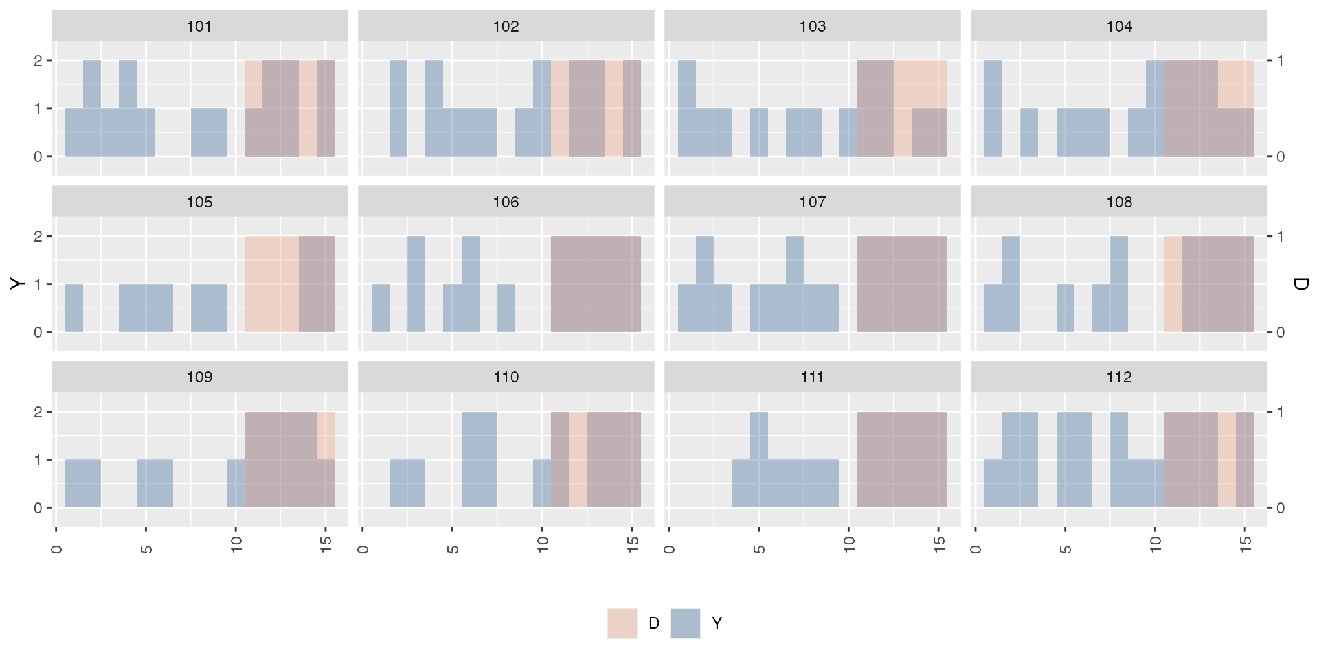
When both variables are continuous:
# 3. Continuous Y, continuous D:
panelview(lnpop ~ polity2, data = capacity,
          index = c("country","year"),
          type = "bivar",
          by.unit = TRUE,
          theme.bw = FALSE,
          color = c("blue","red"),
          show.id = c(1:12))
#> 21 treatment levels.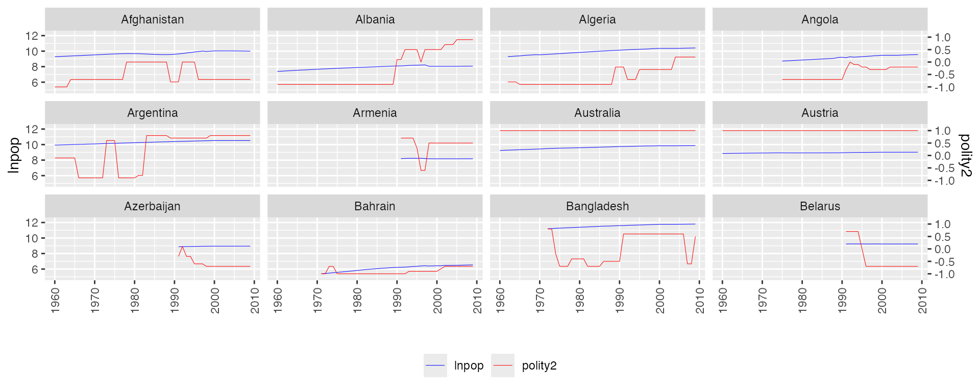
With discrete outcome and continuous treatment:
# 4. Discrete Y, continuous D
simdata$x <- seq(0.001,0.9,0.001)
panelview(Y ~ x, data = simdata,
          index = c("id", "time"),
          type = "bivar",
          by.unit = TRUE,
          outcome.type = "discrete",
          lwd = 0.4,
          id = unique(simdata$id)[1:12])
#> 900 treatment levels.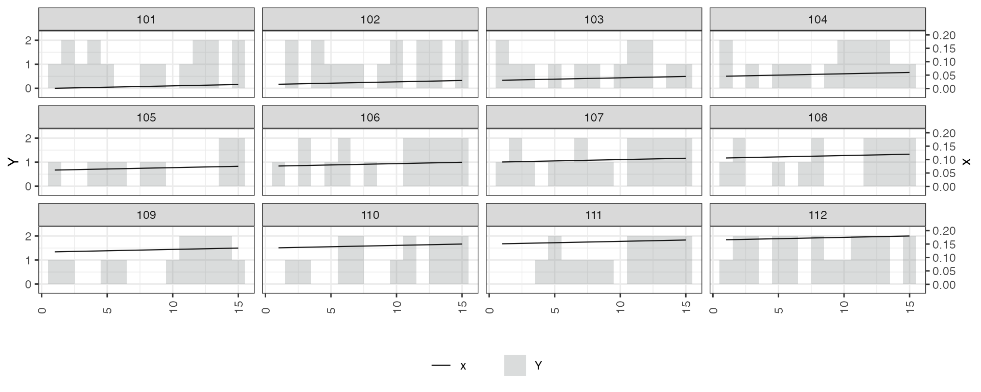
Adding style = "line" to plot both variables in
lines:
## Line the discete treatment
# 1. Y: continuous; D: discrete
panelview(turnout ~ policy_edr + policy_mail_in + policy_motor, data = turnout,
          index = c("abb","year"),
          type = "bivar",
          by.unit = TRUE,
          style = "line",
          theme.bw = FALSE,
          lwd = 0.5,
          show.id = c(1:12),
ylab = "Turnout") 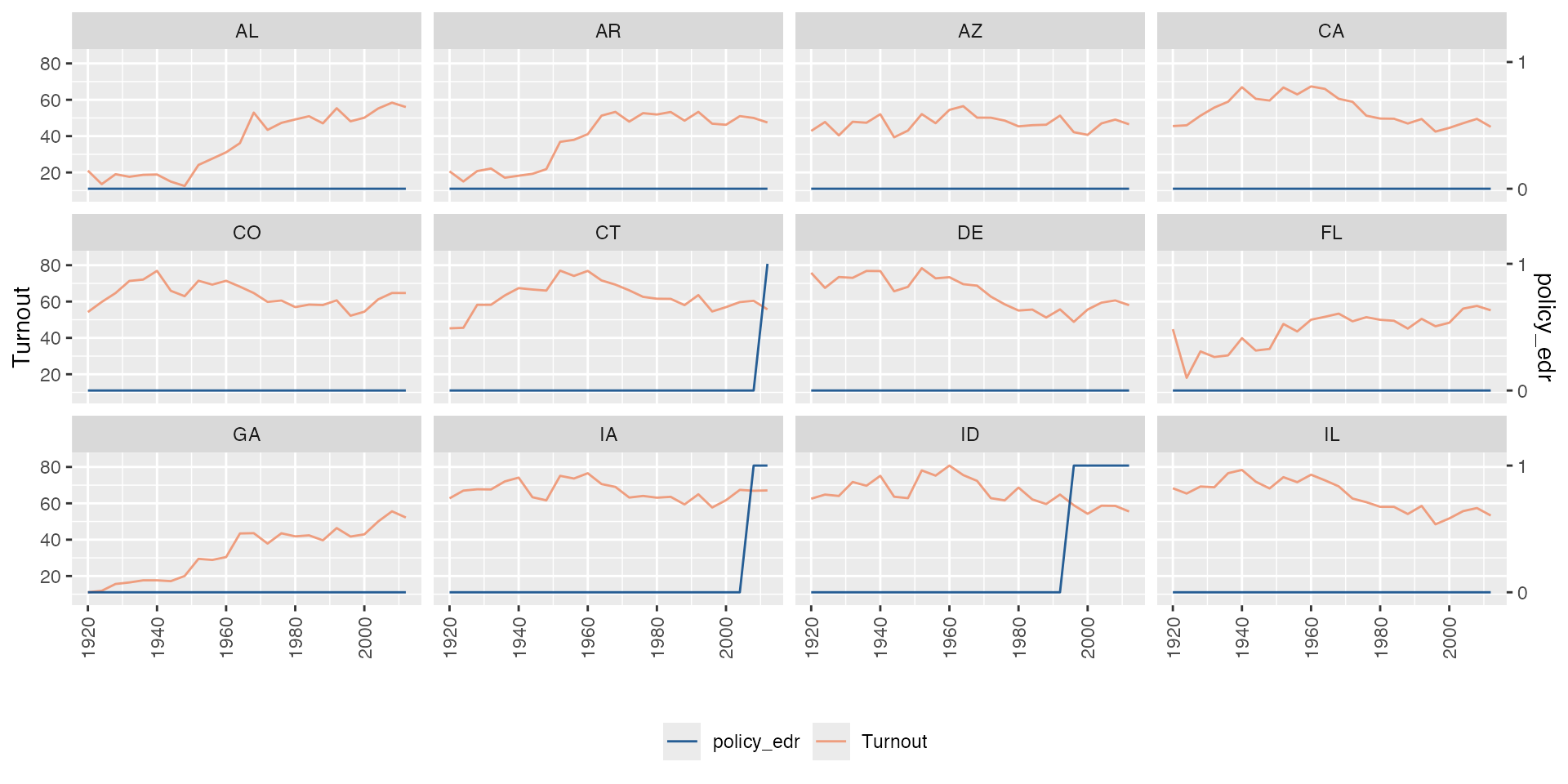
# 2. Y: Discrete; D: discrete
panelview(Y ~ D, data = simdata,
          index = c("id", "time"),
          type = "bivar",
          by.unit = TRUE,
          outcome.type = "discrete",
          style = "line",
          theme.bw = FALSE,
          lwd = 0.4,
id = unique(simdata$id)[1:20]) 